The Soul of Color: Understanding the Emotional Language of Warm and Cool Tones
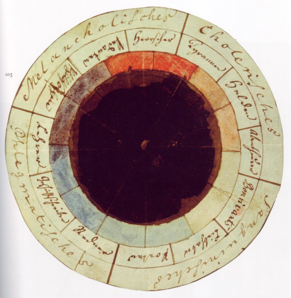 Color psychology
Color psychology is the study of colors and hues as a determinant of human behavior. Color influences perceptions that are not obvious, such as the taste of food. Colors have qualities that may cause certain emotions in people. How color influences i...
Color is far more than a mere aesthetic choice; it is the very breath of an interior space, a potent force capable of evoking profound emotion and reshaping the fundamental ambiance of our homes. Long before we had modern design terminology, artists understood that color was a language of its emotion. While Sir Isaac Newton’s prism revealed the scientific spectrum of light, it was Johann Wolfgang von Goethe who truly captured the heart of the matter. In his
Theory of Colours, he moved beyond physics to explore how we
feel color. To him, color was not just a wavelength but a subjective experience—a dialogue between light and darkness that touches the human spirit. As Carl Jung famously suggested, colors are the "mother tongue of the
subconscious." When we choose a palette for our rooms, we are essentially composing a silent symphony, deciding whether our sanctuary will sing with the excitement of a bright morning or the quiet repose of a twilight dusk.
Radiant Energy: How Warm Palettes Evoke Vitality and Light
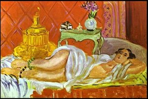 Odalisque, Harmony in Red
A Symphony of Red: Introducing "Odalisque, Harmony in Red" Henri Matisse's “Odalisque, Harmony in Red,” painted in 1926, isn’t merely a depiction of a reclining woman; it’s an immersive experience. This oil on canvas embodies the heart of Fauvism – a...
Tranquil Depths: Creating Calm with a Cool-Toned Sanctuary
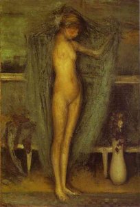 Harmony in Blue and Gold, The Little Blue Girl
Harmony in Blue and Gold: An Exploration of Whistler’s Aesthetic Vision James Abbott McNeill Whistler stands as an iconoclast within the artistic landscape of his era—a painter who defiantly championed “art for art’s sake,” rejecting the didactic imp...
The Art of Balance: Mastering Chromatic Equilibrium in Interior Design
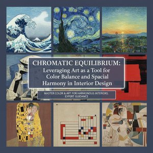 Chromatic Equilibrium: Leveraging Art as a Tool for Color Balance and Spatial Harmony in Interior Design
The Foundations of Chromatic Equilibrium: Understanding Color Theory & Psychology Harmonizing Spaces: A Guide to Utilizing Color Palettes in Interior Design Elevate your interior design projects with our expert guide to color palettes! Learn the psyc...
Curating Your Vision: Using Custom Art to Perfect Your Color Story
At ArtsDot.com, we believe that decorating your home should be an act of discovery rather than a daunting task. We invite you to move beyond the traditional method of searching by artist name and instead explore our collections by color, mood, or room type. Whether you are seeking the vibrant pulse of a warm-toned print or the serene depths of a cool-toned landscape, our curated selection is designed to help you build your confidence as a collector.
For those looking to truly personalize their color story, our Handmade Oil Reproductions offer unparalleled possibilities:
- Custom Color Matching: Work with our Project Coordinators to adjust hues so they perfectly match your existing decor.
- Stylistic Remixes: Request a photo to be painted in the light-drenched style of Monet or the textured impasto of Van Gogh.
- Digital Mockups: See the composition before the paint touches the canvas through our Professional Digital Mockup Service.
If you are unsure how a specific hue will interact with your walls, our Free Expert Art Consultations allow us to digitally place artwork in a photo of your space, providing a visual preview that ensures your selection is perfect. At ArtsDot.com, we don't just provide art; we help you curate a life filled with meaning, one color at a time.