Introduction: Beyond Beige – The Power of Muted Palettes
For centuries, art has captivated us with vibrant displays of color, yet a quieter revolution has been unfolding—a shift towards the nuanced beauty of muted palettes. These are not simply ‘soft’ colors; they possess a depth and resonance often overlooked in favor of bolder statements. There's an inherent sophistication in restraint, a power that lies in suggestion rather than proclamation. This exploration delves into the history, psychology, and techniques behind these captivating hues, revealing how artists have harnessed their ability to evoke emotion, atmosphere, and a profound sense of tranquility.
The Historical Roots of Tonalism: A Search for Atmosphere & Emotion
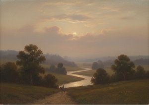 Atmospheric Visions: Exploring Tonalism in American Painting
Explore the captivating world of American Tonalism! Discover its history, key artists like Whistler & Inness, techniques, and lasting influence on art. Expert insights for collectors & enthusiasts.
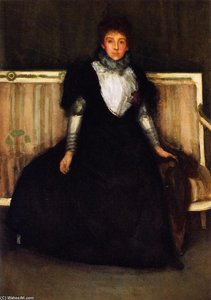
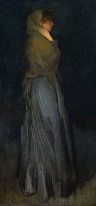
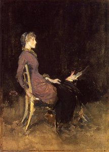
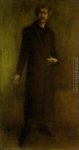
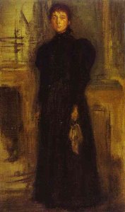
The roots of our fascination with subdued color lie deep within 19th-century American art, specifically in the movement known as Tonalism. Artists like George Inness and James McNeill Whistler sought to capture not merely what they saw, but how they felt. Rejecting the precise realism of earlier styles, they embraced atmospheric effects, using a limited range of grays, browns, blues, and greens to create evocative scenes shrouded in mist and shadow. Consider Whistler’s “Nocturne in Black and Gold,” a painting that famously sparked controversy for its departure from traditional representation but now stands as an iconic example of the style. This wasn't about replicating reality; it was about conveying mood—a sense of quiet contemplation, almost spiritual longing.
The influence of the French Barbizon school, with its emphasis on landscape and natural light, also played a crucial role. However, Tonalism developed a distinctly American character, often imbued with themes of nostalgia and the sublime. As artists grappled with the aftermath of the Civil War, these landscapes became spaces for reflection, offering solace and a sense of national identity forged through shared experience. The emphasis shifted from detailed depiction to capturing the *feeling* of a place—the weight of history, the stillness of nature, the ephemeral quality of light.
Color Psychology & Subdued Hues: Evoking Mood and Introspection
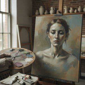 The Subdued Palette: Emotional Resonance & Aesthetic Impact of Muted Tones in Art
Explore the captivating world of muted tones in art! Discover Tonalism's history, Whistler’s influence & how subtle color palettes evoke emotion. Find serene landscapes and expert advice for integrating these timeless pieces into your home with Wahoo...
Why do muted colors resonate so deeply with us? The answer lies in the fascinating field of color psychology. While color associations can vary across cultures, certain principles remain consistent. Bright, saturated colors tend to be stimulating and energetic, grabbing our attention immediately. Muted colors, conversely, are calming and soothing. They allow the eye to rest, fostering a sense of peace and tranquility. This is because they require more processing by the brain—we aren’t bombarded with immediate visual information, allowing for deeper contemplation.
The subtle interplay of hues also influences our perception of space and emotion. Cool muted tones (blues, grays) often evoke feelings of serenity and introspection, while warmer muted tones (browns, ochres) can create a sense of comfort and nostalgia. As documented in studies on color therapy, these shades can even have physiological effects, lowering heart rate and reducing stress levels. The choice of palette isn’t merely aesthetic; it's a powerful tool for shaping the emotional landscape of an artwork or interior.
Mastering the Technique: Layering, Blending, and Achieving Depth in Neutral Colors
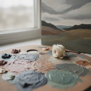
Creating a truly effective muted color scheme requires more than simply diluting bright colors. The key lies in understanding how to mix and layer hues to achieve depth and complexity. One common technique is to combine a color with its complementary color—for example, mixing red with green. This doesn’t necessarily result in brown; instead, it creates a nuanced grayed tone that feels richer and more sophisticated than simply adding white or black.
Glazing – applying thin, transparent layers of paint over dried underlayers – is another essential technique. This allows artists to build up subtle variations in color and value, creating an atmospheric effect that mimics the way light interacts with the environment. The use of scumbling—a dry-brush technique where paint is lightly dragged across the canvas—can also add texture and depth, further enhancing the sense of atmosphere. Artists often work from dark to light, building up layers of shadow and highlight to create a luminous quality.
Notable Artists & Exemplary Works: From Whistler to Rothko
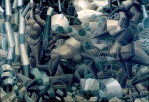 Nudes in the Forest
Explore Fernand Léger’s ‘Nudes in the Forest’! A revolutionary Cubist masterpiece showcasing Tubism & geometric forms. Discover a captivating work of art – perfect for collectors.
James McNeill Whistler’s “Arrangements in Grey and Black No. 1” (famously known as “Whistler's Mother”) exemplifies the Tonalist aesthetic, prioritizing tonal harmony over precise representation. Fernand Léger’s ‘Nudes in the Forest’, while distinctly Cubist, demonstrates a masterful use of geometric forms within a muted palette, creating a captivating interplay between figure and ground. Moving into the 20th century, Mark Rothko's color field paintings, though abstract, share a similar sensibility. Works like “No. 11” and “Untitled” utilize layers of subtly shifting colors to evoke profound emotional responses—a testament to the power of muted tones to transcend representation.
Jean-François Millet’s work, such as ‘Pauline Ono In Blue’, showcases a delicate use of color to convey emotion. These artists demonstrate that restraint can be just as powerful as exuberance, and that true mastery lies in understanding how to harness the subtle nuances of color to create lasting impact.
Integrating Muted Tones into Your Collection: Creating Serene Spaces with ArtsDot
The enduring appeal of muted tones makes them a perfect choice for creating serene and sophisticated interiors. Whether you’re drawn to the landscapes of the Tonalists or the abstract explorations of Rothko, incorporating these colors into your collection can transform your space into a haven of tranquility.
At ArtsDot, we offer a wide selection of reproductions featuring artists who have mastered the art of muted color. From classic oil paintings to high-quality prints, you’ll find pieces that perfectly complement your style and create the atmosphere you desire. Explore our collection today and discover the power of subtlety—a world where less is often more, and emotion speaks volumes.