Harmony in Blue = Orange: An Exploration of Geometric Abstraction
Paul Klee’s “Harmony in Blue = Orange” stands as a testament to the enduring power of abstract art—a deceptively simple composition brimming with intellectual depth and emotional resonance. Painted sometime between 1923 and 1930, this piece exemplifies Klee's signature style: geometric abstraction infused with elements of Expressionism and underpinned by his profound understanding of color theory. The artwork’s visual language prioritizes form over representation, inviting viewers to engage in a dialogue about perception and feeling rather than passively observing a depicted scene.
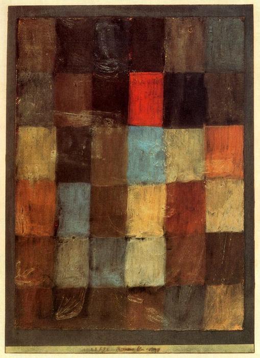
- Composition & Structure: The canvas is divided into numerous irregularly shaped blocks or panels—a deliberate fracturing that mirrors the fragmentation of experience itself. These geometric forms – predominantly squares and rectangles – are arranged with an asymmetrical balance, creating a dynamic tension that draws the eye across the surface.
- Color Palette & Texture: Dominated by earthy hues like browns, tans, and ochres, “Harmony in Blue = Orange” utilizes subtle variations in shade to generate depth and atmosphere. The textured surface—likely achieved through impasto—adds physicality to the image, emphasizing Klee’s tactile approach to painting.
- Technique: Oil paint on canvas is evident through visible brushstrokes, contributing to the artwork's textural richness. This technique allows for layering of pigments and manipulation of light, enhancing the overall visual impact.
The historical context surrounding Klee’s creation of “Harmony in Blue = Orange” is crucial to appreciating its significance. Produced during the Weimar Republic—a period marked by political instability and artistic experimentation—the painting reflects the broader trends of the Bauhaus movement and Surrealist influences. Bauhaus, championed by Walter Gropius, sought to unify art, craft, and technology, prioritizing functional design alongside aesthetic considerations. Klee’s exploration of geometric forms aligns perfectly with this ethos, demonstrating a commitment to rational organization while simultaneously embracing spontaneity and intuition.
Symbolism & Emotional Impact: While devoid of recognizable imagery, “Harmony in Blue = Orange” speaks powerfully to universal themes of balance and discordance. The interplay between blues and oranges—often associated with calmness and vibrancy respectively—suggests a negotiation between opposing forces. The fragmented geometry can be interpreted as representing the complexities of human consciousness, mirroring the artist’s own preoccupation with exploring psychological states through visual means. Ultimately, the painting invites contemplation on how order emerges from chaos and how beauty resides in unexpected combinations.
Further Exploration: To delve deeper into Paul Klee's artistic vision, consider visiting Zentrum Paul Klee in Bern, Switzerland—the world’s largest collection of his artwork—or exploring Kunstmuseum Bern for insights into his broader oeuvre. Alternatively, immerse yourself in the legacy of Frida Kahlo and her exploration of identity and emotion through vibrant color palettes and symbolic imagery.