A Burst of Action: Decoding Roy Lichtenstein’s “That my ship was below them…”
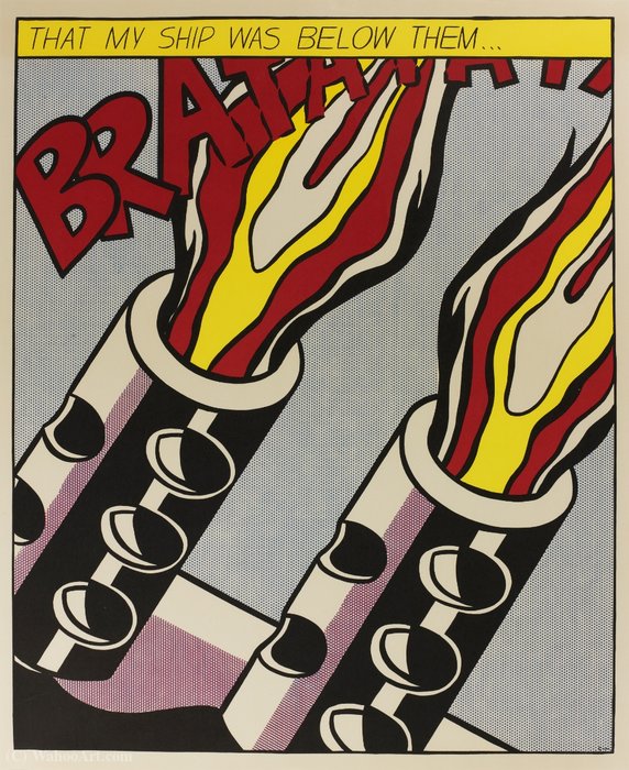
“That my ship was below them…” (1964), is a quintessential example of Roy Lichtenstein's groundbreaking Pop Art style, immediately recognizable for its bold graphic language and comic-book inspired aesthetic. This work isn’t merely a depiction of military action; it’s a powerful statement on conflict, power dynamics, and the very nature of representation itself.
Deconstructing the Visual Language
The artwork presents two imposing cannons unleashing fiery blasts against a light grey backdrop. Lichtenstein masterfully employs several key stylistic elements:
- Bold Outlines & Flat Color: The composition is defined by thick, black outlines and areas of flat, unmodulated color – hallmarks of Lichtenstein’s technique.
- Ben-Day Dots: The iconic Ben-Day dot pattern, simulating mechanical reproduction, creates texture and shading. This wasn't an attempt to *replicate* printing flaws; it was a deliberate artistic choice that commented on mass production and the visual language of comics.
- Comic Book Narrative: The dramatic composition, coupled with the speech bubble containing the titular phrase, directly references comic book panels. This elevates everyday imagery to the realm of fine art.
- Geometric Forms: Simplified geometric shapes – cylinders for the cannons and stylized flames – contribute to the artwork’s graphic impact and sense of immediacy.
Historical Context & Artistic Innovation
Roy Lichtenstein emerged as a leading figure in the Pop Art movement of the 1960s, challenging traditional notions of artistic subject matter and technique. Rejecting the emotional intensity of Abstract Expressionism, Pop Art embraced popular culture – advertising, comic books, and everyday objects – as its source material.
“That my ship was below them…”, created during a period of Cold War tension, reflects an engagement with themes of conflict and power, albeit filtered through the lens of mass media. Lichtenstein’s work wasn't about glorifying war; it was about examining *how* we perceive and consume images of violence.
Symbolism & Interpretation
The phrase “THAT MY SHIP WAS BELOW THEM…” is deliberately ambiguous, hinting at a moment of realization or defeat. The artwork’s symbolism extends beyond the literal depiction of cannons firing:
- Power and Destruction: The cannons represent raw power and the potential for destruction.
- Impersonal Warfare: The mechanical aesthetic – the Ben-Day dots, the flat colors – suggests a detachment from the human cost of conflict. It’s warfare as spectacle, devoid of emotional nuance.
- The Power of Narrative: The speech bubble emphasizes the importance of storytelling and how narratives shape our understanding of events.
Emotional Impact & Interior Design Considerations
Despite its seemingly detached aesthetic,
“That my ship was below them…”, evokes a sense of dramatic tension and impending chaos. The bold colors and graphic composition command attention, making it a striking focal point for any space.
- Modern & Contemporary Interiors: This artwork is ideally suited to modern and contemporary interiors, adding a touch of sophisticated edge.
- Statement Piece: Its large scale and impactful imagery make it an excellent statement piece for living rooms, offices, or galleries.
- Color Palette Integration: The artwork’s color palette – primarily red, yellow, black, and grey – can be echoed in surrounding furniture and décor to create a cohesive design scheme.
Owning a high-quality reproduction of this iconic work allows you to bring a piece of art history into your home or office, sparking conversation and inspiring contemplation. It’s a testament to Lichtenstein's enduring legacy as one of the most influential artists of the 20th century.