Foundations of Visual Order: Why Composition is Critical in Hospitality Design
 The Eloquence of Arrangement: Exploring Compositional Strategies in Western Art
Introduction: The Foundations of Visual Harmony Unlocking Beauty: A Beginner's Guide to Appreciating Art Unlock the beauty of art! Our expert guide for beginners explores artistic movements, visual language & interpretation. Develop your eye & deepen...
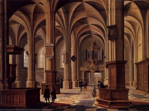
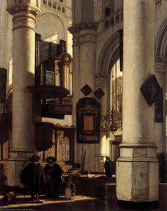
To gaze upon a masterpiece is to enter into a silent dialogue, a conversation structured not by words, but by the deliberate arrangement of form, light, and space. For the hospitality professional, understanding composition is akin to learning the grammar of a visual language. It serves as the invisible scaffolding that supports the emotional weight of a room, guiding a guest's eye from the initial moment of encounter through a carefully choreographed journey of discovery. In the high-stakes environment of hotel design, where every element must contribute to a cohesive brand identity, composition is never merely about where an object sits; it is about the tension between presence and absence, the balance of weight, and the rhythmic pulse of lines that direct our gaze. Whether you are furnishing a boutique suite or a grand lobby, mastering these foundational principles allows you to transform a mere collection of decor into a curated atmosphere of intentionality and luxury.
The Rule of Thirds: Establishing Focal Points in Portraiture and Suite Decor
 Mastering Composition: A Guide to the Rule of Thirds, Golden Ratio, and Diagonal Secrets in Art History
The Architecture of Vision: Understanding Compositional Foundations To gaze upon a masterpiece is to enter into a silent dialogue with the artist, a conversation structured not by words, but by the deliberate arrangement of form, light, and space. Fo...
One of the most accessible yet profound tools in an artist's repertoire is the
Rule of Thirds, a principle that avoids the static nature of perfect symmetry to create a more organic sense of equilibrium. By mentally dividing a canvas into a grid of nine equal rectangles, the artist identifies four key intersection points. In classical portraiture, such as the elegant works of Jean-François de Troy, placing the primary subject—perhaps the piercing gaze of a sitter or the delicate curve of a neck—along these lines or at their intersections prevents the composition from feeling stagnant. For the interior designer, this technique is invaluable when selecting artwork for intimate spaces like guest suites. Utilizing pieces that employ the Rule of Thirds provides a certain
breathing space that invites the viewer to contemplate the subject's depth, preventing the walls from feeling overcrowded and ensuring that each piece serves as a sophisticated focal point rather than a mere distraction.
The Golden Ratio: Engineering Mathematical Harmony in Large-Format Murals and Multi-Panel Installations
List of works designed with the golden ratioMany works of art are claimed to have been designed using the golden ratio. However, many of these claims are disputed, or refuted by measurement. The golden ratio, an irrational number, is approximately 1.618; it is often denoted by the Greek letter...
Beyond simple grids lies the
Golden Ratio, an irrational number approximately equal to 1.618, often denoted by the Greek letter $\phi$. This mathematical proportion has been sought after since antiquity, appearing in everything from Egyptian monuments to the meticulous Renaissance masterpieces of Piero della Francesca. The Golden Ratio provides a sense of divine proportion and natural beauty that is inherently pleasing to the human eye. In modern architectural applications, this principle can be engineered through the use of
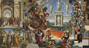
multi-panel sets and large-format installations. When designing for wide, expansive walls or grand staircases, selecting art that adheres to these mathematical harmonies—such as our 3, 4, or 5-panel split layouts—ensures that the artwork feels integrated into the very structure of the building. By utilizing the Golden Ratio in the arrangement of large-scale murals or ceiling frescoes, a designer can achieve a sense of intellectual order and serene humanism that resonates with guests on a subconscious level.
Dynamic Lines and Diagonals: Directing Eye Movement Through Corridors and Public Spaces
Lines are the optical phenomena that allow an artist to direct the eye of the viewer, creating a visual path that enables movement within a piece. While literal lines, such as architectural moldings or furniture edges, define a space, the
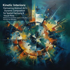
diagonal lines found within fine art can create a sense of energy and motion. In the context of hotel corridors and public transition zones, diagonals serve as powerful tools for wayfinding and engagement. A painting featuring strong diagonal compositions can lead the eye through a long hallway, creating an illusion of depth and preventing the sensation of a tunnel-like enclosure. These lines can derive from the borders of contrasting colors or the sequence of discrete elements within a landscape, acting as a silent guide that pulls the guest forward into the next experience, turning a simple walk to a room into a dynamic exploration of art and architecture.
Scale and Balance: Integrating Compositional Principles into Architectural Planning
Design principlesDesign principles are fundamental guidelines or concepts in the visual arts used to help viewers understand a given scene. == Principles == Generally, design principles guide the viewer's attention by manipulating various aspects of a visual idea. Th...
The final pillar of masterful composition lies in the interplay of
scale and
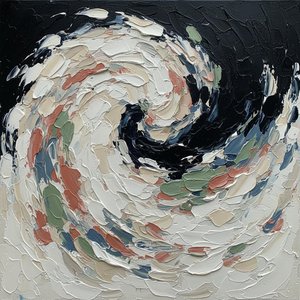
balance. Scale describes the relative size of elements within a design; by using scale to make an element larger than others, a designer can emphasize a specific feature or create a profound sense of depth. In a large lobby, a massive, high-impact canvas can anchor the room, while smaller, balanced pieces provide rhythm in secondary seating areas. This must be paired with an understanding of
negative space—the empty area around a shape. Just as much as the positive subject matters, the "white space" around an artwork is essential to bring balance and prevent visual fatigue. A well-balanced design, where weight is distributed evenly across the visual field, tends to appear calm and stable, whereas intentional imbalance can be used sparingly to create drama or intrigue. For the procurement professional, selecting art that respects these principles of scale and balance ensures that every acquisition contributes to a stable, luxurious, and professionally curated environment.