


The Psychology of Space: Defining Your Interior's Emotional Intent
 Harmony or Contrast? How to Choose the Perfect Impressionist Painting for Your Home's Mood
The Soul of the Room: Understanding the Emotional Resonance of Impressionism Capturing the Soul: The Most Emotionally Moving Impressionist and Post-Impressionist Masterpieces The Luminous Revolution: How Impressionism Redefined the Art of Seeing Impr...
To enter a well-curated room is to step into a silent dialogue, a conversation between the architecture of the walls and the soul of the inhabitant. Before a single brushstroke is considered for a canvas, one must first understand the emotional intent of the space itself. Is the room a sanctuary, designed for the quietude of reflection and the shedding of the modern world's frantic pace? Or is it a salon, intended to provoke thought, stimulate intellect, and serve as a vibrant stage for social engagement? The selection of art is never merely an act of decoration; it is an act of emotional curation. When we choose a piece, we are deciding which pulse our living space will follow. For the discerning enthusiast, the room serves as a vessel, and the artwork acts as its heartbeat, dictating whether the atmosphere remains in a state of tranquil repose or vibrates with the kinetic energy of life.
Understanding this psychological foundation requires us to look beyond the frame. A room filled with soft, diffused light and muted tones naturally invites a sense of introspection. In such spaces, the art should act as an extension of this stillness. Conversely, a space designed for grandeur and impact demands works that command attention through scale and complexity. By defining the emotional resonance you wish to achieve—be it peace, awe, or intellectual stimulation—you establish the parameters for your artistic journey, ensuring that every masterpiece brought into your home serves a profound purpose.
The Art of Harmony: Achieving Serenity through Analogous Palettes and Impressionist Light
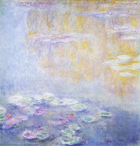
 The Water Lily Pond, Pink Harmony
Captivating Subject and Enchanting Atmosphere This exquisite impressionist masterpiece transports viewers to a tranquil water lily pond, where nature’s delicate beauty is captured in a harmonious balance of light and color. The scene centers around a...
There is a profound, almost spiritual peace to be found in the pursuit of visual harmony. In the realm of color theory, harmony is achieved when elements exist in a state of consonance, where colors and forms blend into a seamless, luminous embrace. This is most exquisitely realized through the use of analogous palettes—colors that reside side-by-side on the color wheel, such as the soft greens, blues, and violets found in Claude Monet’s iconic water lily series. In works like The Water Lily Pond, Pink Harmony, we witness a masterclass in atmospheric balance. The delicate interplay of light and color creates a world where the boundaries between water, foliage, and sky dissolve into a singular, tranquil vision.
To bring this sense of serenity into your own interior, one looks toward the Impressionist tradition, which revolutionized the art of seeing by prioritizing the ephemeral dance of light over rigid form. When an Impressionist landscape is placed within a room, it invites the viewer to abandon the shadowed certaincertainties of the modern world and embrace a reality that breathes. The use of pastel tones—colors with high value and low saturation—can further enhance this effect, offering a soothing, nostalgic quality that anchors the room in simplicity. By selecting works that utilize soft transitions and a unified color temperature, you create an environment where the eye can wander without tension, finding rest in the gentle rhythm of nature’s fleeting moments.
The Power of Contrast: Creating Visual Tension with Chiaroscuro and Complementary Tones
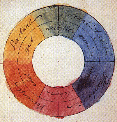 Color theory
Color theory, or more specifically traditional color theory, is a historical body of knowledge describing the behavior of colors — namely in color mixing, color contrast effects, color harmony, color schemes and color symbolism. Color theory and colo...
While harmony offers rest, contrast offers life. Contrast is the engine of visual interest, providing the necessary tension that prevents a space from becoming stagnant or overly saccharine. This can be achieved through two primary methods: color and light. In terms of color, the use of complementary colors—those positioned directly opposite each other on the wheel, such as deep blues against warm oranges—creates a vibrant, pulsing energy. This technique introduces a rhythmic vitality that can transform a quiet corner into a focal point of immense character.
Beyond color, the most dramatic form of contrast is found in the mastery of light and shadow, known historically as chiaroscuro. Consider the architectural brilliance of Pieter Neefs the Elder, whose Flemish ecclesiastical interiors utilize dual light sources to create a sense of profound mystery and reverence. By allowing light to emanate from an unseen window while plunging other corners into deep, velvety shadows, such works imbue a room with a palpable atmosphere of drama and depth. This interplay of extreme light and dark does more than just illuminate a scene; it directs the viewer's gaze, creates structural weight, and introduces a sense of the divine or the monumental. For those seeking to invigorate their interiors, a high-contrast masterpiece serves as a powerful counterpoint to minimalist architecture, injecting a soul of complexity and movement.
Curating the Atmosphere: Matching Masterpiece Genres to Architectural Styles
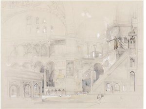 Interior of Hagia Sophia, Constantinople
Subject and Composition This captivating architectural drawing offers a detailed glimpse into the majestic interior of the Hagia Sophia, one of the most iconic symbols of Byzantine architecture and religious history. The sketch captures the grandeur ...
The relationship between art and architecture is one of mutual reinforcement. A sophisticated interior designer understands that the genre of a painting must respect, yet ideally elevate, the structural language of the room. In spaces characterized by classical grandeur—featuring soaring arches, ornate columns, or heavy moldings—works that echo architectural permanence are most effective. The detailed, academic precision found in drawings of the Hagia Sophia or the meticulous religious interiors of the 19th-century Flemish masters can reinforce a sense of history and structural integrity. These pieces act as anchors, grounding the room in a lineage of human achievement.
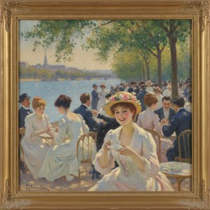
In contrast, modern or contemporary spaces with clean lines and open floor plans often benefit from the "softening" effect of Impressionist or Post-Impressionist works. A painting by Renoir, celebrating the sun-dappled joy of Parisian life, can break the rigidity of a minimalist room, introducing organic textures and a sense of human connection. Even more daring is the use of large-format murals or multi-panel "group set" paintings, which can transform a wide wall or a grand staircase into a cohesive architectural feature. The goal is to find a stylistic synergy where the art does not merely sit upon the wall but becomes an integral part of the room's very anatomy.
Beyond Decoration: Integrating Historical Narratives into Modern Living
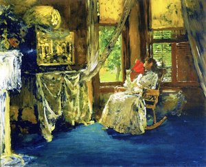
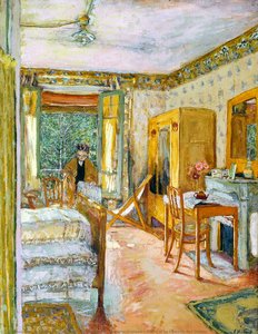 Sunlit Interior: Madame Vuillard's Room at La Closerie des Genêts
A Glimpse into Intimate Domesticity: Vuillard’s Sunlit Interior Jean-Édouard Vuillard's *Sunlit Interior: Madame Vuillard's Room at La Closerie des Genêts* (1921) offers a captivating window into the private world of a woman within her personal space...
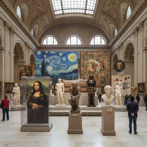
To live among masterpieces is to inhabit a living museum, where every canvas serves as a window into a different era. The true connoisseur understands that art is a silent conversation with history. When you hang a reproduction of a 17th-century masterpiece, you are not just displaying a beautiful image; you are inviting the spirit of the Baroque or the Renaissance into your daily life. This integration allows for a "period shift" within the modern home, where the comforts of contemporary technology meet the profound aesthetic values of the past.
This narrative depth can be personalized through the art of the "remix." At ArtsDot.com, we believe that history is not static. Our artists possess the skill to transform personal milestones into historical triumphs—for instance, reimagining a modern wedding portrait in the luminous, light-drenched style of Monet, or even transforming a contemporary figure into a subject of a Rembrandt-esque portrait. This allows the inhabitant to weave their own biography into the grand tapestry of art history, creating a home that is both deeply personal and culturally significant.
A Collector's Toolkit: Expert Strategies for Selecting and Commissioning Timeless Art
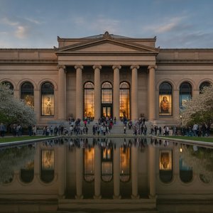
 The Barnes Foundation
A Sanctuary of Vision: The Soul of The Barnes Foundation To step into The Barnes Foundation is to enter a space where the boundaries between art, life, and education dissolve into a singular, transformative experience. Located in the heart of Philade...
Selecting the perfect artwork requires a blend of intuition and technical knowledge. For those beginning their collection, we recommend starting with color analysis. Determine if your room thrives on the soothing nature of analogous tones or the energetic tension of complements. If you find yourself uncertain, our expert art consultants are available to provide personalized proposals, even utilizing digital mockups to show how a specific composition will interact with your unique wall space.
When moving beyond prints toward true investment-grade pieces, consider the tactile superiority of handmade oil reproductions. Unlike flat, computer-printed posters, a hand-painted work on 100% cotton canvas offers visible brushstrokes and a deeper tonal range that captures the true essence of the original. Each piece is a labor of passion, meticulously layered by artists trained in prestigious academies, ensuring that the impasto textures and light reflections are authentic to the movement being represented. Whether you are seeking a single focal point or a multi-panel arrangement to span a grand hall, the key to a successful collection lies in the quality of the craftsmanship and the intentionality of the choice. By prioritizing works that offer both historical depth and physical texture, you ensure that your interior remains not just a place of residence, but a sanctuary of enduring beauty.