
The Chromatic Foundation: Understanding Color Psychology in Environmental Design
 Color psychology
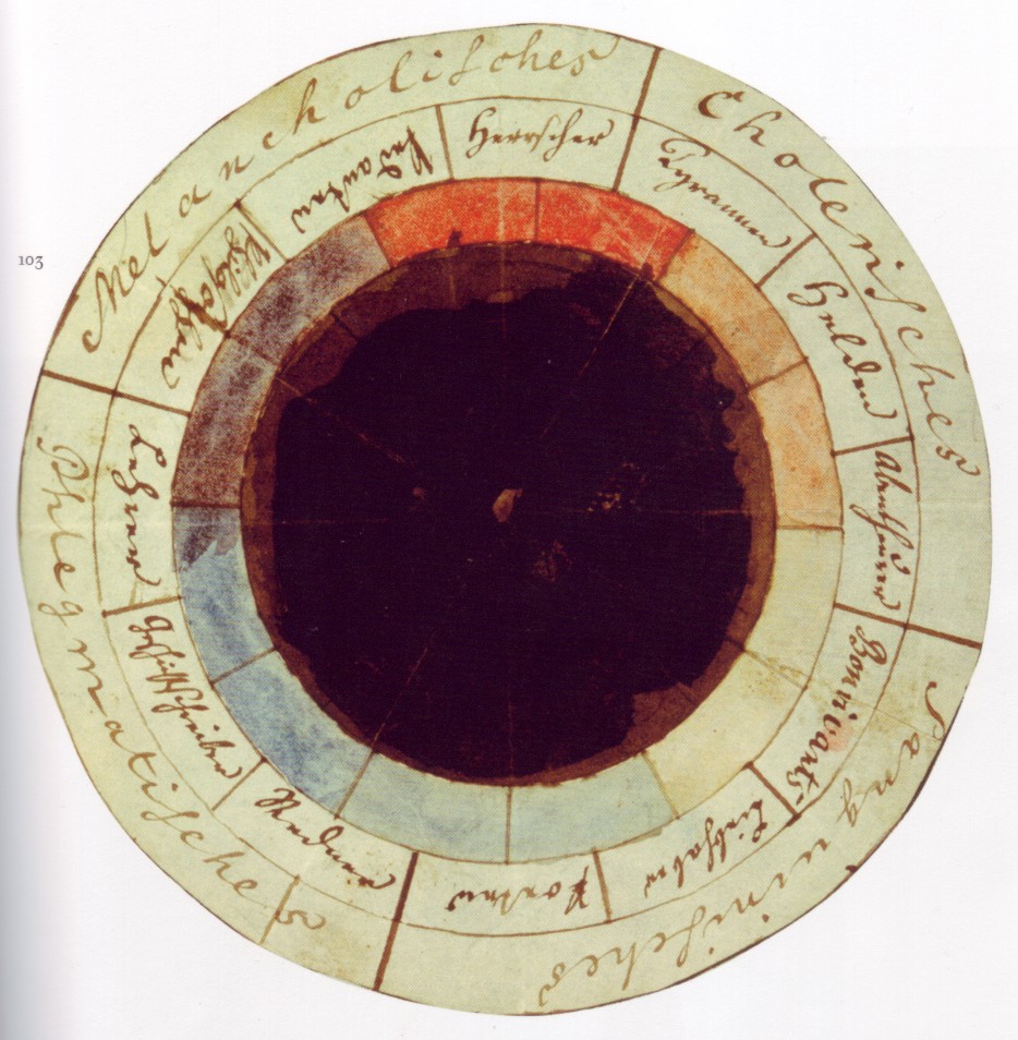
Color psychology is the study of colors and hues as a determinant of human behavior. Color influences perceptions that are not obvious, such as the taste of food. Colors have qualities that may cause certain emotions in people. How color influences i...
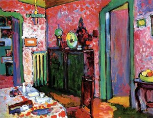
To design a space is to compose a silent symphony, where every hue acts as a note capable of altering the very heartbeat of its inhabitants. In the realm of high-end hospitality, color psychology transcends mere decoration; it becomes a fundamental tool of environmental psychology. As we explore the relationship between an environment and human behavior, we find that colors possess intrinsic qualities that influence perceptions far beyond the visible spectrum. A well-placed shade can alter the perceived temperature of a room or even the subtle taste of a curated menu. This profound connection suggests that color is not merely an aesthetic choice but a determinant of human experience.
The study of these chromatic influences traces back through history, from the ancient Egyptian use of sunlight and colored crystals for therapeutic purposes to the scientific inquiries of Johann Wolfgang von Goethe. In his seminal Theory of Colors, Goethe explored the psychological nature of hue, describing yellow as a source of serenity and blue as a complex intersection of excitement and repose. For the modern hotel designer, understanding these nuances is essential for maximizing the well-being of guests. By manipulating color, one can control the atmosphere, guiding the guest from the high-energy stimulation required in a grand lobby to the profound stillness necessary within a private suite.
Impressionist Light: How Atmospheric Palettes Evoke Emotional Resonance
 10 Iconic Impressionist Landscapes That Changed Art Forever
Introduction To step into the world of Impressionist landscapes is to abandon the rigid boundaries of reality and embrace the fleeting dance of light and atmosphere. Imagine standing on the banks of the Seine or amidst a sun-drenched meadow in Givern...
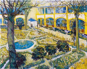
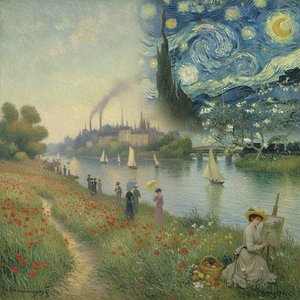
To step into the world of an Impressionist landscape is to abandon the rigid boundaries of reality and embrace the fleeting dance of light. The Impressionists—visionaries such as Monet, Renoir, and Pissarro—revolutionized our perception by moving away from the somber, academic shadows of the past. They sought to capture the impression: that ephemeral, breathless moment before the light shifts and the shadows lengthen. Their technique, characterized by a vibrant, broken palette and energetic brushstrokes, allows a space to breathe with the movement of the natural world.
In an interior setting, integrating the luminous palettes of Impressionism can introduce a sense of vitality and freshness. Imagine a lounge bathed in the soft, violet haze of a setting sun or the shimmering warmth of a summer afternoon in Glimmering Giverny. These works do not merely document a scene; they invite the viewer to linger within a sensory experience. By utilizing the light-drenched techniques of these masters, a designer can create spaces that feel expansive and alive, mirroring the way light breathes upon a canvas to evoke a sense of wonder in the everyday.
The Architecture of Calm: Using Muted Tones and Post-Impressionist Depth for Restorative Spaces
 Interior with Palette
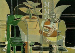
A Contemplative Interior: Unveiling Braque’s ‘Interior with Palette’ Georges Braque's *Interior with Palette*, painted in 1942, offers a compelling glimpse into the artist’s mature style – a refined and introspective phase following his pivotal role ...
While Impressionism celebrates the fleeting moment, Post-Impressionism offers a more structured, introspective meditation on space. For designers tasked with creating restorative, quiet sanctuaries, the works of Georges Braque or Paul Gauguin provide an invaluable blueprint. In his 1942 masterpiece, Interior with Palette, Braque utilizes a muted palette of greens and browns to construct a contemplative atmosphere. His use of geometric simplification and solid forms creates a sense of stability and groundedness, essential for spaces intended for reflection and rest.
Similarly, Gauguin’s exploration of earthy tones—ochre, umber, and terracotta—demonstrates how a heavy, tactile application of paint can ground a room in tangible reality. These deeper, more somber palettes do not weigh a space down; rather, they provide an emotional anchor. When designing private suites or library lounges, the use of such Post-Impressionist depth allows for a sense of intimacy and soulfulness. It is a departure from the superficial, offering instead a window into the human experience through layers of texture and color that suggest permanence and peace.
Bold Contrasts and Visual Energy: Lessons from Cubism and Fauvism for High-Impact Interiors
 Complementary colors
Complementary colors are pairs of colors which, when combined or mixed, cancel each other out (lose chroma) by producing a grayscale color like white or black. When two highly chromatic complementary colors are placed next to each other, they create ...
For the more avant-garde architectural project, one might look toward the radical fragmentation of Cubism or the audacious, uninhibited palettes of the Fauves. These movements represent a rebellion against convention, utilizing color as a tool of pure emotion rather than naturalistic representation. The use of complementary colors—those pairs like red and cyan that create a striking visual tension when placed side-by-side—can be utilized to inject energy into high-traffic areas such as bars, restaurants, or social hubs.
The structural lessons of Cubism, particularly the way artists like Braque used angular lines to emphasize form over naturalism, can inform the way art interacts with modern architectural geometry. By introducing works that utilize bold, non-naturalistic hues, a designer can create focal points that command attention and stimulate conversation. This approach transforms a wall from a mere boundary into a dynamic participant in the room's energy, challenging the guest to engage with the space on a more visceral, intellectual level.
Curating the Masterpiece: Integrating Historical Artworks into Modern Hospitality Design
 Henry Ford Hospital
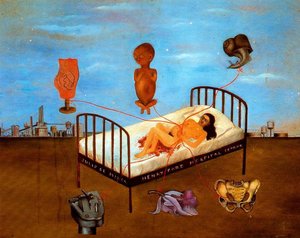
Explore Frida Kahlo’s ‘Henry Ford Hospital,’ a surrealist masterpiece of pain & resilience. Discover its symbolism, vibrant colors, & raw emotion – a unique art piece.
The ultimate achievement in luxury design is the seamless integration of historical gravity with modern sophistication. Curating an art collection for a hotel is not merely about filling voids on a wall; it is about storytelling. Whether through large-format murals that recreate the grandeur of a Renaissance ceiling or bespoke, multi-panel oil reproductions that span a wide staircase, the art must serve as the soul of the architecture. At ArtsDot.com, we specialize in this very intersection of history and design.
Our studio offers more than mere copies; we offer the ability to "remix" art history for the contemporary professional. We provide hand-painted oil reproductions on 100% cotton canvas, ensuring that the visible brushstrokes and deep tonal ranges of the masters are preserved. For the discerning hotel designer, we offer a bespoke service: from custom sizing and multi-panel layouts to "Period Shifts," where personal or brand imagery can be reimagined in the style of Rembrandt or Van Gogh. Through our Professional Digital Mockup Service, designers can visualize these masterpieces on their specific walls before the first stroke of oil touches the canvas, ensuring that every chromatic choice serves the ultimate goal: creating an unforgettable, atmospheric experience for every guest.