


Introduction
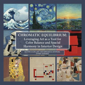
To step into a gallery is to enter a silent conversation with the masters, where light and pigment perform a delicate dance across the canvas. While some works command attention through sheer, overwhelming vibrance, there exists a more profound category of mastery: those rare masterpieces defined by balanced color intensity . In these works, brilliance does not shout; it breathes. It is a sophisticated equilibrium where deep, resonant shadows meet luminous highlights, creating a visual harmony that feels both intentional and eternal.
Throughout history, the pursuit of this chromatic balance has been the hallmark of the world's most revered creators. From the soft, atmospheric transitions of the Impressionists to the dramatic, light-drenched chiaroscuro of the Baroque era, artists have long understood that true emotional depth is found in the tension between color and restraint. These works were born from a period of immense cultural evolution—a time when new pigments were being discovered and techniques like impasto allowed for a tactile dimension to color that could capture the very essence of light itself.
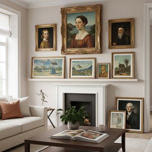
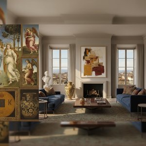
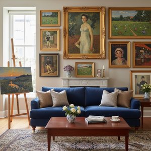
Today, these paintings remain profoundly meaningful, serving as anchors in our increasingly frenetic visual landscape. In an age of digital saturation, the balanced intensity of a hand-painted oil work offers a sanctuary of focus. They do not merely decorate a room; they curate an atmosphere, providing a sense of permanence and sophisticated grace that resonates within the modern home or luxury hospitality space.
As we embark on this curated journey, we invite you to look beyond the surface. We have selected ten extraordinary works that exemplify this perfect equilibrium—pieces where every hue is placed with surgical precision and every shade serves a greater narrative purpose. Prepare to encounter a collection where color is not just seen, but felt.
Mona Lisa (La Gioconda) - Leonardo da Vinci
 Mona Lisa (La Gioconda) - Leonardo da Vinci
In the Mona Lisa , Leonardo da Vinci achieves a sublime equilibrium of light and shadow that defines the very essence of balanced color intensity. The brilliance of this masterpiece lies not in vibrant pigments, but in his revolutionary sfumato technique—a delicate, smoky transition where light seems to breathe through layers of translucent glaze. By eschewing harsh outlines, Da Vinci allows a soft, diffused illumination to dance across Lisa Gherardini’s features, creating a chiaroscuro effect that feels organic rather than staged.
This masterful command of atmospheric perspective ensures that the muted, earthy tones of the sitter harmonize perfectly with the hazy, blue-tinted mountains in the distance. The result is a painting where light does not merely strike a surface but emerges from within it. For the discerning collector, possessing a high-quality oil reproduction of this work brings a profound sense of depth and quiet luxury to a contemporary space. The subtle gradations of tone and the interplay of shadow offer a sophisticated focal point, adding an unmistakable layer of historical prestige and emotional resonance to any curated interior.
Starry Night (New York, MoMA) - vincent willem van gogh
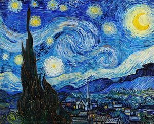 Starry Night (New York, MoMA) - vincent willem van gogh
To gaze upon the swirling heavens of Starry Night (New York, MoMA) by Vincent van Gogh is to witness a profound equilibrium between cosmic turbulence and visual harmony. Painted in 1889 amidst the artist's stay at Saint-Paul-de-Mausole, this masterpiece earns its place among the top artworks celebrated for their balanced color intensity through a masterful tension of opposites. Van Gogh utilizes a deep, nocturnal palette of ultramarine and cobalt, yet these heavy tones are perfectly tempered by the radiant, pulsating yellows of the crescent moon and celestial stars.
The tactile energy of his signature impasto technique creates a rhythmic movement that guides the eye across the canvas, where thick, expressive brushstrokes transform light into a physical presence. The dark, vertical silhouette of the cypress tree acts as a grounding anchor against the ethereal sky, preventing the vibrant luminosity from overwhelming the composition. This delicate balance of high-contrast pigments and structural depth ensures that the painting evokes both awe and serenity, offering a timeless emotional resonance that continues to transform modern interiors into spaces of deep contemplation.
The Disintegration of Persistence of Memory, 1952-54 - Salvador Dalí
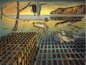 The Disintegration of Persistence of Memory, 1952-54 - Salvador Dalí
In The Disintegration of the Persistence of Memory , Salvador Dalí offers more than a mere sequel to his most famous motif; he presents a profound deconstruction of reality itself. This mid-century masterpiece serves as a visual meditation on the fragility of existence, capturing the era's fascination with atomic decay and the fragmentation of the subconscious. It earns its place in our selection for its extraordinary balanced color intensity , where a somber, earthy palette of ochres, deep browns, and muted yellows creates a stabilized tension against the ethereal, pale blues of the distant horizon.
Dalí’s technical brilliance lies in his ability to balance these desaturated tones with sharp, photographic precision, ensuring that even as forms dissolve into geometric fragments, the visual impact remains grounded and impactful. For the discerning collector or interior designer, this work offers a sophisticated dialogue between chaos and order. Integrating such a piece into a curated space invites a timeless reflection on the nature of time and perception, providing a soulful anchor that bridges the gap between historical Surrealism and modern architectural elegance.
The Scream - Edvard Munch
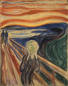 The Scream - Edvard Munch
In The Scream by Edvard Munch, the concept of balance is paradoxically achieved through profound instability. The composition is anchored by a sharp, diagonal recession of the bridge, which provides a structural spine against the chaotic, swirling energy of the sky. This geometric tension creates a mesmerizing equilibrium; while the subject embodies existential dread, the interplay between the heavy, dark foreground and the luminous, fiery horizon achieves a rhythmic harmony that is visually arresting.
The artwork’s celebrated color intensity relies on this precise calibration. The searing oranges and blood-reds of the sunset are perfectly tempered by the deep, melancholic blues and murky greens of the fjord. This masterful use of complementary tones prevents the emotional intensity from becoming overwhelming, instead creating a controlled vortex of color. For the discerning collector, this balance offers a striking parallel to modern minimalist design; the painting’s ability to ground a room with its bold, saturated palette while maintaining a sophisticated, structured flow makes it an unparalleled statement piece for contemporary, high-end interiors.
The Birth Of Venus - Sandro Botticelli
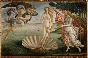 The Birth Of Venus - Sandro Botticelli
In the ethereal stillness of Sandro Botticelli’s The Birth of Venus , time seems to suspend itself, capturing a moment of divine arrival that has enchanted the soul for centuries. This masterpiece earns its place among the top ten artworks celebrated for their balanced color intensity through a masterful equilibrium of soft, luminous tones and rhythmic vitality. Botticelli avoids the overwhelming weight of heavy pigments, opting instead for a palette of pale flesh tones, translucent seafoam greens, and delicate azure that whispers rather than shouts.
The visual harmony is achieved through an elegant linearity; the cool, tranquil blues of the Mediterranean provide a serene backdrop that allows the warm, golden highlights of Venus’s hair and the soft pinks of the falling roses to emerge with breathtaking clarity. This precise calibration of color intensity creates a sense of weightless grace, making the work a cornerstone of Renaissance beauty. In a contemporary interior, such a balanced composition serves as a sophisticated anchor, offering a sense of classical calm and an infusion of light-drenched elegance that transcends the fleeting nature of modern trends.
Olympia - Édouard Manet
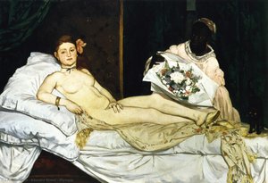 Olympia - Édouard Manet
To stand before a masterpiece that once scandalized the Paris Salon is to witness the very moment modern art found its voice. In Olympia by Édouard Manet, we encounter a profound equilibrium of visual tension and chromatic restraint. This work earns its place among the top artworks celebrated for their balanced color intensity through its masterful use of stark, high-contrast tones that refuse to overwhelm the eye despite their boldness.
Manet eschews the muddy shadows of the academy, instead employing a palette where luminous, pale flesh tones collide with deep, velvety blacks and the vibrant, fleeting hues of a floral bouquet. The brushwork is decisive—visible and textured—creating a surface that feels both flat and strikingly tactile. There is no excessive chiaroscuro here; rather, a controlled distribution of light defines the reclining figure, anchoring the composition in a state of permanent, modern realism. This balance of intense highlights and saturated darks creates a rhythmic visual pulse that remains as arresting today as it was in 1863. Bringing such a piece into a contemporary collection does more than decorate a wall; it introduces a legacy of fearless authenticity and sophisticated tonal harmony to your space.
American Gothic - Grant Wood
 American Gothic - Grant Wood
There is a gaze in American Gothic by Grant Wood that follows you—not with judgment, but with understanding . This 1930 masterpiece does not merely present a scene of rural resilience; it acts as a mirror to the soul of a nation. Its inclusion in our selection of artworks celebrated for their balanced color intensity is no coincidence. Wood masterfully employs a palette of muted earth tones—somber browns, deep greens, and weathered grays—to create a visual equilibrium that feels both grounded and profound.
The intensity of the work lies in its restraint. The sharp, geometric precision of the pitchfork and the Carpenter Gothic window provides a structural strength that balances the soft, diffused light falling upon the figures' stoic faces. Now, imagine that steady, unwavering gaze in your own space. It does not watch you; rather, it reminds you that you are seen, anchoring your room with a sense of quiet dignity and timeless permanence.
Number 1, 1949 - Paul Jackson Pollock
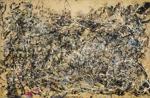 Number 1, 1949 - Paul Jackson Pollock
In Number 1, 1949 , Jackson Pollock achieves a breathtaking equilibrium that defines the very essence of balanced color intensity. While the surface appears as a chaotic arena of action painting, there is a profound, rhythmic stability found within its web of splatters. The work avoids overwhelming the viewer through a masterful orchestration of tones; the deep blacks, earthy ochres, and muted whites are punctuated by subtle, delicate hints of reddish-pink that prevent the composition from collapsing into darkness.
As a cornerstone of our selection, this masterpiece demonstrates how high-contrast energy can coexist with visual serenity. For the modern interior designer or collector, Pollock’s ability to balance raw, gestural movement with a sophisticated palette offers unparalleled inspiration. It serves as a powerful focal point in contemporary spaces, where its intricate layers of texture and controlled chromatic tension bring a sense of dynamic sophistication and intellectual depth to any curated environment.
A Sunday Afternoon on the Island of La Grande Jatte - Georges Seurat
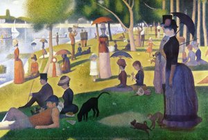 A Sunday Afternoon on the Island of La Grande Jatte - Georges Seurat
In A Sunday Afternoon on the Island of La Grande Jatte , Georges Seurat achieves a sublime equilibrium that defines the very essence of balanced color intensity. As you stand before this monumental work, your eyes do not encounter heavy, overwhelming pigments, but rather a luminous dance of tiny, distinct dots of pure color. This revolutionary Pointillist technique allows soft greens, tranquil blues, and warm oranges to optically merge, creating a shimmering atmosphere that feels both vibrant and profoundly still.
There is a psychological depth found in the stillness of the figures; their detached, quiet gazes invite us into a moment of eternal leisure, acting as a universal mirror for our own desires for peace. The painting does not demand attention through aggression, but captures it through a sophisticated harmony of light and shadow. For the discerning collector, introducing this masterpiece into a private sanctuary transforms the room into a space for profound reflection. It provides an anchor of serenity, where the carefully balanced chromatic vibrations foster an environment of calm contemplation and timeless elegance.
Adoration of the Trinity (Landauer Altar) - Albrecht Dürer
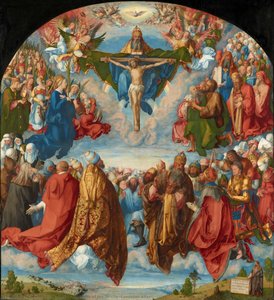 Adoration of the Trinity (Landauer Altar) - Albrecht Dürer
In Albrecht Dürer’s Adoration of the Trinity , color does not shout; it breathes. As a cornerstone of our selection for artworks celebrated for their balanced color intensity , this monumental piece avoids the overwhelming saturation often found in late Gothic works, opting instead for a sophisticated equilibrium. The palette is a masterclass in restraint, where the luminous, ethereal light of the divine meets the grounded, earthy tones of Nuremberg’s populace.
There is a gaze in this masterpiece that follows you—not with judgment, but with understanding . As you trace the gold-trimmed robes and the soft, atmospheric clouds, you realize this isn't merely a religious depiction; it is a mirror . The way Dürer balances the regal brilliance of saints against the muted, naturalistic hues of peasants creates a visual harmony that feels both celestial and deeply human. Now, imagine that balanced glow in your own space. Not watching you, but reminding you : you are seen. You are part of this eternal, beautifully composed story.
Conclusion
As the light fades on our exploration of these balanced masterpieces, we are reminded that art is never truly a relic of the past; it is a living, breathing dialogue that continues to shape the very atmosphere of our modern lives. These ten works do more than merely showcase technical mastery over pigment and light—they offer a sanctuary of equilibrium in an often chaotic world. When we invite such balanced color intensity into our homes, we are not simply hanging a decoration; we are welcoming a profound emotional resonance that anchors a room, settles the spirit, and invites a moment of quiet contemplation amidst the rush of the everyday.
Whether it is the gentle interplay of shadows in a Dutch interior or the soft, rhythmic hues of an Impressionist landscape, these paintings serve as eternal echoes of human emotion, bridging the centuries to touch our contemporary souls. They remind us that beauty, at its most potent, lies in harmony—in that precise, delicate tension where color and composition meet to create something much greater than the sum of their parts. It is this enduring legacy of grace and stability that allows these works to transform a house into a curated sanctuary, turning walls into windows through which we view the timelessness of human creativity.
We invite you to continue this journey of discovery and find the perfect equilibrium for your own space by exploring our full collection . May you find a piece that speaks to your heart, bringing the enduring strength and sophisticated serenity of the Old Masters into the intimate narrative of your life.