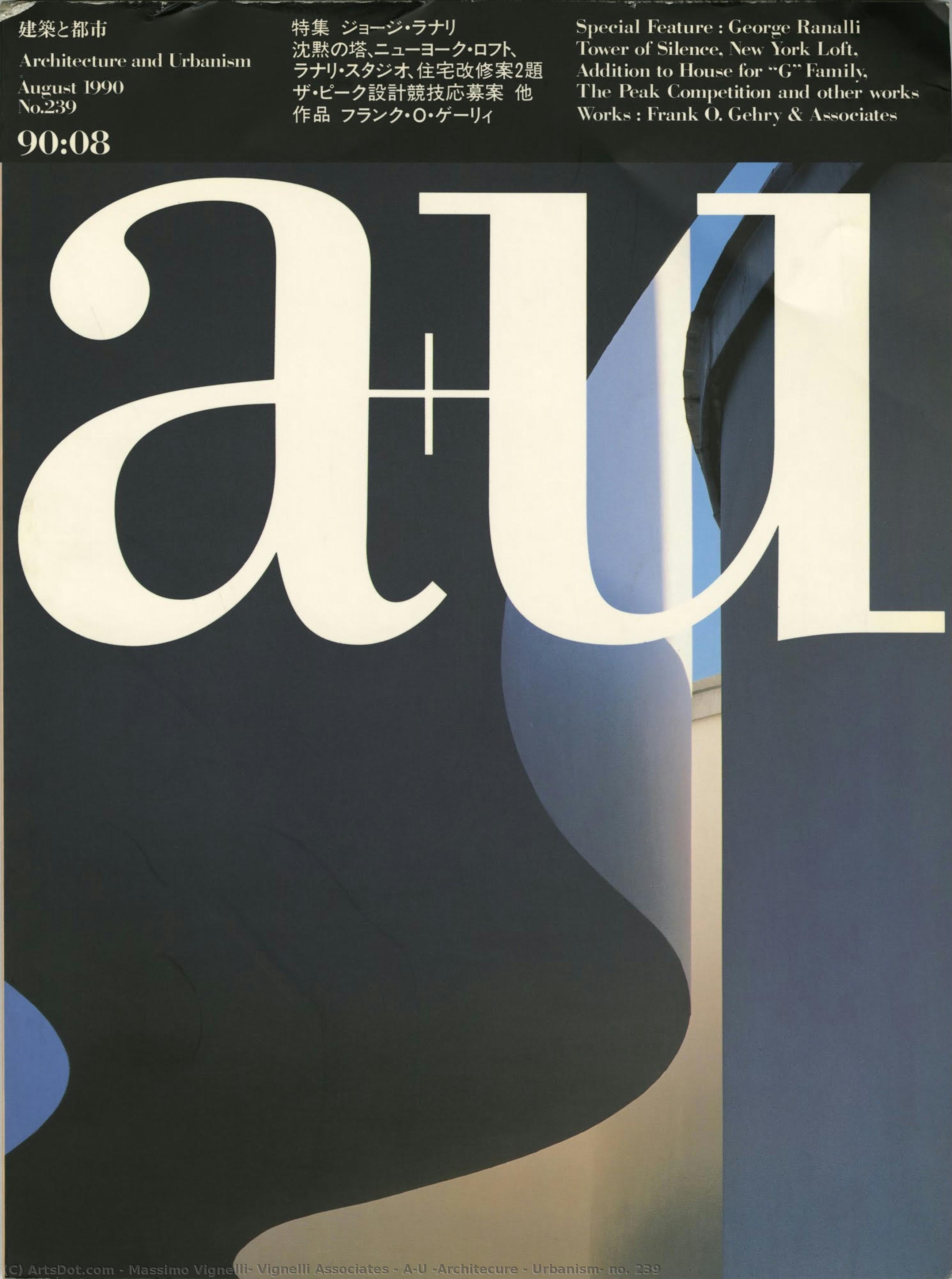
Massimo Vignelli: A Pioneer of Minimalist Graphic Design
Massimo Vignelli (1931–2014), an Italian designer whose legacy extends far beyond the realm of typography, stands as a monumental figure in the history of modernist design. Born in Milan, he embarked on a career dedicated to upholding the core tenets of simplicity and functionality—principles instilled in him during his formative years at the Politecnico di Milano and honed through an apprenticeship with the Castiglioni brothers, masters of Italian industrial aesthetics. Vignelli’s unwavering belief that “words and images interact to create feelings, to expand our perception, and to enrich our knowledge” profoundly shaped his artistic vision and propelled him to redefine visual culture across continents. He wasn't merely crafting objects; he was sculpting experiences—streamlining interactions and elevating the mundane into something extraordinary.
- Early Influences: Vignelli’s initial exposure to design philosophy stemmed from his collaboration with Achille Castiglioni and Pier Giacomo Castiglioni, whose innovative approach to furniture and industrial design championed elegant solutions rooted in geometric forms.
- The NYC Subway Map: Arguably his most iconic achievement, the New York City subway map remains a testament to Vignelli’s mastery of visual communication. Rejecting conventional cartographic conventions, he opted for a bold, reductive aesthetic—a deliberate departure from prevailing trends—that prioritized clarity and ease of navigation above all else.
- Corporate Identity Design: Vignelli's work extended beyond public spaces; he meticulously crafted corporate identities for prominent brands like Knoll Design, embodying his commitment to understated elegance and conveying brand values with precision.
A Celebration of Geometric Simplicity
Vignelli’s artistic style is characterized by an uncompromising devotion to geometric abstraction—a stylistic hallmark that reflects the broader ethos of modernist design. He favored basic shapes—circles, squares, rectangles—as building blocks for his compositions, believing that “To design a book or a magazine means to control the emotions of the reader by manipulating the visual content…” This deliberate reduction in complexity wasn’t merely an aesthetic choice; it was a strategic decision aimed at maximizing impact and fostering contemplation. The resulting designs possess a remarkable serenity—a palpable sense of order and balance that transcends mere decoration.
- Color Palette: Vignelli predominantly utilized grayscale tones—varying shades of grey, white, and black—creating a visual atmosphere that evokes introspection and sophistication.
- Typography: He championed the use of legible sans-serif fonts—particularly Helvetica—selecting typefaces that prioritized clarity and readability without sacrificing stylistic distinction.
- Spatial Arrangement: Vignelli’s meticulous attention to spatial organization—the careful placement of elements within a design—contributed significantly to its overall impact, guiding the viewer's eye and reinforcing key messages.
A Legacy Enduring Through Time
Massimo Vignelli’s influence continues to resonate in contemporary graphic design and visual culture. His pioneering approach to typography and his unwavering commitment to minimalist aesthetics serve as inspiration for designers worldwide—a testament to the enduring power of simplicity and elegance. As he eloquently stated, “Designing a book or a magazine means to control the emotions of the reader by manipulating the visual content…” Vignelli’s legacy transcends stylistic trends; it embodies a fundamental belief in design's capacity to enrich human experience and elevate everyday life—a conviction that remains profoundly relevant in our visually saturated world. His work stands as an enduring reminder that beauty can be found in restraint, and that thoughtful consideration of form and function yields results that are both intellectually stimulating and emotionally rewarding.