

The Baroque Aesthetic: Defining Grandeur and Emotional Impact for Luxury Interiors
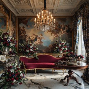
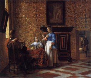
To step into a space defined by the Baroque is to enter a realm where the boundaries between reality and theater dissolve. For the modern hotel designer, the Baroque era offers more than mere decoration; it provides a profound psychological toolkit for creating unforgettable guest experiences. Emerging from the religious and political upheavals of the 17th century, particularly the Counter-Reformation, this movement was born from a desire to inspire awe and absolute devotion. Unlike the serene, balanced stability of the High Renaissance, the Baroque embraces the unexpected, the monumental, and the intensely emotional. It is an aesthetic of persuasion, designed to overwhelm the senses and command attention through sheer scale and visceral energy.
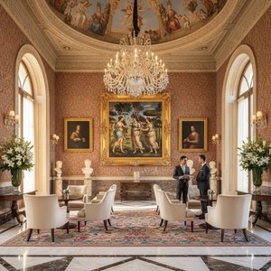
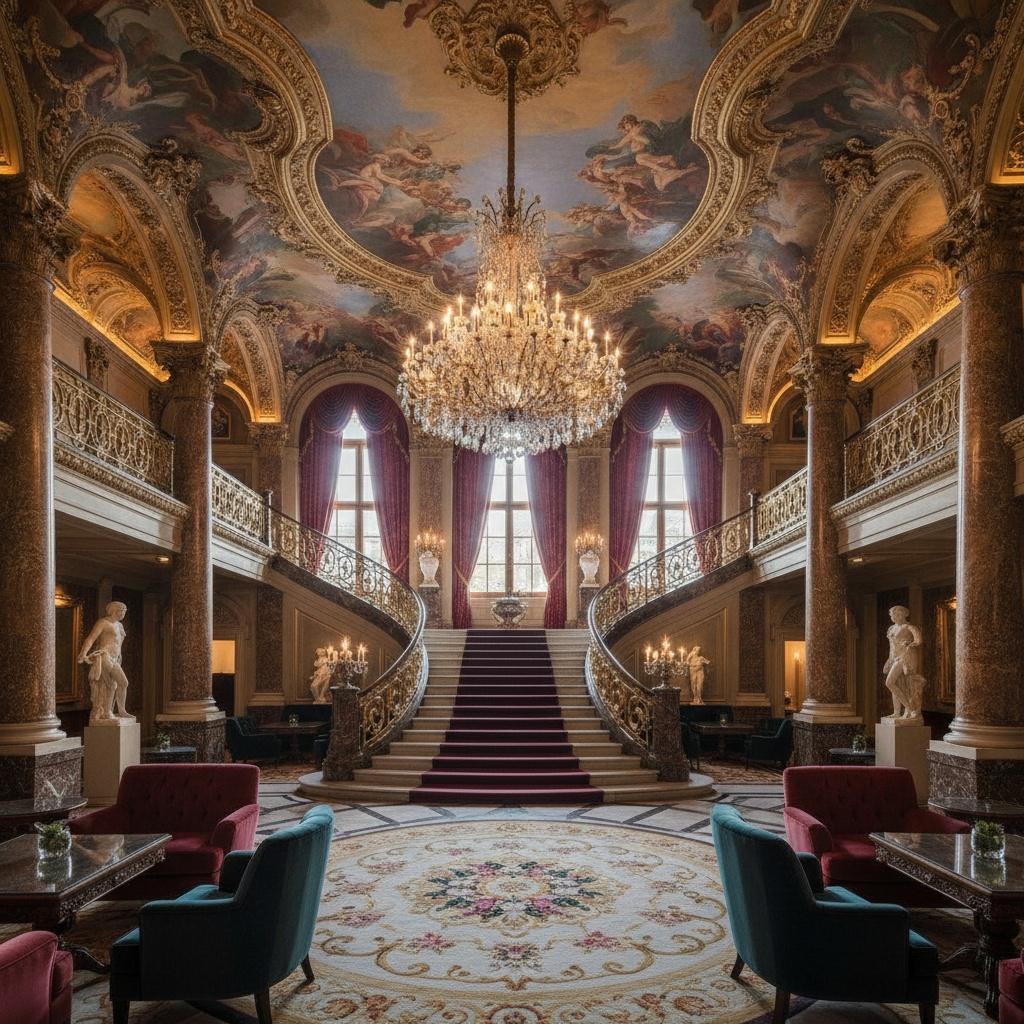
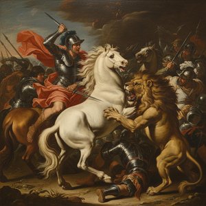
In the context of luxury hospitality, this translates to a design language of unyielding confidence. When a designer utilizes Baroque elements, they are not simply filling a wall; they are establishing a narrative of prestige. The movement’s hallmark is its ability to evoke a sense of grandeur—a quality that resonates deeply within high-end lobbies and executive suites. By integrating the exuberant details and the palpable tension characteristic of masters like Rubens or Caravaggio, a space can transition from a functional transit point to a destination of cultural significance. The Baroque does not ask for permission to be noticed; it asserts its presence through movement, richness, and an unapologetic embrace of the sublime.
Chiaroscuro and Light: Utilizing Dramatic Contrast to Define Architectural Depth
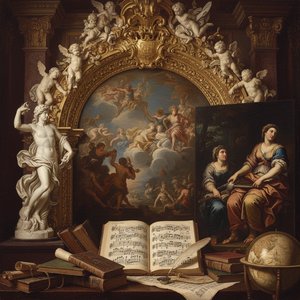
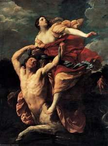
Perhaps the most potent instrument in the Baroque repertoire is chiaroscuro—the masterful manipulation of light and shadow. This technique does not merely illuminate a subject; it sculpts it. By plunging large portions of a composition into deep, impenetrable darkness and piercing them with brilliant, focused light, artists like Caravaggio created a sense of three-dimensionality that feels almost tactile. For the interior professional, understanding this interplay is essential when designing lighting schemes for grand architectural volumes. The dramatic contrast found in Baroque paintings can be mirrored in physical space through strategic spotlighting, which directs the eye toward focal points such as bespoke furniture or monumental art pieces.
This selective illumination serves a dual purpose: it creates intimacy within vast halls and adds a layer of mystery to more secluded corners. When light interacts with the rich textures of an oil reproduction—the visible brushstrokes and the heavy impasto—it enhances the perceived depth of the work, making the canvas appear to breathe. In a hotel setting, where lighting must balance functional clarity with atmospheric mood, adopting the Baroque philosophy of high-contrast shadows allows for the creation of "pockets" of drama. This prevents a large room from feeling flat or sterile, instead providing a rhythmic movement of light that guides the guest through an evolving visual landscape.
Mastering Movement: Integrating Dynamic Compositions into Large-Scale Hotel Wall Decor
The Baroque period marked a definitive departure from the static, centralized plans of previous eras. In its place came a fascination with the diagonal, the spiral, and the swirling vortex. This sense of perpetual motion is what gives Baroque art its "living" quality. For designers tasked with decorating expansive walls, staircases, or long corridors, this dynamism is an invaluable asset. A single, static image can often feel lost in a massive lobby; however, a composition that utilizes movement—where figures seem to emerge from the shadows or drapery flows across the frame—can effectively bridge the gap between the artwork and the architecture.
This movement is particularly effective when utilizing multi-panel layouts. The modern trend of splitting a singular masterpiece across three, four, or even five panels allows a designer to wrap a narrative around a corner or stretch a moment of divine intervention across an entire feature wall. This technique creates a cohesive, panoramic experience that mimics the breathtaking ceiling frescoes found in Roman basilicas like Il Gesù. By choosing works that possess an inherent kinetic energy, the designer ensures that the art does not merely sit upon the wall but actively engages with the architectural flow of the building, pulling the viewer into its unfolding drama.
Strategic Color Palettes: Leveraging Deep Tones and Opulent Gold for Sophisticated Spaces
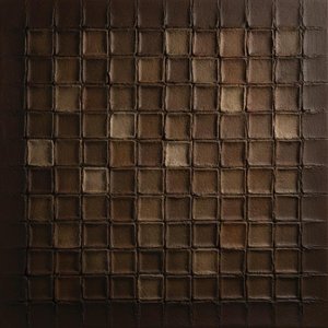 Relief of Weathered Umber Cells in Deep Sepia Grooves
Experience the tactile depth of Relief of Weathered Umber Cells in Deep Sepia Grooves by David Moreau, a modern plaster and texture masterpiece offering an exclusive opportunity to own a singular ArtsDot creation.
Color in the Baroque era was never used with restraint; it was a tool for emotional resonance and symbolic weight. The palette is characterized by deep, saturated tones—rich ochres, burnt umbers, crimson, and midnight blues—often punctuated by the brilliant, incandescent whites of divine light or the heavy, reflective presence of gold. For the procurement manager or decorator, these colors offer a foundation for creating "mood-driven" environments. A room anchored in the dark, earthy tones of a Flemish master can feel grounded, masculine, and profoundly luxurious, especially when paired with modern textures like polished marble or dark wood.
Furthermore, the integration of gold—whether through gilded frames, metallic accents in furniture, or the golden light depicted within the paintings themselves—adds a layer of "sensuous richness" that is synonymous with luxury. This palette allows for a sophisticated layering of color that can withstand the challenges of large-scale implementation. When selecting reproductions for a hospitality project, focusing on these deep, tonal ranges ensures that the art remains impactful even under varied lighting conditions. The goal is to create a sense of "opulent ornamentation" where the colors of the artwork and the materials of the interior exist in a state of harmonious, high-impact tension.
Curating the Collection: Sourcing High-Volume Reproductions and Custom Murals for Hospitality Projects
Executing a large-scale design vision requires more than just aesthetic inspiration; it requires a reliable supply chain capable of delivering museum-quality results at scale. For hospitality professionals, the challenge lies in sourcing art that is both visually commanding and logistically manageable. This is where the distinction between different types of reproductions becomes critical. While high-quality Giclée prints offer an efficient solution for rapid deployment, the true impact of a Baroque-inspired space is often achieved through Handmade Oil Reproductions. These pieces, painted on 100% cotton canvas with visible brushwork and deep tonal ranges, provide the tactile depth that a flat print simply cannot replicate.
For truly transformative projects, such as grand lobbies or dining halls, the use of large-format murals and ceiling frescoes can redefine the entire architectural volume. These works, painted on massive canvas rolls, allow designers to recreate the dizzying illusion of 17th-century ceilings in a modern context. Whether you are managing a single custom commission or orchestrating a multi-room rollout for a hotel chain, the key is to work with a partner who understands the technical requirements of large-scale procurement—including custom sizing, multi-panel engineering, and the logistical precision required for international shipping. By leveraging professional services like digital mockups and custom color matching, designers can ensure that every piece of art is not just an addition, but a fundamental component of the architectural identity.