Understanding Gouache: The Architect's Medium for Bold Color and Opaque Texture
In the demanding world of hospitality design, where every visual element must contribute to a cohesive brand narrative, the choice of medium can define the very soul of a space. While watercolor offers a translucent, ethereal quality that whispers of lightness and air, gouache provides something far more substantial for the designer seeking impact. Often referred to as opaque watercolor, gouache possesses a unique chemical density—a heavy pigment load combined with a gum arabic binder—that allows it to sit upon a surface with a matte, velvety finish. For the procurement manager or hotel designer, this medium represents a bridge between the fluid spontaneity of water-based art and the commanding presence of traditional oils.
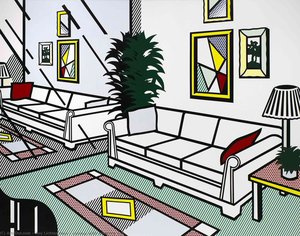
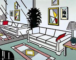
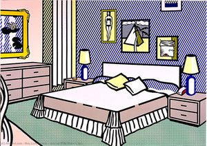
The architectural significance of gouache lies in its ability to deliver flat, saturated planes of color that do not bleed into the substrate, making it an indispensable tool for creating graphic, modern aesthetics. Unlike the luminous, light-passing layers of watercolor, gouache blocks light, creating a surface that feels solid and intentional. This characteristic is particularly useful when designing for high-traffic commercial environments where bold, legible motifs are required to anchor a room. When we consider the tactile nature of luxury interiors, the matte texture of gouache provides a sophisticated counterpoint to the reflective surfaces of marble, polished brass, and glass, offering a visual "rest" that is both modern and timeless.
Technical Mastery: Layering and Opacity Techniques for High-Impact Visuals
Mastering the opaque power of gouache requires an understanding of its dual nature: it can be diluted to a wash or applied with a thick, buttery consistency. For the professional eye, the true magic happens in the controlled layering of pigment. Because the paint is fundamentally water-based but highly opaque, an artist can layer light colors over dark—a feat nearly impossible in traditional watercolor without significant masking. This allows for the creation of intricate details and sharp edges that are essential for the precise geometric patterns often found in contemporary hotel lobbies or boutique restaurant branding.
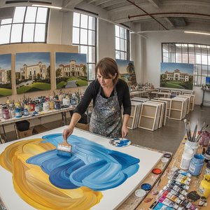
In large-scale applications, such as custom murals or decorative ceiling frescoes, the technique of layering becomes a structural element of the design. One might begin with broad, translucent washes to establish the tonal foundation of a landscape, only to finish with heavy, opaque strokes that define architectural silhouettes or floral highlights. This depth of field creates a sense of three-dimensionality on a flat plane, providing a visual richness that prevents large wall surfaces from feeling sterile. For the designer managing a project's aesthetic weight, understanding this technical versatility ensures that the chosen artwork can support both the subtle nuances and the bold statements required by a complex interior scheme.
Gouache vs. Watercolor: Selecting the Right Medium for Large-Scale Design Projects
The decision between gouache and watercolor is rarely about which medium is superior, but rather which serves the specific functional requirements of the space. In procurement, we often evaluate art based on its "visual weight." Watercolor is a medium of transparency; it relies on the white of the paper to provide light. This makes it ideal for serene, spa-like environments or guest rooms where a sense of tranquility and breathability is paramount. However, watercolor can sometimes lack the "punch" required for high-impact focal points in grander, more dramatic architectural settings.
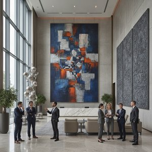
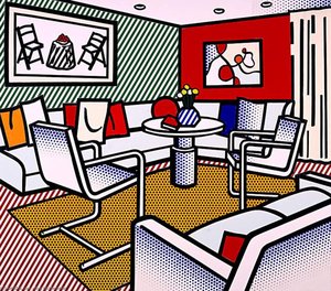
Gouache, conversely, offers a much higher level of control over color saturation. Because it can be applied with such density, it is the preferred choice for works that require graphic clarity and intense pigment concentration. When designing for corporate spaces or high-end restaurants where the art must compete with strong architectural lines and vibrant upholstery, the opacity of gouache ensures the artwork remains a dominant, legible feature. It allows for a "graphic" approach to fine art, where shapes are clearly defined and colors remain true even under varied lighting conditions, from dim evening lounge settings to bright, sun-drenched atriums.
Integrating Gouache Aesthetics into Hospitality Interiors: From Mood Boards to Murals
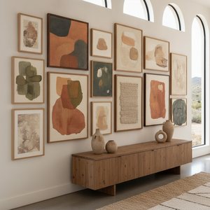
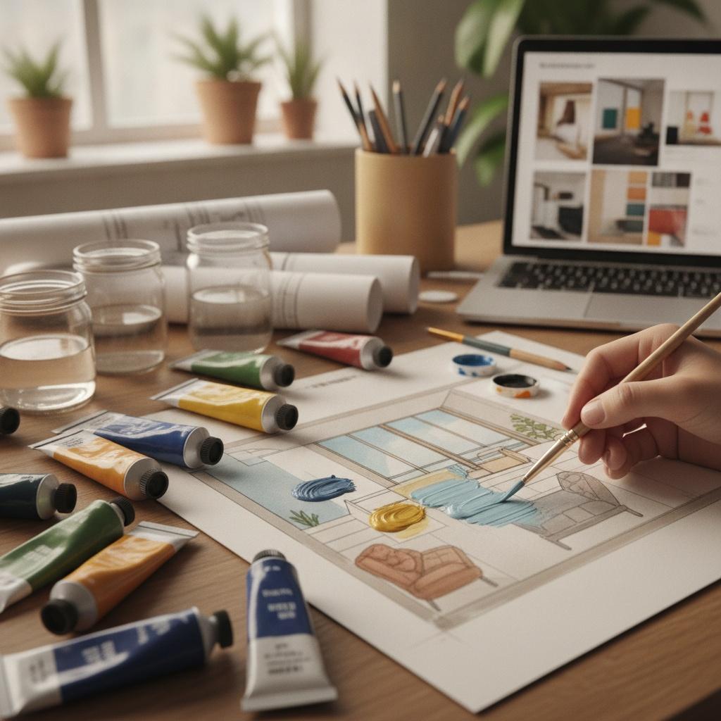
Integrating the gouache aesthetic begins long before a single brushstroke touches canvas; it starts in the mood board. The matte, non-reflective quality of gouache allows designers to experiment with color palettes that are both saturated and sophisticated. When selecting art for a hospitality project, one must consider how the pigment interacts with the room's lighting. Gouache’s lack of gloss prevents distracting glares from overhead spotlights, making it an excellent choice for corridors or dining areas where visual comfort is essential for guest experience.
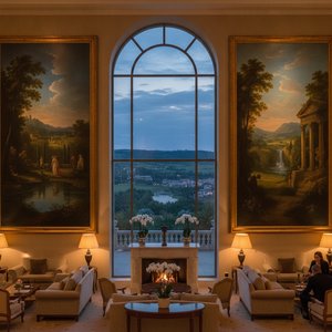
Beyond individual framed pieces, the gouache style can be scaled into massive architectural interventions. The ability to produce large-format murals on canvas rolls allows a designer to wrap a room in a continuous, painterly narrative. These works can mimic the look of historical frescoes while maintaining a contemporary, graphic edge. Whether it is a multi-panel set spanning a grand staircase or a single, monumental piece acting as a centerpiece for a lobby, the gouache aesthetic provides a sense of permanence and deliberate craftsmanship that elevates a commercial space into a curated destination.
Sourcing Professional Artworks: Utilizing Gouache Styles in Commercial Procurement
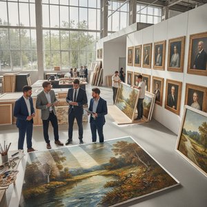
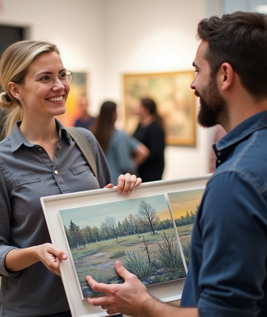
For the procurement professional, the challenge lies in sourcing high-quality, repeatable, and scalable art solutions that meet strict budgetary and timeline constraints. When looking for works that embody the gouache tradition, it is vital to distinguish between mass-produced prints and true hand-painted reproductions. A high-quality reproduction offers the tactile depth of real pigment—the visible brushstrokes and the physical texture of the paint—which a simple digital print cannot replicate. This distinction is critical in luxury hospitality, where the "soul" of the artwork contributes directly to the perceived value of the property.
At ArtsDot.com, we specialize in providing these high-volume, professional solutions for the hospitality and corporate sectors. We understand that for a procurement manager, reliability is as important as aesthetics. Our catalog offers an extensive range of styles, from classical landscapes to modern abstract works, available in multiple sizes to fit any architectural requirement. We provide a streamlined, efficient process: from digital mockups that allow you to visualize art on your specific walls to robust logistics including VAT-compliant invoicing and global shipping via DHL or FedEx. Whether you require a single custom commission or a large-scale multi-panel installation for a hotel chain, our focus is on delivering museum-quality, hand-painted excellence with the operational reliability your business demands.