 Ver en contexto
 Enviar
 Compartir
 Detalles

 Descargar
 Similares
 Radiografía
 Presentación de diapositivas
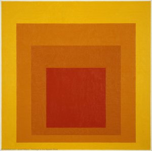
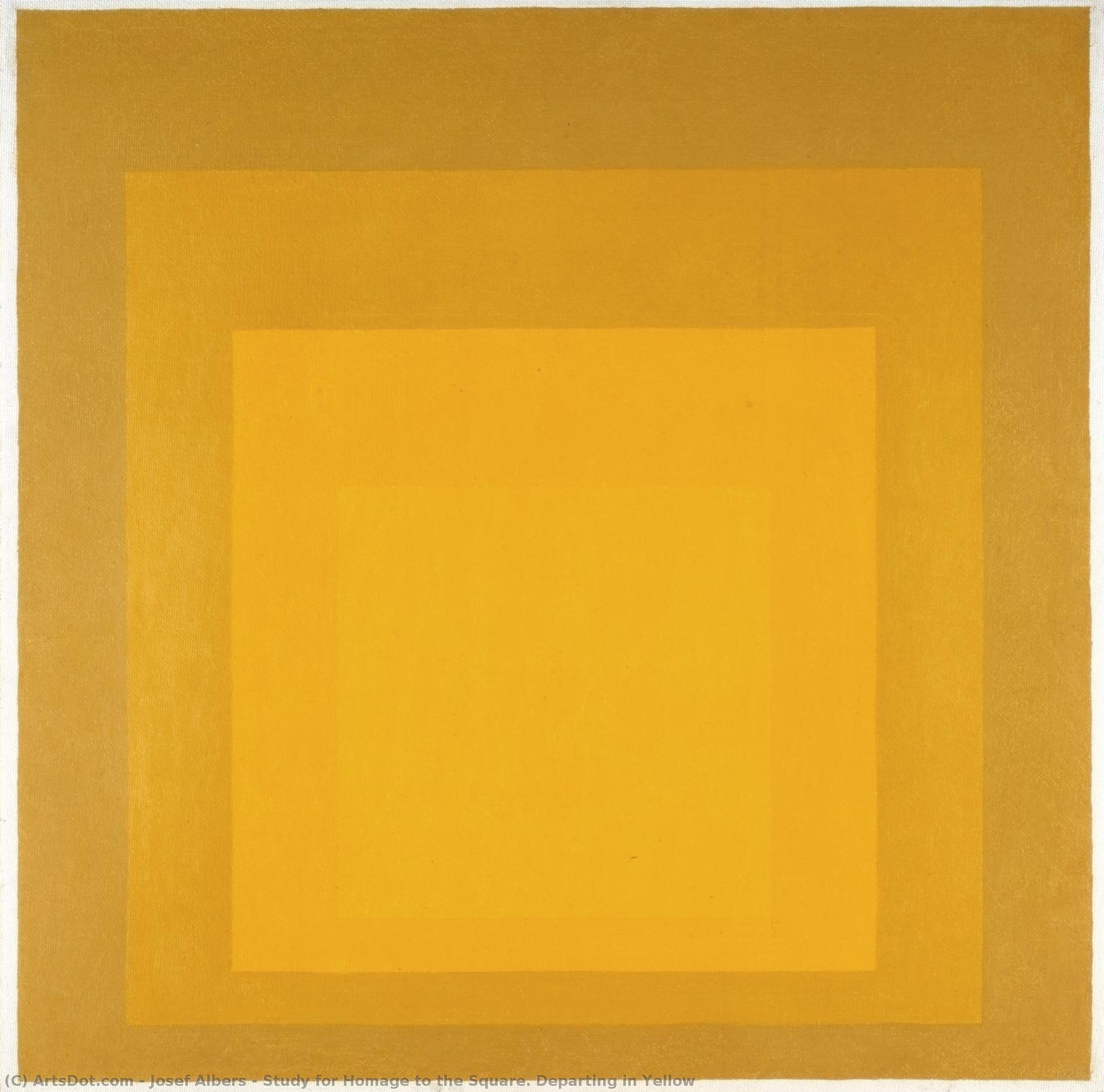
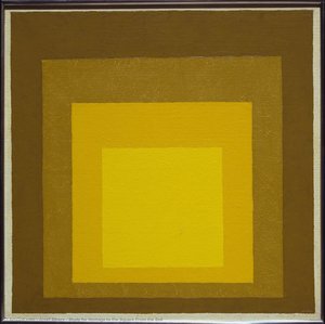
Study for Homage to the Square. Departing in Yellow


 Ver más
Giclée / Impresión de arte
Impresiones giclée o en lienzo de calidad de museo con producción rápida y opciones de acabado flexibles. ( Comprar pintura hecha a mano Comprar imagen)
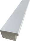
P118B $10
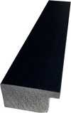
P118H $10
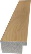
P118W $10
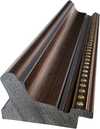
P438Z $10
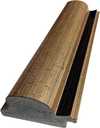
P508JH $12

P508YH $12
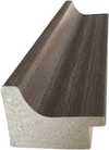
P805H $10
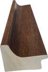
P805Z $10
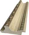
P919BZ $10
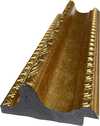
P919G $10
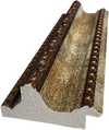
P919XJ $10
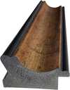
P959ZH $10

P968JZ $12
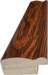
W106C $8
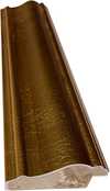
W218G $10
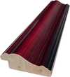
W218JH $8
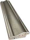
W218Y $10
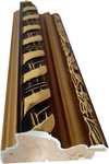
W307PJ $10
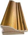
W316G $10
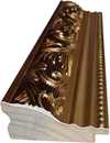
W316PJ $8
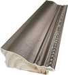
W316Y $10
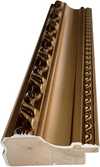
W398PJ $8
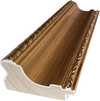
W4111J $10
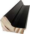
W500HY $15
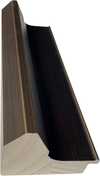
W500JH $15
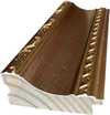
W692G $12
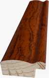
W849H $8
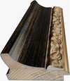
W940BG $15
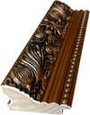
W953PJ $8
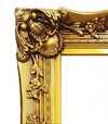
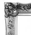
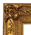
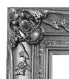
Elija entre nuestros tamaños predefinidos que respetan las proporciones originales de la obra.

Puede introducir sus propias dimensiones para adaptarse a un marco o espacio específico. Si el tamaño seleccionado no coincide con las proporciones de la imagen original, recortaremos la obra de arte o extenderemos la imagen con un borde con efecto espejo o de color sólido. Se enviará una maqueta digital para su aprobación antes de que comience la producción.
Tenga en cuenta que la vista previa en pantalla no refleja el recorte o la extensión real. Solo la maqueta mostrará con precisión la composición final.
Aunque existen tamaños personalizados, recomendamos seleccionar una dimensión de la lista predefinida para preservar las proporciones originales.
Envío a todo el mundo () en 2 semanas en lugar de las 4/5 semanas estándar. (25 agosto)

Envío exprés gratuito a todo el mundo

Lienzo de lino de alta calidad

Seguro de envío total

Garantía de reembolso de impuestos aduaneros

Garantía de fidelidad cromática exacta

Política de devolución de 60 días (solo por defectos)

Garantía de devolución del 100% del dinero

Descuento por cantidad
 La opción de vidrio solo está disponible en tamaños inferiores a 110 cm.

Study for Homage to the Square. Departing in Yellow
Giclée / Impresión de arte
Dimensiones de la reproducción
-


Precio total final
$ 62
Descripción de la pieza
A Geometric Meditation on Color and Perception
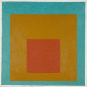
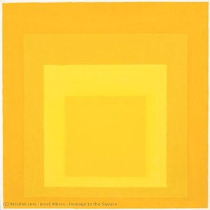
Josef Albers’ “Study for Homage to the Square: Departing in Yellow” isn't merely a painting; it’s an invitation into a carefully constructed world of color, balance, and subtle psychological exploration. Created in 1964 during his prolific period dedicated to understanding the interaction between hues, this work exemplifies Albers’ groundbreaking approach to abstraction – moving beyond representational imagery to delve directly into the fundamental properties of color itself. The piece immediately commands attention with its stark simplicity: a large square divided into four smaller squares, each subtly shifting in tone and saturation. This foundational structure, the “Homage to the Square,” became a cornerstone of Albers’ teaching and artistic practice, allowing him to systematically investigate how colors influence one another, creating an ever-evolving dialogue on the canvas.
- The Palette: The dominant color is a vibrant, almost luminous yellow-orange – Naples Yellows, as noted in archival research – that transitions smoothly into lighter shades within the inner squares. This gradient isn’t random; it's meticulously calculated to demonstrate how adjacent colors affect our perception of each other.
- Geometric Precision: Lines are clean and decisive, defining the boundaries between the squares with sharp edges, a deliberate choice that emphasizes order and control. The composition is rigorously geometric, reflecting Albers’ fascination with mathematical principles and their application to art.
- Minimalist Texture: The surface appears remarkably smooth and flat, devoid of visible brushstrokes or texture. This controlled application of paint speaks to Albers' desire to strip away extraneous elements, focusing solely on the interaction between color itself.
Exploring the Theory of Color Interaction
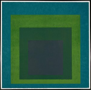
Albers’ “Homage to the Square” series was born from a deep investigation into the nature of perception and how we experience color. He believed that colors didn't exist in isolation but rather influenced each other, creating a dynamic interplay of visual effects. His research culminated in his seminal book, *Interaction of Color*, which outlined these principles through countless experiments and observations. This particular study exemplifies those theories beautifully – the subtle shifts in hue within each square demonstrate how adjacent tones can intensify or diminish one another, altering our overall perception of the composition. The piece isn’t about depicting a specific scene or object; it's about illustrating the fundamental rules governing color relationships.
Albers famously stated that “color is not what we see, but what we feel,” and this sentiment is powerfully embodied in this work. It invites the viewer to engage with the painting on an emotional level, allowing their own associations and experiences of color to shape their interpretation.Historical Context & Albers’ Legacy
To understand “Study for Homage to the Square: Departing in Yellow,” it's crucial to consider Josef Albers’ broader artistic journey. He began his career as a schoolteacher, developing a keen eye for detail and an appreciation for craftsmanship – skills that would later inform his approach to art. His time at the Bauhaus profoundly influenced his aesthetic sensibilities, introducing him to principles of functional design and geometric abstraction. Following the Bauhaus's closure, Albers continued to refine his theories and techniques, ultimately establishing himself as a leading figure in American Abstract Expressionism. The “Homage to the Square” series represents a culmination of this lifelong exploration, demonstrating his mastery of color theory and his commitment to pushing the boundaries of artistic expression.
Albers’ influence extends far beyond the art world. His teaching methods—emphasizing observation, experimentation, and critical thinking—have shaped generations of artists and designers, leaving a lasting legacy on contemporary visual culture.A Timeless Exploration of Perception
“Study for Homage to the Square: Departing in Yellow” is more than just a visually striking artwork; it’s a profound meditation on color, perception, and the relationship between art and the viewer. Its enduring appeal lies in its simplicity, its intellectual rigor, and its ability to evoke a sense of quiet contemplation. Whether viewed as a scientific study or an emotional experience, this piece continues to challenge our understanding of how we see and feel the world around us. Reproductions capture the subtle nuances of color and form that are essential to appreciating Albers’ genius, offering a window into his meticulously crafted visual language.
Obras relacionadas
Biografía del artista
Primeros Años y Educación
- Nacimiento: 19 de marzo de 1888, Bottrop, Alemania
- Fallecimiento: 25 de marzo de 1976, New Haven, Connecticut, EE. UU.
- Josef Albers creció en una familia de artesanos, fomentando una temprana apreciación por los materiales y las técnicas.
- Inicialmente trabajó como maestro de escuela desde 1908 hasta 1913 antes de formarse como profesor de arte en la Königliche Kunstschule de Berlín (1913-1915).
- Las primeras exploraciones artísticas incluyeron grabado, vidrieras y pintura. Su primera comisión pública fue una ventana de vidrio emplomado, "Rosa Mystica Ora Pro Nobis", en 1918.
Período Bauhaus y Desarrollo de la Teoría
- En 1922, Albers se unió a la facultad del Bauhaus, inicialmente enseñando en el curso preliminar 'Werklehre' (práctica del taller) dentro del departamento de diseño.
- Su tiempo en el Bauhaus fue fundamental para dar forma a su filosofía artística y enfoque de la teoría del color.
- Comenzó a investigar sistemáticamente los efectos perceptuales de las relaciones de color, alejándose del arte representacional hacia la abstracción.
- La influencia de artistas como Paul Klee y Wassily Kandinsky es evidente en sus primeros trabajos, aunque desarrolló una metodología única centrada en la observación empírica en lugar de la interpretación metafísica.
Homenaje al Cuadrado e Investigaciones Cromáticas
- En 1949, Albers comenzó su serie más famosa, "Homenaje al Cuadrado". Este proyecto continuo consistió en pinturas que presentaban cuadrados anidados dentro de cuadrados, explorando cómo interactúan y se influyen los colores.
- La serie no pretendía ser una celebración de la geometría, sino más bien una investigación sistemática sobre la percepción del color y su naturaleza engañosa.
- Albers documentó meticulosamente sus experimentos con el color en su libro seminal, "Interacción del Color" (1963), que presentaba su teoría sobre cómo los colores se gobiernan mutuamente a través de una lógica interna y a menudo engañosa.
Legado Docente e Influencia
- Después de dejar el Black Mountain College en 1950, Albers dirigió el departamento de diseño de la Universidad de Yale hasta su jubilación en 1958.
- Fue un maestro muy influyente que enfatizaba la experimentación práctica y la observación crítica.
- Entre sus alumnos destacados se encuentran Ruth Asawa, Ray Johnson, Robert Rauschenberg, Cy Twombly y Susan Weil, todos ellos influenciados por su enfoque de la creación artística.
Significado Histórico
- Josef Albers es reconocido como una figura clave en el desarrollo del arte abstracto y la teoría del color.
- Su serie "Homenaje al Cuadrado" sigue siendo icónica por su exploración de los fenómenos perceptuales y su estética minimalista.
- “Interacción del Color” continúa siendo un texto fundamental para artistas, diseñadores y educadores interesados en comprender las complejidades de las relaciones de color.
- El énfasis de Albers en la observación empírica y la experimentación sistemática influyó en generaciones de artistas y solidificó su lugar como pionero del arte abstracto.
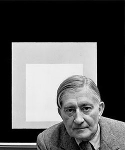
Josef Albers
1888 - 1976 , Alemania
Datos clave
- Artistas Que Influyeron:
- Matisse
- Cézanne
- Klee
- Kandinsky
- Fecha De Fallecimiento: 25 de marzo de 1976
- Fecha De Nacimiento: 19 de marzo de 1888
- Influenciado A Artistas:
- Robert Rauschenberg
- Cy Twombly
- Lugar De Nacimiento: Bottrop, Alemania
- Movimiento Artístico: Arte abstracto
- Nacionalidad: Alemán-estadounidense
- Nombre Completo: Josef Albers
- Obras Notables: ['Homenaje al cuadrado']
Artículos relacionados
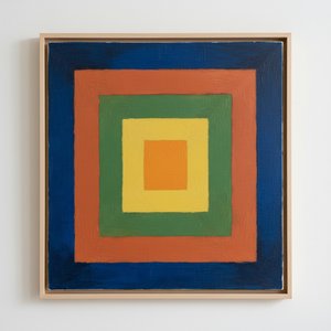
Josef Albers: A Homage to Color Interaction & the Foundations of Visual Perception
Explore Josef Albers's groundbreaking color theory & the 'Homage to the Square' series. Discover how his work revolutionized visual perception and influenced modern art movements like Minimalism & Op Art. Learn about his Bauhaus roots & lasting legacy.
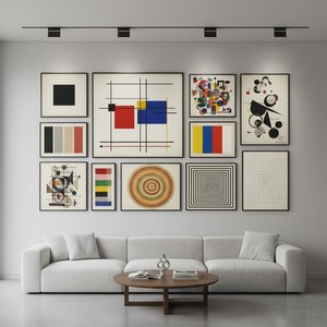
Abstracción Geométrica: 10 Obras Maestras que Transformaron el Arte Moderno | ArtsDot
Descubre las 10 obras maestras de la abstracción geométrica que revolucionaron el arte moderno. Explora a Mondrian, Malevich y Kandinsky en ArtsDot.com. Reproducciones de alta calidad para tu hogar.
Kazimir Malevich: Las 25 Obras Maestras del Suprematismo para Inspirar tu Hogar
Descubre las 25 obras maestras de Kazimir Malevich, pionero del Suprematismo. Explora la historia, el significado y la belleza del arte abstracto moderno. Reproducciones de alta calidad para inspirar tu hogar en ArtsDot.com.
Beyond Form & Color: Geometric Abstraction's Enduring Legacy in Art History
Explore the captivating world of geometric abstraction! Discover its origins, key artists like Malevich & Mondrian, and why this movement remains highly valued by art collectors today. Expert insights at ArtsDot.

Beyond Form & Color: Geometric Abstraction's Evolution in 20th/21st Century Art
Explore the evolution of geometric abstraction from Cubism to contemporary art. Discover key artists like Malevich & Mondrian, investment insights, and expert collecting advice at ArtsDot.