![Idcny 16: News From The International Design Center\n\nthe Preview Opening! [front Cover] — Michael Bierut](/media/artworks/images-full/3f/2a/3f2a0e54a230bdba450d3881689f0fe5.jpg)
 シェアする
シェアする シェアする
シェアする
 詳細を見る
詳細を見る

 ダウンロード
 似ている作品
 スライドショー
IDCNY 16: News from the International Design Center\n\nThe Preview Opening! [front cover]
 Digital
- Digital
- Graphic Design
 1985
1985- Contemporary
 27.0 x 43.0 cm
 Vignelli Center for Design Studies
 詳細を見る
詳細を見る
ジークレー/アートプリント
迅速な制作と多彩な仕上げオプションを備えた、ミュージアムクオリティのジークレーまたはキャンバスプリント。 ( 手描きの絵画を購入 画像を購入)
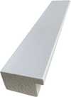
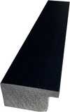
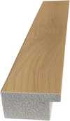




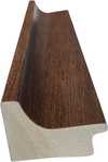
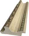

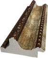
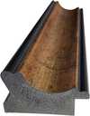





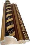

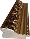
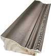

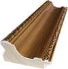
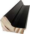

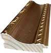
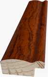
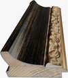
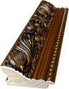


作品のオリジナル比率に合わせた、当店の規定サイズからお選びください。

特定のフレームやスペースに合わせて、ご自身でサイズを指定することも可能です。選択されたサイズが元の画像の比率と一致しない場合、作品をトリミングするか、鏡面反射または単色での塗りつぶしによって画像を拡張いたします。制作を開始する前に、ご確認用のデジタルモックアップをお送りいたします。
画面上のプレビューには、実際のトリミングや拡張は反映されませんのでご注意ください。最終的な構図を正確に確認できるのは、モックアップのみとなります。
カスタムサイズも承っておりますが、元の比率を維持するためには、あらかじめ用意されたリストからサイズを選択することをお勧めいたします。


 ガラスオプションは、110cm未満のサイズでのみご利用いただけます。

IDCNY 16: News from the International Design Center\n\nThe Preview Opening! [front cover]
ジークレー/アートプリント
複製画のサイズ
-


合計金額
$ 62
作品詳細説明
A Moment Frozen in Graphic Brilliance
In the vibrant tapestry of twentieth-century visual communication, few artifacts capture the electric anticipation of a design revolution quite like IDCNY 16: News from the International Design Center. This striking piece, created by the legendary American graphic designer Michael Bierut in 1985, serves as more than just a newsletter cover; it is a window into a pivotal moment in New York's creative history. The composition presents a captivating scene of a hand triumphantly lifting a sign that announces "The Preview Opening!", an image that pulses with the energy of a grand unveiling. Through the lens of Bierut’s masterful eye, what could have been a simple announcement becomes a celebratory performance, inviting the viewer to participate in the excitement of the burgeoning design community.
The visual language of this work is defined by its bold, high-contrast palette and an almost cinematic sense of drama. Set against a deep, saturated red background, the white lettering and numerical details leap forward, demanding immediate attention. This use of color is not merely decorative; it evokes the urgency and passion inherent in the creative process. The inclusion of a hand wearing a tie introduces a subtle layer of formal sophistication, suggesting that while the event is an opening of new ideas, it is rooted in a professional excellence and a structured design discipline. It is a masterful interplay of texture and tone, where the starkness of the typography meets the warmth of human presence.
The Legacy of Swiss Precision and American Vitality
To understand the soul of this piece, one must look to the lineage of its creator. Michael Bierut, a titan of the Pentagram design firm, carries within his work the rigorous principles of the Swiss Style—a movement defined by geometric precision and the iconic clarity of Helvetica. Yet, in this 1985 creation, we see those disciplined roots blossoming into something uniquely American: a sense of spontaneity, pop-culture vibrancy, and communicative power. The artwork embodies the transition from the rigid grids of mid-century modernism to the more expressive, layered graphic identities that would come to define the late eighties.
For the discerning collector or interior designer, this reproduction offers a profound sense of historical continuity. It is an ideal centerpiece for spaces that celebrate intellectual curiosity and modern aesthetics, such as contemporary studios, editorial offices, or sophisticated urban lofts. The piece does not merely decorate a wall; it sparks conversation about the evolution of visual culture and the enduring power of clear, impactful communication. Owning this work is an invitation to surround oneself with the very DNA of modern graphic excellence, bringing a touch of New York's historical design spirit into the contemporary home.
関連作品

アーティストの略歴
Michael Bierut: Clarity and Helvetica – Shaping Visual Culture
Michael Bierut (b. 1957) stands as a towering figure in contemporary graphic design, recognized globally for his unwavering commitment to clarity, masterful use of typography—particularly Helvetica—and astute contributions to the field’s critical discourse. Born in the United States, Bierut's artistic journey began with an early fascination for visual communication and evolved into a distinguished career at Pentagram, one of America’s leading design firms since 1990. This partnership has yielded an astonishing portfolio encompassing branding identities, editorial layouts, packaging designs, and monumental public artworks, cementing his reputation as a visionary innovator. His formative years were marked by exposure to influential designers like Josef Müller-Brockmann and Armin Hofmann, whose principles of Swiss Style—characterized by geometric precision, sans-serif fonts, and restrained color palettes—deeply resonated with Bierut’s aesthetic sensibilities. These influences instilled in him a belief that design should serve as a conduit for conveying information effectively while simultaneously elevating its visual impact. This philosophy is evident throughout his work, where simplicity reigns supreme alongside meticulous attention to detail. Bierut's breakthrough came with the iconic 2016 logo for Hillary Clinton’s presidential campaign—a project lauded for its understated elegance and strategic use of Helvetica. The design prioritized readability and conveyed a sense of calm confidence amidst the turbulent political landscape, demonstrating Bierut’s ability to harness typography as a tool for shaping perception. Beyond client commissions, Bierut has actively championed design education and criticism, lecturing extensively at Yale School of Art since 1989 and fostering a generation of designers who embrace intellectual rigor alongside creative experimentation. Throughout his career, Bierut has garnered numerous awards recognizing his exceptional talent and dedication to the craft—a testament to his enduring influence on the field. He’s been honored by organizations like AIGA (American Institute of Graphic Arts) for his contributions to design excellence and continues to inspire artists worldwide with his unwavering belief in the power of thoughtful visual communication. His work transcends mere aesthetics; it embodies a profound understanding of how design can shape culture and communicate complex ideas with grace and precision.- Notable Achievements: Pentagram Partner (1990-Present), Logo Design for Hillary Clinton Campaign (2016)
- Education: Yale School of Art Lecturer (Since 1989)
- Affiliations: Alliance Graphique Internationale, American Institute of Graphic Arts

Michael Bierut
1957 - , United States of America
基本情報
- Artistic Movement Or Style: Swiss Style
- Artists Or Movements Influenced By This Artist: ['Graphic Design']
- Artists Who Influenced This Artist: ['Helvetica']
- Date Of Birth: 1957
- Full Name: Michael Bierut
- Nationality: American
- Notable Artworks:
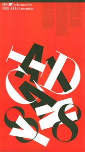
- IDCNY welcomes the 1988 AIA Convention
- Architecture in Japan
- Place Of Birth: United States of America
関連記事
White on Canvas: 10 Masterpieces & Timeless Elegance for Your Home Decor
Explore 10 iconic white paintings by Monet, Whistler & Rothko! Discover the stories behind these serene masterpieces and their impact on art history. Find museum-quality reproductions for your home decor at .
Bold Strokes & Powerful Visions: 10 Artworks That Command Attention | ArtsDot
Experience art's raw power! Explore 10 iconic paintings – Van Gogh, Kahlo & more – that define 'bold'. Discover the stories behind these expressive masterpieces and find museum-quality reproductions for your home at ArtsDot.com.
ロイ・リキテンスタイン傑作25選:ポップアートの革新と現代美術への影響 | ArtsDot
ロイ・リキテンスタインの傑作25選。ポップアートを代表する画家、その技法と時代背景を紐解きます。ベンデイ・ドット、コミック表現…ArtsDotで高品質な複製画やインテリアアートを見つけ、空間にモダンアートの息吹を吹き込みましょう。全作品はこちらから: ArtsDot.com

Crimson Threads of Narrative: Exploring Symbolism & Representation in Artworks Featuring the Red Dress
Explore the rich symbolism of the red dress in art history! From ancient power displays to iconic portraits like Cézanne’s 'Madame Cezanne', discover the cultural and artistic significance behind this captivating color. Expert analysis & insights.
マーク・ロスコ傑作25選:色彩が織りなす深遠な世界|ArtsDot
マーク・ロスコの傑作25選。抽象表現主義を代表する巨匠、色彩が織りなす深遠な世界を探求します。絵画の背景や技法、感動的なストーリーを紐解き、ArtsDotで高品質なアートプリントをお楽しみください。リビングやオフィスにモダンアートを飾るなら!