

 Предпросмотр
 Поделиться
 Поделиться
 Детали произведения

 Скачать
 Похожие работы
 Рентгенография
 Слайд-шоу
 Статистика
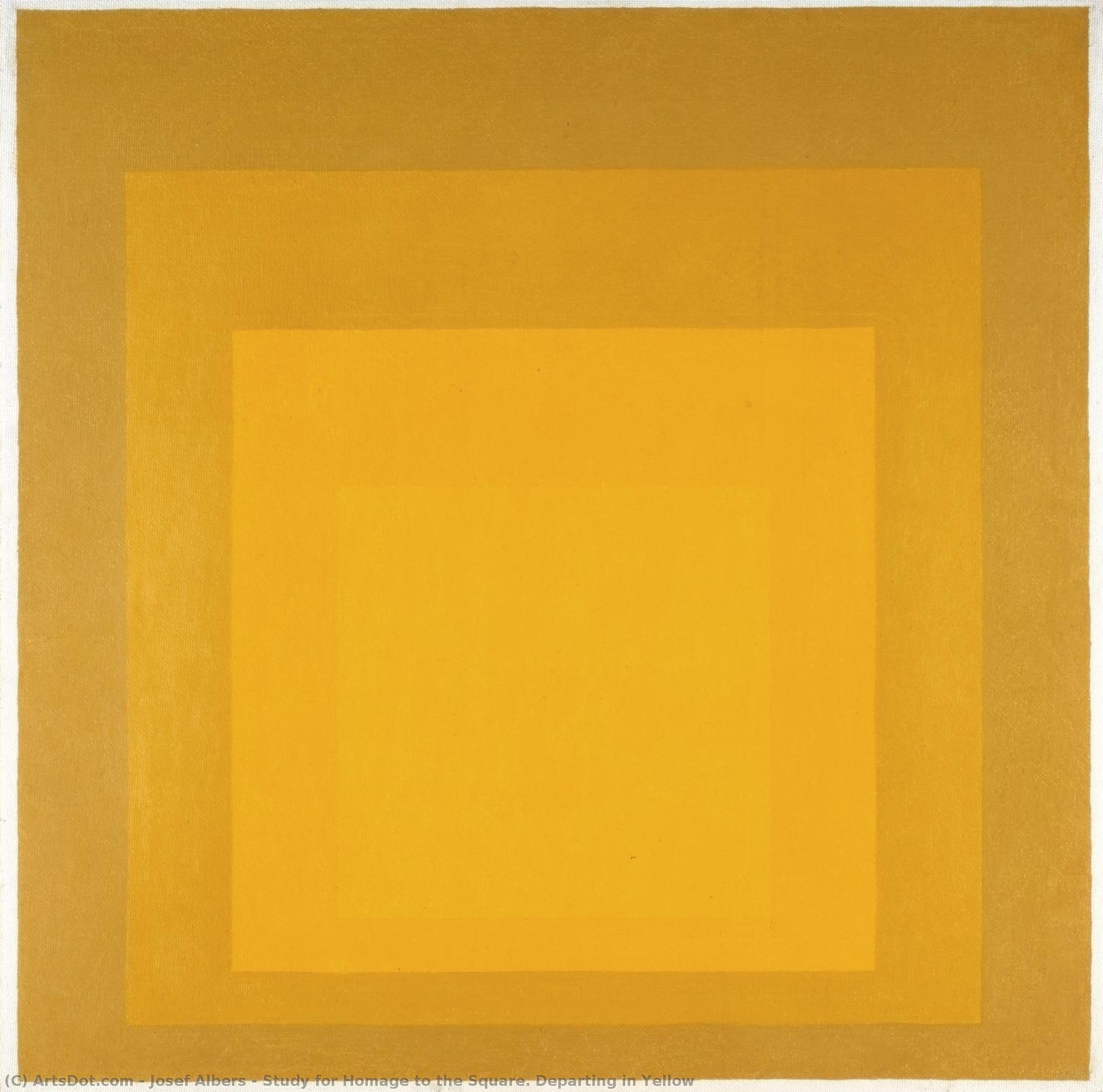
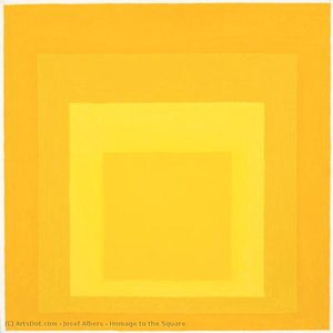
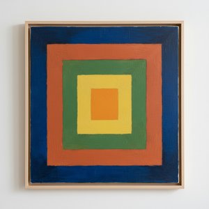
Study for Homage to the Square. Departing in Yellow


 Читать далее
Жикле / Арт-принт
Печать (жикле) или холст музейного качества с быстрыми сроками изготовления и широким выбором вариантов отделки. ( Купить картину ручной работы Перейти к цифровым изображениям)
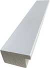
P118B $10
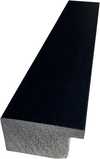
P118H $10
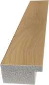
P118W $10
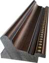
P438Z $10
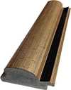
P508JH $12
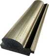
P508YH $12
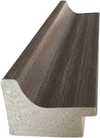
P805H $10
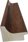
P805Z $10
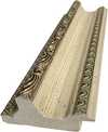
P919BZ $10
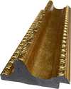
P919G $10
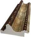
P919XJ $10
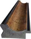
P959ZH $10

P968JZ $12
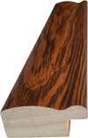
W106C $8
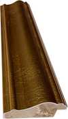
W218G $10
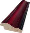
W218JH $8
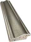
W218Y $10
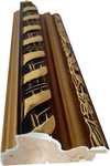
W307PJ $10
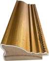
W316G $10
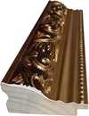
W316PJ $8
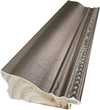
W316Y $10
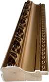
W398PJ $8
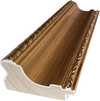
W4111J $10
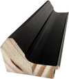
W500HY $15
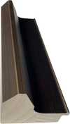
W500JH $15
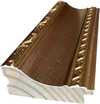
W692G $12
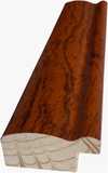
W849H $8
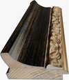
W940BG $15
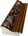
W953PJ $8
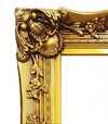
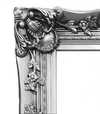
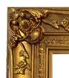
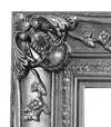
Выберите один из наших стандартных размеров, соответствующих оригинальным пропорциям произведения искусства.

Вы можете указать свои собственные размеры, чтобы репродукция идеально подошла под конкретную раму или пространство. Если выбранный вами размер не будет соответствовать пропорциям оригинала, мы либо обрежем произведение, либо дополним изображение зеркальным отражением краев или однотонной заливкой. Перед началом производства вам будет отправлен цифровой макет для утверждения.
Пожалуйста, обратите внимание, что предварительный просмотр на экране не отображает фактическую обрезку или расширение изображения. Только макет точно покажет финальную композицию.
Несмотря на возможность заказа индивидуальных размеров, мы рекомендуем выбирать размер из предопределенного списка, чтобы сохранить оригинальные пропорции.
Доставка по всему миру () за 2 недели вместо стандартных 4/5 недель. (12 Сентябрь)

Бесплатная экспресс-доставка по всему миру

Высококачественный льняной холст

Полное страхование доставки

Гарантия возмещения таможенных пошлин

Гарантия точного соответствия цветов

100-дневная политика возврата (только при обнаружении дефектов)

Гарантия возврата 100% средств

Предложение оптовых скидок
 Вариант со стеклом доступен только для размеров менее 110 см

Study for Homage to the Square. Departing in Yellow
Жикле / Арт-принт
Размер репродукции
-


Итоговая стоимость
$ 62
A Geometric Meditation on Color and Perception
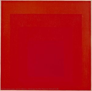
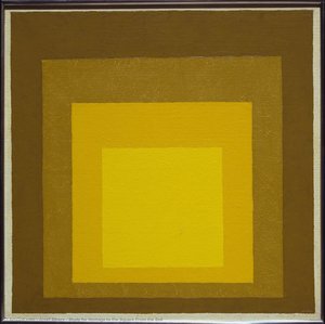
Josef Albers’ “Study for Homage to the Square: Departing in Yellow” isn't merely a painting; it’s an invitation into a carefully constructed world of color, balance, and subtle psychological exploration. Created in 1964 during his prolific period dedicated to understanding the interaction between hues, this work exemplifies Albers’ groundbreaking approach to abstraction – moving beyond representational imagery to delve directly into the fundamental properties of color itself. The piece immediately commands attention with its stark simplicity: a large square divided into four smaller squares, each subtly shifting in tone and saturation. This foundational structure, the “Homage to the Square,” became a cornerstone of Albers’ teaching and artistic practice, allowing him to systematically investigate how colors influence one another, creating an ever-evolving dialogue on the canvas.
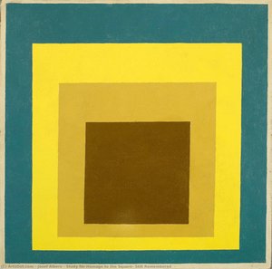
- The Palette: The dominant color is a vibrant, almost luminous yellow-orange – Naples Yellows, as noted in archival research – that transitions smoothly into lighter shades within the inner squares. This gradient isn’t random; it's meticulously calculated to demonstrate how adjacent colors affect our perception of each other.
- Geometric Precision: Lines are clean and decisive, defining the boundaries between the squares with sharp edges, a deliberate choice that emphasizes order and control. The composition is rigorously geometric, reflecting Albers’ fascination with mathematical principles and their application to art.
- Minimalist Texture: The surface appears remarkably smooth and flat, devoid of visible brushstrokes or texture. This controlled application of paint speaks to Albers' desire to strip away extraneous elements, focusing solely on the interaction between color itself.
Exploring the Theory of Color Interaction
Albers’ “Homage to the Square” series was born from a deep investigation into the nature of perception and how we experience color. He believed that colors didn't exist in isolation but rather influenced each other, creating a dynamic interplay of visual effects. His research culminated in his seminal book, *Interaction of Color*, which outlined these principles through countless experiments and observations. This particular study exemplifies those theories beautifully – the subtle shifts in hue within each square demonstrate how adjacent tones can intensify or diminish one another, altering our overall perception of the composition. The piece isn’t about depicting a specific scene or object; it's about illustrating the fundamental rules governing color relationships.
Albers famously stated that “color is not what we see, but what we feel,” and this sentiment is powerfully embodied in this work. It invites the viewer to engage with the painting on an emotional level, allowing their own associations and experiences of color to shape their interpretation.Historical Context & Albers’ Legacy
To understand “Study for Homage to the Square: Departing in Yellow,” it's crucial to consider Josef Albers’ broader artistic journey. He began his career as a schoolteacher, developing a keen eye for detail and an appreciation for craftsmanship – skills that would later inform his approach to art. His time at the Bauhaus profoundly influenced his aesthetic sensibilities, introducing him to principles of functional design and geometric abstraction. Following the Bauhaus's closure, Albers continued to refine his theories and techniques, ultimately establishing himself as a leading figure in American Abstract Expressionism. The “Homage to the Square” series represents a culmination of this lifelong exploration, demonstrating his mastery of color theory and his commitment to pushing the boundaries of artistic expression.
Albers’ influence extends far beyond the art world. His teaching methods—emphasizing observation, experimentation, and critical thinking—have shaped generations of artists and designers, leaving a lasting legacy on contemporary visual culture.A Timeless Exploration of Perception
“Study for Homage to the Square: Departing in Yellow” is more than just a visually striking artwork; it’s a profound meditation on color, perception, and the relationship between art and the viewer. Its enduring appeal lies in its simplicity, its intellectual rigor, and its ability to evoke a sense of quiet contemplation. Whether viewed as a scientific study or an emotional experience, this piece continues to challenge our understanding of how we see and feel the world around us. Reproductions capture the subtle nuances of color and form that are essential to appreciating Albers’ genius, offering a window into his meticulously crafted visual language.
Похожие произведения
Биография художника
A Life Forged in Material: The Early Years and Bauhaus Formation
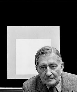
Josef Albers’s artistic journey began not amidst the rarefied air of established academies, but within the pragmatic world of his father’s contracting business in Bottrop, Germany. Born in 1888, young Josef absorbed a deep respect for materials – carpentry, plumbing, house-painting – skills that would fundamentally shape his aesthetic sensibility. This wasn't merely vocational training; it was an immersion into the very essence of making, understanding how forms materialized and the inherent qualities within each medium. He learned to appreciate the subtle textures of wood grain, the precise angles required for a perfect joint, the transformative power of color in a freshly painted wall. Before dedicating himself fully to art, Albers spent five years as a schoolteacher, honing patience and pedagogical skill—attributes that would later define his influential teaching career. This early experience instilled in him a profound understanding of observation, careful measurement, and the importance of clear communication – qualities he would bring to his artistic practice. Formal artistic training commenced at the Königliche Kunstschule in Berlin between 1913 and 1915, where he explored printmaking, painting, and, crucially, stained glass. His early commission, “Rosa Mystica Ora Pro Nobis” (1918), a stunning stained-glass window for a church in Munich, foreshadowed his lifelong fascination with the interplay of light and color, hinting at the abstract explorations to come. This initial work wasn’t simply decorative; it was an investigation into how light *transformed* material, a theme that would resonate throughout his career – a delicate dance between pigment and illumination.The Bauhaus Crucible: Color as Subject
A pivotal moment arrived in 1922 when Albers joined the faculty of the Bauhaus, a revolutionary school seeking to unify all artistic disciplines under Walter Gropius’s visionary leadership. Initially tasked with teaching the preliminary course – *Werklehre* (workshop practice) – he immersed himself in its core principles: functionalism, geometric abstraction, and material exploration. This period proved transformative. Albers began a systematic investigation into color perception, moving away from representational art towards an increasingly abstract vocabulary. He wasn’t interested merely in *what* colors were, but *how* they interacted, how they influenced each other, and how our eyes perceived them. The influence of fellow Bauhaus masters like Paul Klee and Wassily Kandinsky is discernible in his early work, yet Albers charted a unique course, prioritizing empirical observation over metaphysical interpretation. He wasn’t seeking spiritual truths through color; he was meticulously documenting its physical effects – a scientific rigor that became the hallmark of his artistic method. This focus on perception, on how we *see*, rather than what is *seen*, set him apart and laid the groundwork for his future explorations. The Bauhaus environment fostered experimentation with unconventional materials—glass, metal, wood—and encouraged students to challenge traditional notions of art and design. Albers embraced this spirit of innovation, pushing the boundaries of material manipulation and exploring new ways to represent visual relationships.Homage to the Square: A Laboratory of Perception
Following a period teaching at Black Mountain College – where he fostered a generation of American artists including Robert Rauschenberg and Cy Twombly – Albers embarked on what would become his most iconic series in 1949: “Homage to the Square.” This ongoing project consisted of paintings featuring nested squares within squares, each iteration exploring subtle variations in color relationships. It’s a deceptively simple premise, but one that belies an incredibly complex and rigorous investigation. Albers meticulously documented his experiments, revealing how colors aren't static entities but dynamic forces governing each other through internal logic – often misleading to the eye. A seemingly brighter square might appear to recede while a darker one advances, defying intuitive understanding. The series wasn’t intended as a celebration of geometry; rather, it was a laboratory for studying color perception. He used a systematic approach, varying the size and placement of squares, and carefully documenting the resulting visual effects. This research culminated in his seminal book, “Interaction of Color” (1963), a foundational text still studied by artists and designers today – a testament to Albers’ belief that seeing is not passive, but an active process of interpretation. The book isn't a treatise on color theory; it's a series of exercises designed to demonstrate how our perception of color is relative and contextual – a profound exploration of the subjective nature of visual experience.Legacy and Enduring Influence
Josef Albers’s impact extends far beyond his paintings. His tenure as head of the design department at Yale University, from 1950 until his retirement in 1958, cemented his reputation as a profoundly influential teacher. He emphasized hands-on experimentation, critical observation, and relentless questioning of assumptions. Students weren't simply taught *what* to paint; they were taught *how* to see – to analyze, to deconstruct, and to understand the underlying principles governing visual experience. Albers’s approach fostered independent thinking and encouraged students to develop their own unique artistic voices. “Homage to the Square” remains iconic for its exploration of perceptual phenomena, demonstrating that even within seemingly simple forms, there exists an infinite complexity waiting to be discovered. His work continues to inspire artists, designers, and educators alike – a testament to the power of observation, experimentation, and the enduring mystery of color. Albers died on March 25, 1976, in New Haven, Connecticut, leaving behind a legacy that continues to illuminate the world of art and design.Notable Works
- Gray Instrumentation I Prospectus (1975): A minimalist monochrome painting exemplifying geometric balance and subtle tonal variations.
- Study for Homage to the Square – Beaming (Date Unknown): A classic example of Albers’s exploration of color interaction within nested squares, evoking a sense of calm and spatial depth.
- Rosa Mystica Ora Pro Nobis (1918): His early stained-glass commission, foreshadowing his lifelong fascination with light and color.
Йозеф Альберс
1888 - 1976 , Германия
Основные сведения
- Artistic Movement Or Style: Геометрическое абстракционизм
- Artists Or Movements Influenced By This Artist:
- Минимализм
- Полевая живопись
- Artists Who Influenced This Artist:
- Клее
- Кандинский
- Date Of Birth: 19 марта 1888 г.
- Date Of Death: 25 марта 1976 г.
- Full Name: Josef Albers
- Nationality: Немецко-американец
- Notable Artworks:
- Homage to the Square
- Gray Instrumentation I Prospectus
- Rosa Mystica Ora Pro Nobis
- Place Of Birth: Боттруп, Германия
Похожие статьи

Beyond Form & Color: Geometric Abstraction's Evolution in 20th/21st Century Art
Explore the evolution of geometric abstraction from Cubism to contemporary art. Discover key artists like Malevich & Mondrian, investment insights, and expert collecting advice at ArtsDot.
Геометрическая абстракция: 10 шедевров, изменивших искусство | ArtsDot.com
Погрузитесь в мир геометрической абстракции! От Кандинского до Малевича – 10 шедевров, изменивших искусство. Узнайте историю создания и значение культовых картин. Репродукции музейного качества на ArtsDot.com. Вдохновение для вашего интерьера!
Josef Albers: A Homage to Color Interaction & the Foundations of Visual Perception
Explore Josef Albers's groundbreaking color theory & the 'Homage to the Square' series. Discover how his work revolutionized visual perception and influenced modern art movements like Minimalism & Op Art. Learn about his Bauhaus roots & lasting legacy.
Beyond Form & Color: Geometric Abstraction's Enduring Legacy in Art History
Explore the captivating world of geometric abstraction! Discover its origins, key artists like Malevich & Mondrian, and why this movement remains highly valued by art collectors today. Expert insights at ArtsDot.
Казимир Малевич: 25 шедевров супрематизма для ценителей искусства и декора интерьера
Погрузитесь в мир супрематизма с Казимиром Малевичем! 25 культовых картин, история создания и значение. Репродукции высокого качества для вашего интерьера на ArtsDot.com. Откройте всю коллекцию онлайн!