

Introduction
Imagine walking through a sun-drenched gallery where the air feels still, yet every canvas seems to pulse with a quiet, rhythmic energy. There is a rare kind of magic found in art that refuses to shout, opting instead for a perfect equilibrium—a harmony where vibrant pigments and soft, muted tones dance together in total equilibrium. We call this balanced color intensity , a delicate feat of mastery where no single hue overwhelently dominates, yet no shade feels lost to the shadows.
Throughout history, the quest for this chromatic balance has defined the greatest eras of human creativity. From the luminous, light-drenched landscapes of the Impressionists, who sought to capture the fleeting warmth of a summer afternoon, to the structured, emotive depths of the Renaissance masters, artists have used color not just as decoration, but as a language of emotion and stability. These works were born from a profound understanding of how the human eye perceives light and how certain palettes can soothe the soul or stir the intellect without causing visual fatigue.
In our modern, fast-paced world—often filled with overwhelming digital noise—these masterpieces remain deeply meaningful. They offer us a sanctuary of visual rest. For the contemporary decorator or the new collector, finding pieces that possess this inherent balance is the secret to creating a home that feels curated and soulful rather than cluttered. A balanced painting doesn't just sit on a wall; it anchors a room, providing a focal point that invites long, contemplative gazes.
In the following curation, we invite you to embark on a sensory journey through ten iconic works of art. We have selected these pieces specifically for their ability to command attention through subtlety and grace. As you move through this list, prepare to discover how the thoughtful interplay of saturation and tone can transform a simple viewing into an unforgettable emotional experience.
Mona Lisa (La Gioconda) - Leonardo da Vinci
 Mona Lisa (La Gioconda) - Leonardo da Vinci
When you stand before Leonardo da Vinci’s Mona Lisa , you aren't just looking at a portrait; you are witnessing the mastery of light as a living, breathing language. In this masterpiece, color intensity is never jarring; instead, it is perfectly balanced through the revolutionary sfumato technique. Da Vinci didn't simply apply pigment; he composed layers of translucent glazes to create a smoky, seamless transition between tones.
The palette is a sophisticated harmony of muted, earthy hues—soft ochres, deep umbers, and gentle shadows—that prevent any single color from overwhelming the eye. This delicate equilibrium allows the subject's enigmatic expression to emerge from the atmospheric landscape, where distant mountains fade into a hazy, ethereal blue. It is this precise control of tonal gradation that creates such profound depth and psychological mystery. For those looking to bring a sense of timeless serenity into their own space, the La Gioconda serves as the ultimate inspiration, proving that true impact comes not from loudness, but from a perfectly balanced soul.
Starry Night (New York, MoMA) - vincent willem van gogh
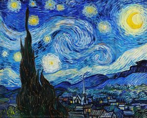 Starry Night (New York, MoMA) - vincent willem van gogh
Imagine standing before a swirling cosmos where the boundary between the heavens and the human soul dissolves into rhythmic motion. In 1889, amidst the quiet solitude of Saint-Paul-de-Mausole, Vincent van Gogh captured this celestial dance in Starry Night (New York, MoMA) by Vincent Willem van Gogh . This masterpiece earns its place among the top 10 artworks celebrated for their 'balanced' color intensity through a masterful tension between deep, nocturnal blues and the radiant, pulsating yellows of the stars and crescent moon.
The painting’s power lies in its tactile energy; the thick impasto brushstrokes create a physical landscape of light and shadow that feels alive under the eye. While the vibrant sky surges with cosmic unrest, the muted, grounded tones of the sleeping village provide a necessary visual anchor, preventing the intensity from becoming overwhelming. It is this precise equilibrium—the dance between turbulent movement and serene stillness—that makes the work so captivating. Today, bringing such a balanced palette into your home allows you to invite that same sense of awe and emotional depth into your personal sanctuary.
The Disintegration of Persistence of Memory, 1952-54 - Salvador Dalí
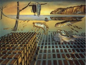 The Disintegration of Persistence of Memory, 1952-54 - Salvador Dalí
In The Disintegration of the Persistence of Memory by Salvador Dalí, a profound sense of stillness is anchored by a palette of earthy ochres and muted browns . These warm, grounded tones create a beautiful tension against the pale, ethereal blues of the distant horizon, achieving that rare, "balanced" color intensity that defines this masterpiece. It is a masterclass in using desaturated hues to evoke a mood of quiet prestige and melancholic reflection without overwhelming the senses.
This sophisticated interplay of light and shadow makes it a premier choice for those looking to curate a thoughtful atmosphere in a modern home. Imagine this piece as the focal point of a dining room or a study; its subdued, organic tones can harmonize perfectly with natural wood textures or neutral linens, bringing a sense of historical depth and intellectual calm to your space. By leaning into its soft, diffused lighting and stable color temperature, you can create an interior that feels both curated and incredibly soothing—a true sanctuary of style.
The Scream - Edvard Munch
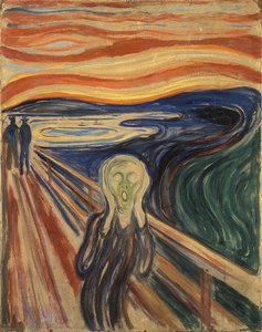 The Scream - Edvard Munch
Imagine standing on a windswept bridge as the sky suddenly erupts into a fever dream of fiery oranges and blood-red streaks. This is the visceral world of Edvard Munch’s The Scream , a masterpiece that captures a moment where the internal psyche meets an external tempest. While the subject matter explores profound existential anxiety, the painting is celebrated in our collection for its remarkably balanced color intensity . The way the searing, warm horizon clashes against the deep, melancholic blues of the fjord creates a visual tension that is both unsettling and hypnotic.
The thick, expressive brushstrokes and swirling textures invite you to feel the movement of the wind and the weight of the atmosphere. In a modern home, this piece acts as a powerful focal point; its bold, saturated palette can anchor a room, offering a sophisticated way to introduce drama and conversation. Whether you are drawn to its historical significance or its ability to transform a neutral space into a gallery of raw emotion, The Scream remains an unforgettable study in the harmony of contrasting tones.
The Birth Of Venus - Sandro Botticelli
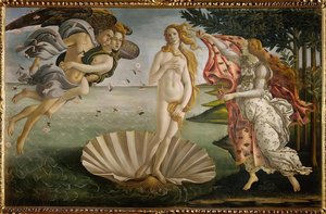 The Birth Of Venus - Sandro Botticelli
Imagine standing before a canvas where the air feels heavy with the scent of sea salt and spring blossoms. In this ethereal moment of divine arrival, we encounter The Birth of Venus by Sandro Botticelli . This masterpiece earns its place in our collection of balanced color intensity through its breathtakingly harmonious palette; there is no jarring contrast here, only a poetic equilibrium between warm and cool tones.
Botticelli masterfully balances the soft, luminous flesh tones of the goddess against the tranquil, pale blues and sea-foam greens of the Mediterranean. The gentle movement of Zephyrus’s breath is rendered through delicate, flowing lines and scattered rose petals that add rhythmic pops of color without overwhelming the eye. The light does not strike the scene with harshness but rather glows from within, much like a soft morning mist. This careful calibration of pigment creates a sense of profound serenity and grace. Even in a modern home, such a balanced interplay of light and hue possesses a unique power to soothe the spirit and transform a room into a sanctuary of classical elegance.
Olympia - Édouard Manet
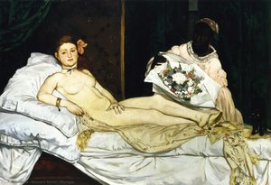 Olympia - Édouard Manet
In Olympia by Édouard Manet, the brilliance lies not in soft, ethereal glows, but in a daringly balanced play of light that strips away classical illusions. Manet masterfully utilizes a directional, almost stark illumination to define Olympia’s form, rejecting the traditional, smoky chiaroscuro for something much more immediate and modern. This command of light creates a striking contrast between the luminous, pale tones of the subject and the deep, velvety shadows of the room's textures.
This intentional use of high-contrast lighting is precisely why this masterpiece earns its place among the Top 10 Artworks Celebrated for Their 'Balanced' Color Intensity . The light doesn't just illuminate; it confronts, creating a rhythmic tension between the bright, crisp whites of the bedsheets and the rich, dark silhouettes of the background. When brought into a contemporary home through a high-quality oil reproduction, this sophisticated interplay of shadow and brilliance adds an incredible sense of architectural depth and luxury. It transforms a flat wall into a window of historical drama, offering a focal point that feels both bold and elegantly composed.
American Gothic - Grant Wood
 American Gothic - Grant Wood
What story does the somber, rolling landscape in American Gothic by Grant Wood tell? Beyond the stern gaze of the iconic figures, the background reveals a world of quiet resilience and midwestern stoicism. Emerging from the Great Depression, this 1930 masterpiece broke ground by rejecting European abstraction, choosing instead to celebrate a grounded, distinctly American identity through the lens of Regionalism.
The painting earns its place in our top ten for its masterful use of balanced color intensity . Rather than overwhelming the eye with vibrant hues, Wood employs a sophisticated palette of muted earth tones—deep browns, soft grays, and sage greens—that create a sense of profound stability. This controlled tonal range provides a calming, prestigious atmosphere that is perfect for modern interiors seeking a sense of history and permanence. For those decorating a study or a quiet reading nook, the painting offers a curated escape into a nostalgic era of dignity and strength. Its geometric precision and smooth, almost photographic textures bring a tactile, museum-quality depth to any room, making it much more than a portrait; it is an anchor of character.
Number 1, 1949 - Paul Jackson Pollock
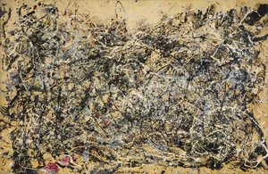 Number 1, 1949 - Paul Jackson Pollock
To stand before Number 1, 1949 is to witness a controlled explosion of pure emotion. Jackson Pollock’s masterpiece defies the traditional boundaries of a canvas, offering instead an immersive arena where the act of creation becomes the subject itself. While the "drip" technique often suggests chaos, this work earns its place among the top 10 artworks celebrated for their balanced color intensity through a sophisticated equilibrium of movement and tone.
The visual language is a rhythmic dance of blacks, ochres, and whites, punctuated by delicate, unexpected whispers of reddish-pink. This careful calibration prevents the dense, interlacing web of lines from becoming overwhelming; instead, it creates a sense of profound depth and atmospheric tension. In today’s modern interiors, where we seek pieces that evoke both energy and serenity, Pollock’s ability to balance raw, gestural spontaneity with a harmonious palette makes this work a timeless anchor for curated spaces. It remains a powerful cultural talking point, reminding us that even within the most complex layers of life, there is an underlying, beautiful order.
A Sunday Afternoon on the Island of La Grande Jatte - Georges Seurat
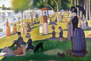 A Sunday Afternoon on the Island of La Grande Jatte - Georges Seurat
When you stand before A Sunday Afternoon on the Island of La Grande Jatte , you aren't just looking at a park scene; you are witnessing the moment light became a science. Georges Seurat didn’t simply paint illumination—he composed it . Through his revolutionary Pointillism, he used tiny, rhythmic dots of pure pigment to invent a luminous glow that seems to vibrate against the retina.
This masterpiece earns its place in our Top 10 for its unparalleled balanced color intensity . Seurat meticulously placed contrasting hues—soft greens, sun-drenched oranges, and cool blues—so that your eyes perform the final brushstroke, optically blending the colors into a seamless, shimmering atmosphere. The result is a serene, dreamlike equilibrium where no single shade overwhelms the other. It is a masterclass in harmony, offering a sense of structured peace that can transform any room. Whether you are drawn to the soft shadows or the vibrant, sun-lit grass, this painting invites you to slow down and rediscover the quiet magic of a summer afternoon.
Adoration of the Trinity (Landauer Altar) - Albrecht Dürer
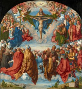 Adoration of the Trinity (Landauer Altar) - Albrecht Dürer
In Albrecht Dürer’s Adoration of the Trinity , we encounter a breathtaking masterclass in visual equilibrium. This monumental work transcends simple religious iconography, offering instead a profound meditation on cosmic order and human connection. What makes this piece a standout among the top 10 artworks celebrated for their balanced color intensity is Dürer’s ability to harmonize a vast, diverse cast of characters—from celestial angels to humble peasants—within a single, cohesive atmosphere.
The palette avoids overwhelming the viewer; instead, it utilizes a sophisticated interplay of luminous golds, deep architectural shadows, and soft, ethereal light that breathes life into the Nuremberg landscape. This careful calibration of pigment creates a sense of serene authority , where no single hue dominates, yet every color contributes to a rhythmic, symphonic whole. In today’s modern interiors, this level of chromatic stability offers a timeless way to introduce masterpiece-level depth and a calming, sophisticated mood, proving that true balance is the ultimate luxury in art curation.
Conclusion
As the light fades on our journey through these balanced masterpieces, we are reminded that these works are far more than mere historical treasures tucked away in silent galleries; they are living, breathing presences. The delicate equilibrium of color and intensity found in each of these ten paintings possesses a unique power to anchor a room, offering a sense of serenity and intentionality that transcends time. They continue to move hearts and shape the very atmosphere of our most cherished spaces, proving that true beauty lies in the harmony between strength and subtlety.
At ArtsDot.com , we believe that every interior deserves this kind of soulful connection. Whether you are an interior designer curating a boutique hotel, an architect breathing life into a luxury villa, or a homeowner seeking to create a refined sanctuary, we serve as your dedicated creative partner. We specialize in turning ambitious design visions into artistic statements through our museum-quality, hand-painted reproductions and bespoke custom collections. From the initial spark of inspiration to seeing a digital mockup of a masterpiece perfectly placed on your wall, we are here to help you bridge the gap between historical wonder and modern living.
We invite you to continue your discovery and find the perfect tonal companion for your next project by exploring our full collection . Let us help you transform your walls into a canvas of timeless elegance, where every brushstroke tells a story of balance, beauty, and enduring grace.