Defining Neoplasticism: The Principles of De Stijl and Universal Order
To understand the profound impact of Neoplasticism on modern spatial design, one must first look beyond the surface of its bold lines to the spiritualized world order it sought to establish. Emerging from the Netherlands in the early twentieth century, the De Stijl movement—led by visionaries such as Piet Mondrian and Theo van Does.Doesburg—was far more than a mere aesthetic preference for straight lines. It was a rigorous philosophical pursuit of universal harmony. In the wake of the chaos brought by World War I, these artists sought to strip away the subjective, emotional excesses of individual expression in favor of an objective, mathematical clarity. By reducing art to its most fundamental components, they aimed to create a visual language that transcended national and personal boundaries, offering a sense of stability and equilibrium through pure abstraction.
This pursuit of order was rooted in the belief that true beauty resides in the balance of opposing forces. In Neoplasticism, this is achieved through the careful tension between vertical and horizontal axes, creating a grid that feels both infinite and contained. For the modern designer, this principle offers a blueprint for creating environments that feel structured yet breathable. The movement’s rejection of the decorative in favor of the essential allows for an architecture of thought, where every element serves a purpose within a larger, cohesive whole. It is this very sense of unshakeable balance that makes Neoplasticism such a potent tool for defining the atmosphere of high-end, contemporary commercial spaces.
The Visual Language: Primary Colors and Geometric Precision in Modern Spaces
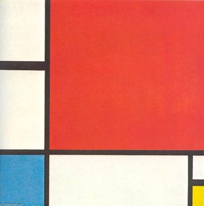
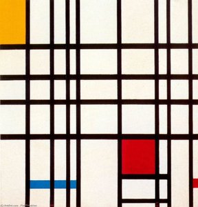
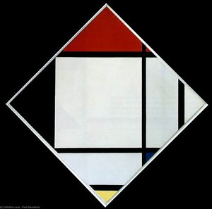
The palette of Neoplasticism is famously disciplined, utilizing a restricted vocabulary of primary colors—red, yellow, and blue—complemented by the non-colors of white, black, and grey. This intentional limitation is not a lack of creativity, but rather a concentration of power. When these pure pigments are placed within a framework of precise geometric forms, they create a rhythmic visual vibration that commands attention without overwhelming the viewer. In a professional interior setting, this allows for a controlled use of color that can guide the eye through a lobby or dining hall, creating focal points that feel integrated into the very structure of the room.
Beyond the color itself, the movement relies on the interplay of weight and space. A large block of saturated red carries a different psychological mass than a slender yellow line, yet when balanced correctly against a black contour, they achieve a state of dynamic equilibrium. This precision is particularly effective in modern hospitality design, where the goal is often to balance high-impact visual statements with an underlying sense of calm and sophistication. By utilizing these fundamental elements, designers can evoke a sense of timelessness, as the works do not rely on fleeting trends but on the eternal logic of geometry and light.
From Canvas to Corridor: Integrating Abstract Geometry into Hospitality Interiors
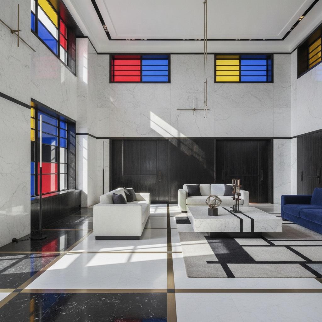
Integrating Neoplasticist principles into hospitality interiors requires a sophisticated understanding of how two-dimensional abstraction interacts with three-dimensional architecture. The movement was never intended to be confined to a frame; its proponents envisioned the ideal fusion of form and function, influencing everything from typography to industrial design and the International Style of architecture. For a hotel designer, this means that an abstract painting is not merely an accessory but a structural component of the interior narrative. The clean lines of a Mondrian-inspired composition can echo the linear motifs of modern furniture, window mullions, and floor patterns, creating a seamless transition from the art to the built environment.
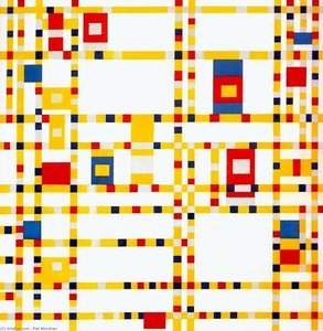
When implementing these works in corridors or transitional spaces, the geometry of the art can be used to manipulate the perception of scale. A series of works featuring intersecting black lines can elongate a hallway, while more densely colored compositions can add warmth and intimacy to smaller lounge areas. The challenge lies in maintaining the mathematical integrity of the style; the art must feel as though it is an extension of the room's architectural DNA. When executed with precision, the presence of Neoplasticist-inspired art elevates a space from a mere functional area to a curated experience of modern elegance.
Strategic Implementation: Using Multi-Panel Compositions for Large-Scale Hotel Walls
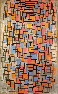
One of the most effective ways to utilize the power of De Stijl in large-scale projects is through the use of multi-panel or polyptych compositions. In grand hotel lobbies or expansive dining rooms, a single, standard-sized canvas often lacks the necessary presence to anchor the space. However, by splitting a complex geometric composition across three, four, or even five panels, a designer can create a multi-panel trend that mirrors the architectural scale of the wall itself. This approach allows the artwork to breathe, spreading the visual weight across a wider area and creating a sense of movement as the viewer walks past.
This technique is particularly useful for covering large, uninterrupted surfaces such as staircases or feature walls. The continuity of color and line across separate canvases ensures that the cohesive, modern architectural look is maintained, preventing the art from feeling like a disconnected afterthought. Furthermore, multi-panel arrangements offer a unique opportunity to play with depth; by slightly staggering the panels or using varying depths of canvas wrap, a designer can introduce a subtle three-dimensional quality that interacts with the ambient lighting of the hotel, adding layers of complexity to the visual experience.
Curating the Collection: Sourcing High-Quality Reproductions for Professional Projects
For procurement managers and designers working under tight timelines and budgets, the challenge is finding art that meets museum-grade standards without the logistical complications of sourcing originals. The key lies in identifying reliable suppliers who specialize in hand-painted oil reproductions. Unlike mass-produced prints, which can lack the necessary texture and tonal depth required for luxury environments, a true oil reproduction offers the visible brushstrokes and impasto textures that provide the "soul" of the piece. This tactile quality is essential when the art is intended to be viewed in close proximity within premium guest suites or executive lounges.
When managing large-scale orders, professional reliability is paramount. A trusted partner should offer a streamlined process—from digital mockups that allow you to visualize the art on your specific wall to efficient, tracked shipping via DHL or FedEx. For hospitality chains requiring consistent branding across multiple locations, the ability to re-order standard sizes and receive VAT-compliant documentation is critical for operational efficiency. By focusing on high-quality, hand-made reproductions, designers can achieve a sophisticated, curated aesthetic that stands the test of time, ensuring that every corner of their property reflects a commitment to excellence and artistic integrity.
For professional art procurement, custom sizing, and expert consultation, visit ArtsDot.com.