The Enduring Appeal of Classic Interiors: Why Abstract Art Complements Timeless Design
 Harmonizing Eras: Classical & Modern Art for Timeless Interiors
Explore the art of blending classical & modern aesthetics for timeless interiors. Discover key artists, design tips, and expert guidance from .
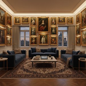
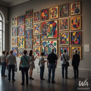
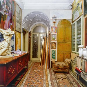
There’s a reason why the hallmarks of classic interior design – symmetry, refined materials, and a sense of historical continuity – continue to captivate us. These spaces speak to a desire for order, beauty, and a connection to enduring traditions. Yet, within this established elegance lies an opportunity for something unexpected: the dynamic energy of abstract art. For centuries, interiors have been curated as reflections of status and taste; today, they are increasingly becoming expressions of individual personality. Abstract art offers precisely that – a means of injecting unique character into time-honored designs without sacrificing their inherent sophistication. It’s a conversation between eras, a subtle rebellion against the predictable, and a testament to the evolving nature of beauty itself.
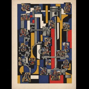
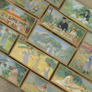
The roots of this harmonious pairing lie in understanding the historical trajectory of art. While classical aesthetics prioritized representation – capturing likenesses and narratives with meticulous detail – the 19th century witnessed a growing dissatisfaction with purely mimetic approaches. Artists began to explore the power of color, form, and texture as independent elements, paving the way for movements like Impressionism, Expressionism, and ultimately, Abstract art. This wasn’t merely a rejection of tradition; it was an expansion of its boundaries. The desire to convey emotion, spirituality, and the very essence of perception led artists to dismantle conventional forms and embrace abstraction. Consider Wassily Kandinsky's pioneering work – his canvases weren’t depictions *of* anything, but rather expressions *through* color and line, resonating with a deeper, more intuitive understanding of the world. This shift in artistic philosophy is precisely what makes abstract art so adaptable to classic interiors; it doesn’t compete with existing narratives, but adds another layer of complexity and intrigue.
Decoding Juxtaposition: Harmonizing Contrasting Styles for Visual Impact
Juxtaposition is an act or instance of placing two opposing elements close together or side by side. This is often done in order to compare/contrast the two, to show similarities or differences, etc. == Speech == Juxtaposition in literary terms is ...
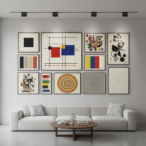
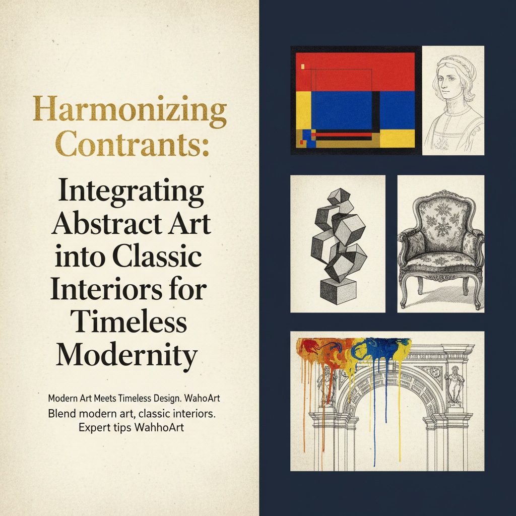
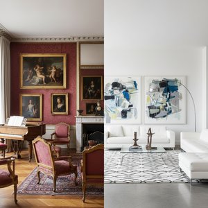
The successful integration of abstract art isn't about simply placing a modern painting on a traditional wall. It’s about the artful application of juxtaposition – the deliberate pairing of contrasting elements to create visual tension and spark interest. This is where the true artistry lies, transforming what could be a discordant clash into a compelling dialogue. Think of an ornate Louis XV console table adorned with a boldly colored geometric abstract sculpture. The contrast in styles—the delicate curves of the furniture versus the sharp angles of the art—immediately draws the eye. It’s a conversation starter, a visual paradox that elevates both pieces.
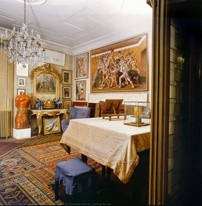
However, effective juxtaposition requires careful consideration. Too much contrast can feel jarring and chaotic, while too little results in an uninspired aesthetic. The key is to find common threads – shared colors, textures, or themes – that tie the disparate elements together. Perhaps a painting with subtle gold accents echoes the gilded details of antique furniture, or a sculpture crafted from natural materials complements classic interiors featuring wood paneling and stone floors. Beyond visual harmony, consider the emotional impact you want to create. A vibrant abstract piece can inject energy into a formal space, while a more subdued composition can offer a calming counterpoint. The goal isn’t to erase the differences between styles, but to celebrate them – to highlight their individual qualities through deliberate contrast.
Color & Texture Alchemy: Selecting Abstracts That Enhance Your Existing Palette
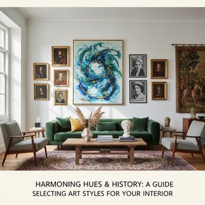 Harmonizing Hues & History: A Guide to Selecting Art Styles for Your Interior
Elevate your interior design with our expert guide to art styles. Discover how to select artwork that harmonizes with your space, from classic movements to custom creations. – quality reproductions & professional advice.
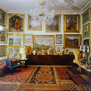
Classic interiors often rely on established color palettes—warm neutrals like creams and beiges, rich jewel tones such as ruby red and sapphire blue, or muted earth tones inspired by nature. When introducing abstract art into these spaces, the selection of colors is paramount. A monochromatic abstract painting in shades of gray or cream offers a subtle yet sophisticated contrast, allowing classic furnishings to take center stage. Alternatively, you can introduce pops of color that echo existing accents—perhaps picking up on the hues of upholstery, rugs, or decorative objects. For instance, an abstract work with hints of ruby red will beautifully complement a room featuring antique velvet chairs in a similar tone.
But it’s not just about matching colors; it's about understanding their psychological impact. Warm colors evoke energy and excitement, while cool colors convey tranquility and relaxation. Consider also the texture of the artwork. Classic interiors frequently feature materials like silk, velvet, wood, and marble—all known for their refined textures. Introducing an abstract painting with a contrasting texture can add depth and dimension to the room. Heavily textured abstracts, created using impasto techniques or mixed media, invite tactile exploration and provide a welcome contrast to smooth surfaces. The interplay between texture and light is also crucial; a textured surface will reflect light in different ways than a polished one, creating dynamic shadows and highlights.
Scale and Proportion: Finding the Right Size Abstract for Your Space
The scale of an abstract artwork significantly impacts its presence within a classic interior. Choosing the right size is critical to achieving balance and visual harmony. In general, larger-scale abstracts work best in rooms with high ceilings and ample space. A large painting can become the focal point of the room, instantly modernizing the aesthetic without overwhelming it. However, avoid choosing a piece that’s too large for the space, as this can create a claustrophobic effect.
Conversely, smaller abstracts are ideal for accentuating vignettes or gallery walls. These pieces add visual interest without dominating the room. Consider also the proportions of the artwork in relation to existing furnishings. A long, horizontal painting might complement a low-slung sofa, while a tall, vertical painting can draw the eye upwards and create a sense of height. When in doubt, err on the side of larger rather than smaller; a slightly oversized abstract painting is often more impactful than one that’s too small for the space. The goal is to create a visual balance—to ensure that the artwork complements the existing furnishings without overpowering them.
Framing the Narrative: Elevating Abstract Art Within a Classic Setting
Framing is an often-overlooked element of interior design, yet it plays a crucial role in enhancing the overall aesthetic. When integrating abstract art into classic interiors, careful framing can elevate the artwork and complement existing furnishings. Classic interiors typically feature ornate frames—gilded wood, intricate carvings, or rich moldings. When selecting a frame for an abstract painting, consider whether you want to match or contrast this style.
A traditional frame can add a touch of formality and elegance to a modern abstract piece, while a minimalist frame can create a more contemporary look. However, avoid choosing a frame that’s too ornate or distracting, as this can detract from the artwork itself. Consider also the color of the frame; a gold frame can complement warm-toned abstracts, while a silver frame can enhance cool-toned pieces. Alternatively, you can opt for a neutral frame—black, white, or gray—to allow the artwork to take center stage. Ultimately, the goal is to choose a frame that complements both the abstract painting and the existing aesthetic of the classic interior.
Beyond Reproduction: Commissioning Custom Abstracts to Perfectly Suit Your Vision
At ArtsDot.com, we believe that art should be as unique as the spaces it inhabits. While our curated collection of museum-quality reproductions offers a stunning array of options, we also specialize in custom creations—allowing you to transform your vision into reality. Whether you have a specific color palette in mind, a desired size or format, or even a personal photograph you’d like to reimagine as an abstract painting, our skilled artists can bring your ideas to life. This is particularly valuable when working with classic interiors, where finding artwork that perfectly complements existing furnishings can be challenging.
Our custom photo-to-painting service allows you to upload a cherished memory and have it transformed into a unique abstract masterpiece. You’ll work directly with our artists throughout the process, providing feedback on color choices, composition, and style. We offer digital mockups for approval before painting begins, ensuring that the final piece meets your exact specifications. With ArtsDot.com, you're not just purchasing artwork; you're investing in a personalized experience—a testament to your individual taste and a celebration of enduring beauty.