 Preview
 Send
Send Share
Share
 Details

 Download
 Similars
 X-Ray
X-Ray Diaporama
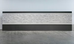
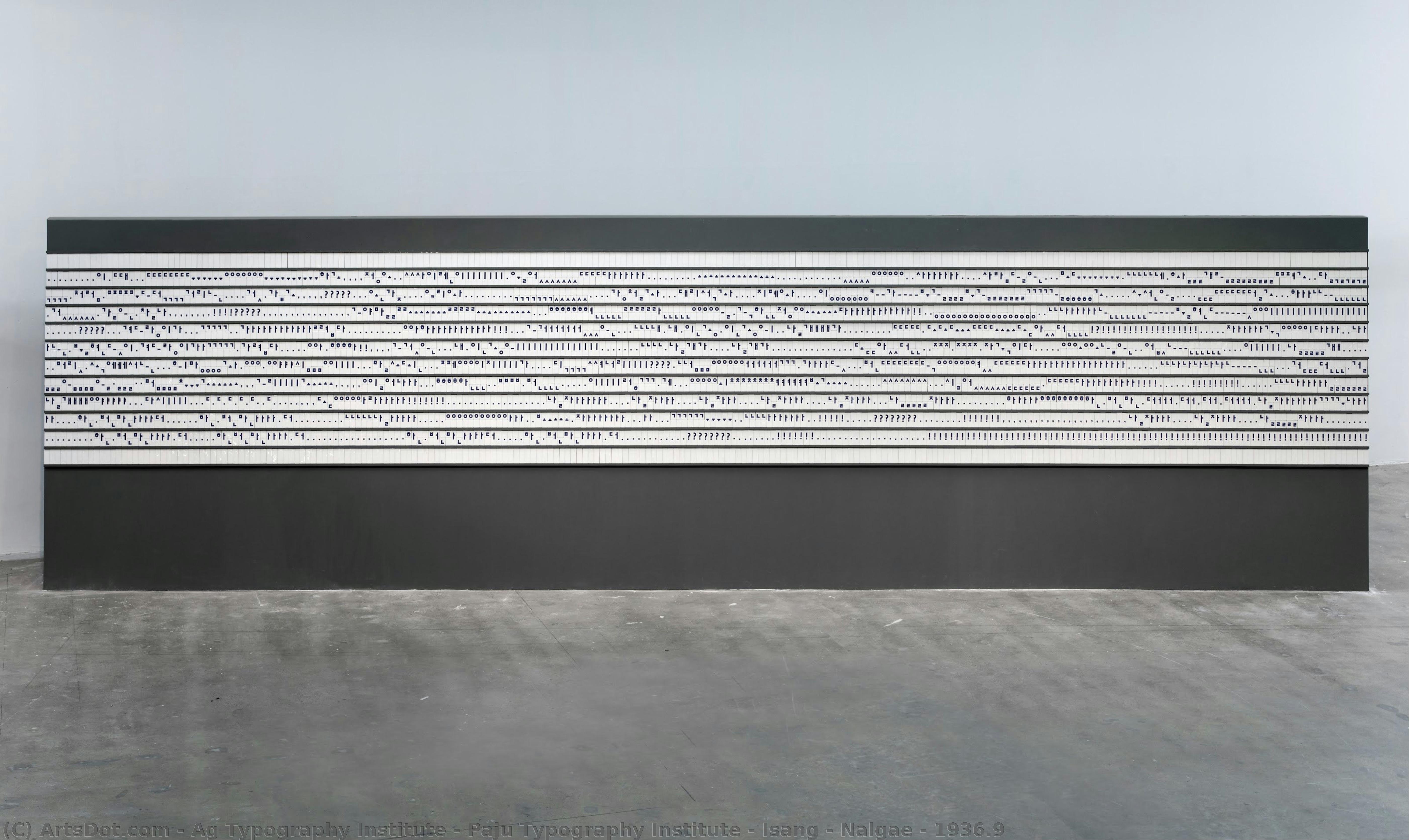
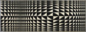
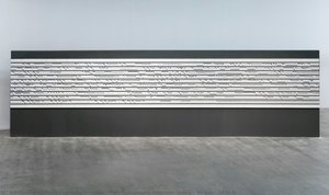
Isang - Nalgae - 1936.9
 2019
2019 900.0 x 243.0 cm
 Gwangju Design Biennale
 Read More
Hand Made Oil Reproduction
Hand-painted oil on canvas in your size and frame, made to order by our artists. ( Buy Print Buy Image)
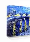
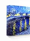

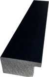

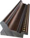
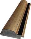

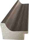
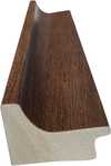
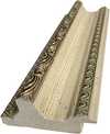
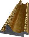
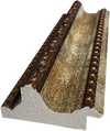
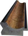

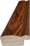
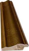

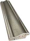
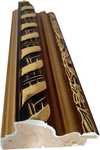


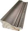
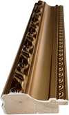


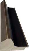

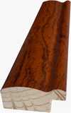
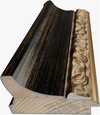

Pick from our preset sizes that match the artwork's original proportions.

You may enter your own dimensions to fit a specific frame or space. If your selected size does not match the original image's proportions, we will either crop the artwork or extend the painting with additional hand-painted elements. A digital mockup will be sent for your approval before production begins.
Please note that the on-screen preview does not reflect the actual cropping or extension. Only the mockup will accurately show the final composition.
While custom sizes are available, we recommend selecting a dimension from the predefined list to preserve the original proportions.
After order, ArtsDot.com team will email client for instructions and provide a mockup preview
Worldwide Delivery () in 3/4 weeks instead of standard 5 weeks. (23 August). No compromise on quality.

Free Worldwide Express Shipping

High-Quality Linen Canvas

Full Shipping Insurance

Customs Tax Refund Guarantee

True Color Matching Guarantee

60-Day Return Policy (Defects Only)

100% Money-Back Guarantee

Bulk Discount Offer
 Glass option is only available in size under 110 CM

Isang - Nalgae - 1936.9
Reproduction Medium
Reproduction Size
-


Total Price
$ 263
Artwork Description
Related Artworks
Artist Biography
The Collaborative Vision of Ag Typography Institute & Paju Typography Institute
The Ag Typography Institute and the Paju Typography Institute, while distinct entities geographically and in their specific focuses, represent a fascinating convergence of artistic practice and educational philosophy within the realm of contemporary typography. To speak of them as a single “artist” is unconventional, yet it accurately reflects the collaborative spirit that defines their most impactful work – projects born from shared workshops, exhibitions, and a mutual dedication to pushing the boundaries of letterform design. Their story isn’t one of individual genius but rather of institutional synergy, demonstrating how collective exploration can yield innovative results. Founded in Seoul, South Korea (Ag Typography Institute) and Paju Book City (Paju Typography Institute), both institutions emerged from a growing recognition of typography not merely as a technical skill, but as a vital art form capable of shaping visual culture and intellectual discourse.Roots in Korean Tradition & Global Dialogue
The foundations of this collaborative approach lie deeply embedded within the rich artistic traditions of Korea. Historically, calligraphy held immense cultural significance, extending beyond simple communication to embody spiritual expression and philosophical ideals. While Western typography gained prominence with the advent of printing technology, a reverence for hand-drawn letterforms persisted in Korean art. The Ag Typography Institute consciously sought to bridge this gap – to integrate the precision and aesthetic sensibilities of traditional calligraphy with the possibilities offered by modern type design. This wasn’t simply about replicating historical styles; it was about understanding the underlying principles of balance, rhythm, and spatial harmony that informed them. The Paju Typography Institute, established within a city dedicated to publishing and artistic creation, further amplified this dialogue. Its location fostered an environment where typography was viewed not in isolation but as integral to the broader context of bookmaking, illustration, and literary expression. Early workshops between the two institutes focused on exploring Korean typefaces – both historical and contemporary – analyzing their strengths and weaknesses, and identifying opportunities for revitalization. This initial phase laid the groundwork for a more ambitious program of collaborative projects that would soon garner international attention.Experimental Type & Interdisciplinary Exploration
The hallmark of work emerging from Ag Typography Institute & Paju Typography Institute is its experimental nature. They actively challenge conventional notions of legibility and functionality, often prioritizing aesthetic impact and conceptual depth over strict adherence to established typographic norms. This manifests in a variety of ways: the creation of highly stylized typefaces inspired by Korean brushstrokes; the exploration of three-dimensional letterforms that blur the line between sculpture and design; and the integration of typography with other artistic mediums such as painting, photography, and digital animation. A key element is their embrace of interdisciplinary collaboration. They frequently partner with artists from diverse fields – poets, musicians, dancers – to create works where typography serves as a catalyst for new forms of expression. For example, one notable project involved designing a typeface specifically tailored to the rhythmic patterns of Korean poetry, resulting in a visual and auditory experience that transcended traditional reading. Another initiative saw them collaborate with architects to incorporate custom-designed typefaces into building facades, transforming urban spaces into dynamic typographic landscapes. This willingness to venture beyond the confines of conventional design practice has been instrumental in establishing their unique artistic identity.Impact & Historical Significance
The collaborative efforts of Ag Typography Institute and Paju Typography Institute have had a profound impact on contemporary typography, both within Korea and internationally. They’ve played a pivotal role in elevating the status of Korean type design, showcasing its unique aesthetic qualities to a global audience. Their work has been exhibited at prestigious venues worldwide, including the Type Directors Club in New York and numerous international book fairs. More importantly, they have inspired a new generation of typographers and designers to embrace experimentation, interdisciplinary collaboration, and a deeper understanding of cultural context.- Their emphasis on integrating traditional Korean artistic principles into modern type design has fostered a renewed appreciation for the country’s rich visual heritage.
- They have demonstrated the power of typography as a tool for social commentary and intellectual discourse, using letterforms to explore themes of identity, memory, and cultural change.
- Their collaborative approach has challenged conventional notions of authorship and artistic practice, highlighting the benefits of collective exploration.
Quick Facts
- Artistic Movement Or Style: Typography
- Date Of Death: Living
- Full Name: Ag Typography Institute + Paju Typography Institute