 Preview
 Send
Send Share
Share
 Details

 Download
 Similars
 X-Ray
X-Ray Diaporama
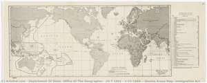
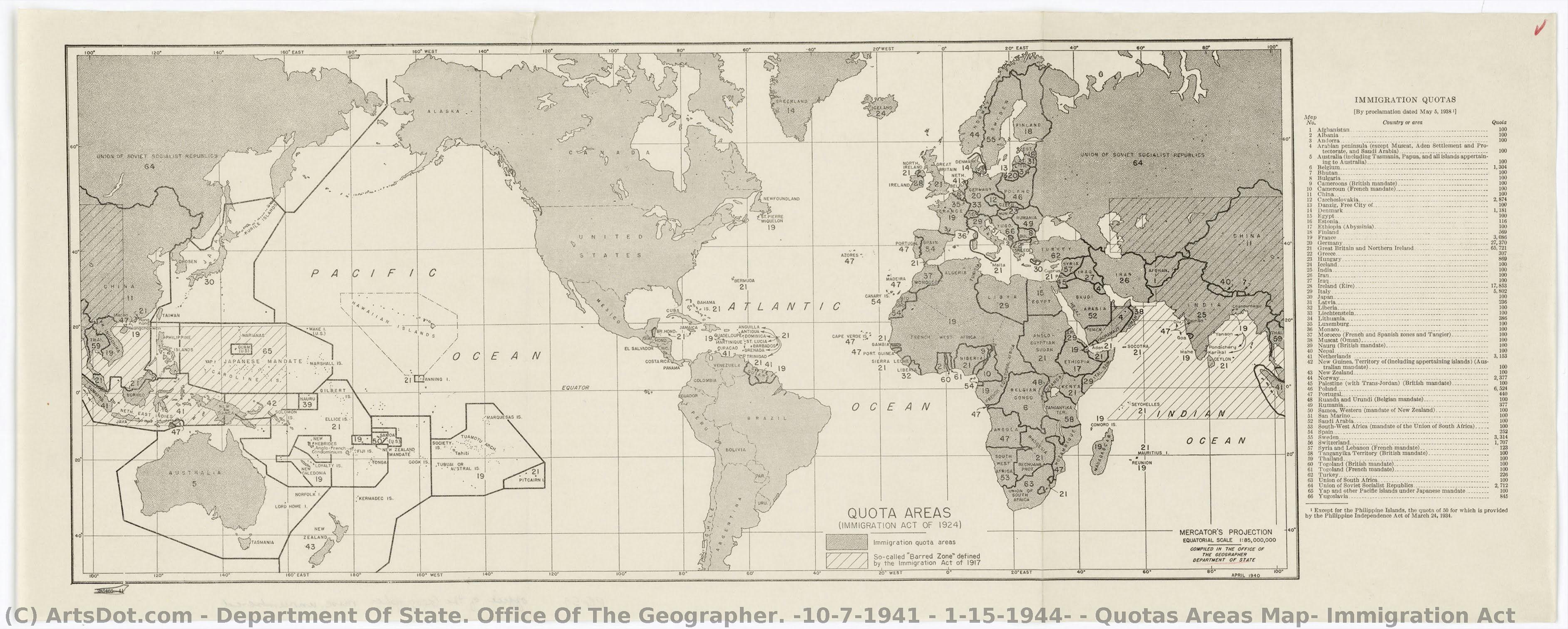
Quotas Areas Map, Immigration Act


 Read More
Giclée / Art Print
Museum-quality giclée or canvas print with fast production and flexible finish options. ( Buy Hand Made Painting Buy Image)




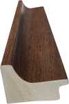
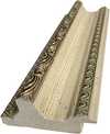
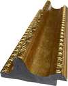
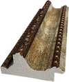
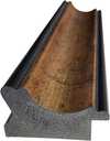

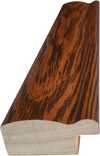
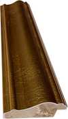

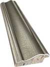
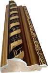


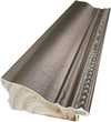
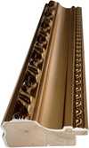

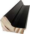
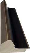
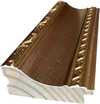
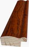
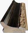





Pick from our preset sizes that match the artwork's original proportions.

You may enter your own dimensions to fit a specific frame or space. If your selected size does not match the original image's proportions, we will either crop the artwork or extend the image with a mirrored or solid-fill edge. A digital mockup will be sent for your approval before production begins.
Please note that the on-screen preview does not reflect the actual cropping or extension. Only the mockup will accurately show the final composition.
While custom sizes are available, we recommend selecting a dimension from the predefined list to preserve the original proportions.
Worldwide Delivery () in 2 weeks instead of standard 4/5 weeks. (7 September)

Free Worldwide Express Shipping

High-Quality Linen Canvas

Full Shipping Insurance

Customs Tax Refund Guarantee

True Color Matching Guarantee

100-Day Return Policy (Defects Only)

100% Money-Back Guarantee

Bulk Discount Offer
 Glass option is only available in size under 110 CM

Quotas Areas Map, Immigration Act
Giclée / Art Print
Reproduction Size
-


Total Price
$ 63
Related Artworks






Artist Biography
A Cartographic Echo of Policy: The Department of State’s Office of the Geographer (1941-1944)
The Department of State's Office of the Geographer, active from October 7, 1941, to January 15, 1944, represents a fascinating and somewhat unusual entity in the landscape of American art. It wasn’t a collective of individual artists pursuing personal expression, but rather a governmental bureau tasked with visually representing complex geopolitical realities during a period of immense global upheaval – the Second World War. This office existed not to create beauty for its own sake, but to serve as an instrument of policy, translating data and strategic concerns into maps that informed decision-making at the highest levels. Its brief existence, coinciding almost perfectly with America’s direct involvement in the war, makes its output a unique historical artifact, revealing much about the nation's anxieties, priorities, and evolving understanding of the world.The Context of Creation: War and Information
The formation of the Office of the Geographer was directly linked to the escalating international tensions of the late 1930s and early 1940s. As war spread across Europe and Asia, the U.S. government recognized a critical need for accurate and readily accessible geographic information. Prior to this office, such work was scattered across various departments, leading to inefficiencies and potential inconsistencies. The creation of a centralized unit within the State Department aimed to streamline map production and analysis, providing policymakers with a clear visual understanding of global events. This wasn’t simply about pinpointing locations; it was about visualizing strategic vulnerabilities, resource distribution, population movements, and the complex web of international relationships. The office's mandate extended beyond traditional cartography, encompassing demographic studies, economic analyses, and even projections of potential conflict zones. The attack on Pearl Harbor in December 1941 undoubtedly accelerated the office’s work, transforming it into a vital component of the war effort.Mapping Immigration: A Case Study in Visual Policy
While the Office produced maps covering a vast range of topics – troop deployments, trade routes, resource availability – one particularly revealing example of its work is the “Quotas Areas Map, Immigration Act.” This map, created to illustrate the origins of immigrants entering the United States under the provisions of the 1924 Immigration Act, offers a stark visual representation of national biases and anxieties. The map doesn’t simply show where people were coming from; it highlights the areas subject to strict quotas, effectively visualizing discriminatory immigration policies based on nationality. The use of color-coding and shading subtly reinforces existing prejudices, presenting a geographic distribution that implicitly justifies restrictive measures. This isn't neutral cartography; it’s a deliberate attempt to shape public perception and legitimize exclusionary practices. The map serves as a powerful reminder of how seemingly objective visual representations can be deeply embedded in political agendas.Techniques and Influences: From Traditional Cartography to Data Visualization
The Office of the Geographer drew upon established traditions of cartography, employing skilled draftsmen and utilizing techniques honed over centuries. However, its work also foreshadowed the rise of modern data visualization. The need to convey complex information quickly and effectively led to experimentation with new graphic forms – thematic maps, statistical charts integrated into geographic representations, and simplified diagrams designed for rapid comprehension. The influence of social science research is evident in many of their products, particularly those dealing with population demographics and economic trends. While the aesthetic qualities of these maps were often secondary to their informational purpose, a degree of visual clarity and precision was essential. The office’s cartographers weren't merely copying existing data; they were actively interpreting it and translating it into a form that could be readily understood by policymakers lacking specialized geographic expertise.Legacy and Historical Significance
The Office of the Geographer was disbanded in January 1944, its immediate wartime purpose fulfilled. However, its legacy extends far beyond the maps it produced during those brief two years. It demonstrated the crucial role that visual information could play in shaping foreign policy and national security strategies. The office’s emphasis on centralized data collection and analysis paved the way for the creation of more sophisticated intelligence agencies, such as the Central Intelligence Agency, established shortly after the war. Furthermore, its work serves as a cautionary tale about the potential for maps to be used as instruments of propaganda and social control. The “Quotas Areas Map,” in particular, remains a potent symbol of discriminatory immigration policies and the dangers of visualizing prejudice. Today, these maps offer valuable insights into the complex relationship between geography, politics, and power during one of the most transformative periods in modern history.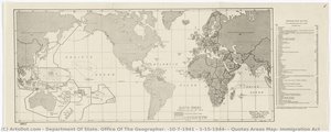
Quick Facts
- Date Of Birth: 10/7/1941
- Date Of Death: 1/15/1944
- Full Name: Department Of State. Office Of The Geographer.
- Notable Artworks: ['Quotas Areas Map, Immigration Act']