 Preview
 Send
Send Share
Share
 Details

 Download
 Similars
 X-Ray
X-Ray Diaporama
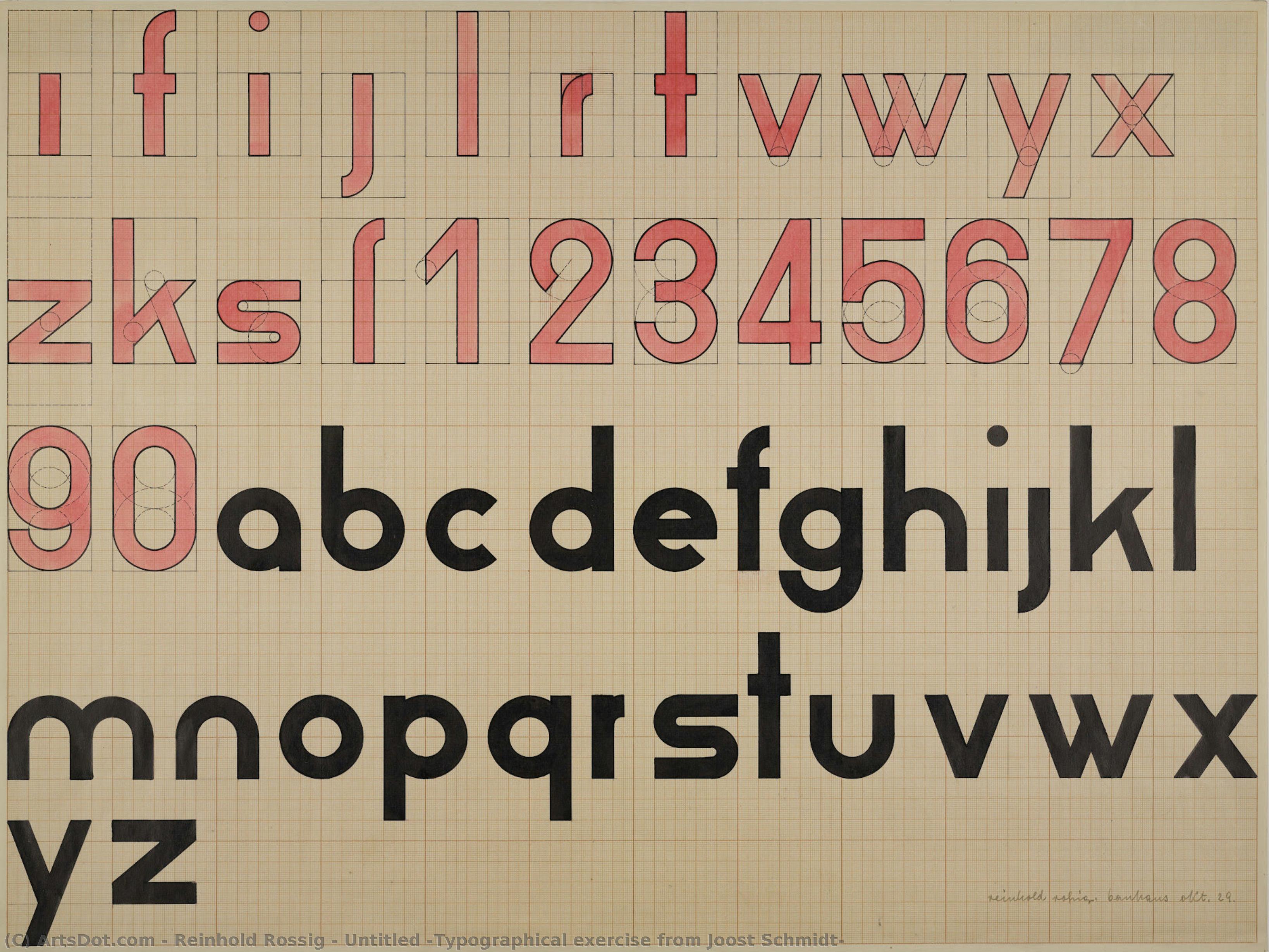
Untitled (Typographical exercise from Joost Schmidt
 Painting
- Bauhaus
 1929
1929- Modern
 45.0 x 61.0 cm
 Bauhaus Dessau Foundation
 Read More
Purchase a high-resolution, enhanced digital image, far superior to the online preview.
Each file is meticulously prepared by our in-house specialists using advanced tools and expert manual retouching. We ensure every image has exceptional clarity, precise color accuracy, and fine detail.
The final file is delivered via email within 72 hours, optimized for immediate use in professional, editorial, and print environments. This is the same quality trusted by top-tier design studios, publishers, and galleries.
Digital Image
Download a high-resolution file for personal display, printing, and creative projects. ( Buy Print Buy Hand Made Painting)
Included in Every Digital Image Order
Expert Digital Delivery, Guaranteed
When you choose ArtsDot.com, you're not just getting an image - you're receiving a professionally enhanced digital artwork, crafted with precision and backed by a satisfaction guarantee. Here's everything that comes with your order, automatically:

Fast Email Delivery
Your high-resolution digital image file will be emailed to you within 72 hours of ordering - ready for immediate use.

AI-Enhanced Digital File
Your artwork is professionally optimized using advanced AI tools and manual editing, ensuring maximum detail, clarity, and color accuracy.

Free Lifetime Re-Delivery
Accidentally deleted or lost your file? No worries - we'll resend it to you anytime, free of charge.

No Import Fees - Ever
Enjoy your artwork instantly with zero customs, duties, or delivery fees - digital downloads are always tax-free.

Color Accuracy Guarantee
We ensure your digital image reflects the original colors as closely as possible using professional tools and color management.

60-Day Satisfaction Guarantee
If you're not satisfied with your digital image, we'll revise it or refund 100% within 60 days - no questions asked.

100% Money-Back Guarantee
Not satisfied? Get a full refund within 60 days of receiving your digital file - no questions asked.

Bulk Order Discounts
Buy 3 images, save 10% - Buy 5, save 15% - Buy 10+, save 20%. Great for creative projects, galleries, and agencies.
Collectible Description
A Symphony of Structure: Decoding the Typographical Exercise
In the realm of early twentieth-century graphic experimentation, few works capture the rhythmic precision of the Bauhaus era quite like Untitled (Typographical exercise from Joost Schmidt). This striking piece, captured through the lens of Reinhold Rossig, serves as a profound meditation on the intersection of language and visual architecture. At first glance, the viewer is met with a disciplined arrangement of the alphabet, where each character is granted its own stage, meticulously placed in rows that evoke the organized pulse of a modern machine. The interplay between the bold red and deep black pigments creates a high-contrast dialogue, transforming mere letters into sculptural elements that command the eye to dance across the canvas.
, , - ,
, , .
- No Markdown, no asterisks.
- Content: Subject, style, technique, historical context, symbolism, emotional impact.
- Target audience: Art lovers, collectors, interior designers.
Structure plan:
Section 1 (H2): The visual essence and composition.
Section 2 (H2): Historical context and the spirit of typography/Bauhaus influence.
Section 3 (H2): Aesthetic value for modern interiors and collecting.
The technique employed here is a masterclass in minimalist impact. By stripping away the superfluous, the artist focuses on the raw geometry of form. The presence of a numbering system interlaced within the typographic grid suggests a deeper layer of meaning—perhaps an attempt to quantify the infinite possibilities of communication or to map the very DNA of language itself. This systematic approach creates a sense of profound order, yet there is an underlying tension in the starkness of the composition that keeps the viewer perpetually engaged, searching for the hidden rhythm within the rows.
The Legacy of Precision and Modernist Thought
To understand this work is to touch the heartbeat of 1929, a period defined by a radical reimagining of how humans interact with information. While the piece is attributed to the hand of Reinhold Rossig, it pays homage to the revolutionary typographical spirit of Joost Schmidt. The composition breathes the air of the Bauhaus movement, where the boundary between fine art and functional design was intentionally blurred. Every stroke and every placement reflects a commitment to clarity, efficiency, and the beauty of industrial logic. It is not merely an alphabet; it is a blueprint for a new visual language, one that seeks to find harmony in the structured chaos of the modern age.
The emotional resonance of the piece lies in its ability to evoke both stability and curiosity. For the collector, it represents a window into a transformative era of German art history. For the interior designer, it offers a sophisticated focal point that brings a sense of intellectual rigor and avant-garde elegance to any space. Whether placed in a minimalist contemporary gallery or a classic study, this reproduction serves as a timeless testament to the power of graphic discipline, inviting anyone who gazes upon it to find beauty in the most fundamental building blocks of our shared communication.
, , . - No Markdown, no asterisks. - Content: Subject, style, technique, historical context, symbolism, emotional impact. - Target audience: Art lovers, collectors, interior designers. Structure plan: Section 1 (H2): The visual essence and composition. Section 2 (H2): Historical context and the spirit of typography/Bauhaus influence. Section 3 (H2): Aesthetic value for modern interiors and collecting.
The technique employed here is a masterclass in minimalist impact. By stripping away the superfluous, the artist focuses on the raw geometry of form. The presence of a numbering system interlaced within the typographic grid suggests a deeper layer of meaning—perhaps an attempt to quantify the infinite possibilities of communication or to map the very DNA of language itself. This systematic approach creates a sense of profound order, yet there is an underlying tension in the starkness of the composition that keeps the viewer perpetually engaged, searching for the hidden rhythm within the rows.
The Legacy of Precision and Modernist Thought
To understand this work is to touch the heartbeat of 1929, a period defined by a radical reimagining of how humans interact with information. While the piece is attributed to the hand of Reinhold Rossig, it pays homage to the revolutionary typographical spirit of Joost Schmidt. The composition breathes the air of the Bauhaus movement, where the boundary between fine art and functional design was intentionally blurred. Every stroke and every placement reflects a commitment to clarity, efficiency, and the beauty of industrial logic. It is not merely an alphabet; it is a blueprint for a new visual language, one that seeks to find harmony in the structured chaos of the modern age.
The emotional resonance of the piece lies in its ability to evoke both stability and curiosity. For the collector, it represents a window into a transformative era of German art history. For the interior designer, it offers a sophisticated focal point that brings a sense of intellectual rigor and avant-garde elegance to any space. Whether placed in a minimalist contemporary gallery or a classic study, this reproduction serves as a timeless testament to the power of graphic discipline, inviting anyone who gazes upon it to find beauty in the most fundamental building blocks of our shared communication.
Related Artworks




Artist Biography
The Visionary Lines of Reinhold Rossig
To encounter the work of Reinhold Rossig is to step into a world where the boundaries between graphic precision and emotional abstraction dissolve. Though his name may not be as widely whispered in mainstream galleries as some of his contemporaries, his artistic legacy offers a profound window into the shifting soul of twentieth-century Germany. Born in 1903, Rossig’s life spanned one of the most turbulent eras in human history, and his art serves as a silent witness to the transition from the experimental fervor of the Weimar Republic to the heavy, ideologically charged atmosphere of the German Democratic Republic (GDR).
Rossig’s early development was marked by an extraordinary versatility that allowed him to navigate multiple artistic languages. His formative years were deeply intertwined with the avant-garde movements of his time; notably, his work reflects the rigorous pedagogical influences of the Bauhaus era. One can see traces of this discipline in his 1929 watercolor, a color wheel exercise derived from the lessons of Wassily Kandinsky. This period of his life was characterized by an exploration of pure form, typography, and the mathematical beauty of color, establishing him as a master of graphic design long before he became a chronicler of social landscapes.
From Graphic Precision to Social Narrative
As the political landscape of Germany shifted, so too did the focus of Rossig’s brush and pencil. While his early career was defined by the sharp, minimalist compositions of modern graphic design—such as his striking posters for The Threepenny Opera—his later works began to pulse with a more visceral, human energy. He moved beyond the purely aesthetic to engage with the weight of existence. In his oil paintings and graphite drawings, there is an unmistakable tension between the structured world of industrial progress and the psychological fragility of the individual.
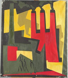
His ability to capture the essence of German life is perhaps most evident in his depictions of the post-war era. Whether rendering the nostalgic, sun-drenched street scenes of Dresden-Gruna or the imposing, soot-stained industrial landscapes of factory smokestacks, Rossig possessed a unique talent for finding beauty within the mundane and the monumental alike. His work often oscillates between two poles:
- The Observational: Meticulous graphite drawings that document the textures of urban life and the quiet dignity of everyday architecture.
- The Expressive: Surreal, abstract expressionist pieces like Threatening or 10 Years of GDR, where vibrant colors and chaotic interiors reflect the underlying anxieties of a society living under intense political scrutiny.
A Legacy of Complexity and Contrast
The historical significance of Reinhold Rossig lies in his refusal to be confined by a single movement. He was an artist who could master the rigid geometry of a typographical exercise one moment and evoke the haunting, claustrophobic atmosphere of political repression the next. His work Police Terror (1933) stands as a chilling testament to the era's darkness, utilizing oil on canvas to confront the viewer with the visceral reality of state violence.
Ultimately, Rossig’s oeuvre is a tapestry of contradictions: light and shadow, order and chaos, individual and state. He remains a vital figure for collectors and historians alike, offering a nuanced perspective on the German experience through a lens that is both deeply personal and broadly historical. Through his mastery of graphite, watercolor, and oil, he ensured that the fleeting emotions and enduring structures of his era would be preserved in a permanent, evocative artistic record.
reinhold rossig
Germany
Quick Facts
- Artistic Movement Or Style: Graphite Pencil
- Date Of Death: Living
- Full Name: Reinhold Rossig
- Nationality: German
- Notable Artworks:
- Threatening
- The Threepenny Opera in the Komödienhaus
- Original 1931 graphite drawing
- Place Of Birth: Germany