
The Ben-Day Dot: Precision and the Illusion of Mass Production
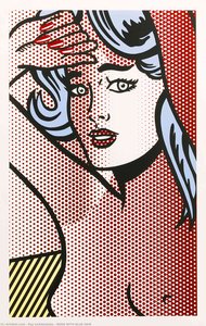
To encounter a Roy Lichtenstein masterpiece is to witness a profound paradox of modernism: the elevation of the disposable into the eternal. At the heart of his visual language lies the Ben-Day dot, a mechanical printing technique originally relegated to the cheap, pulpy pages of comic books and newsprint. For the discerning collector, these dots are far more than mere stylistic flourishes; they represent a calculated interrogation of how we perceive reality in an age of industrial reproduction. By meticulously recreating the appearance of low-cost commercial printing through the medium of fine art, Lichtenstein challenged the very definition of authenticity.
In works such as Goldfish Bowl II, the dot serves as a bridge between the tactile world of the painter and the sterile precision of the machine. There is an inherent tension in seeing a hand-applied pattern that mimics a mechanical error or a printing limitation. This technique forces the viewer to engage with the surface of the canvas, recognizing that what appears to be a flat, printed image is actually a complex layering of pigment. It is this deliberate illusion of flatness that creates a hypnotic effect, drawing the eye into a rhythmic dance of light and shadow that feels both infinitely modern and deeply structured.
Primary Emotions: The Psychological Impact of Red, Yellow, and Blue
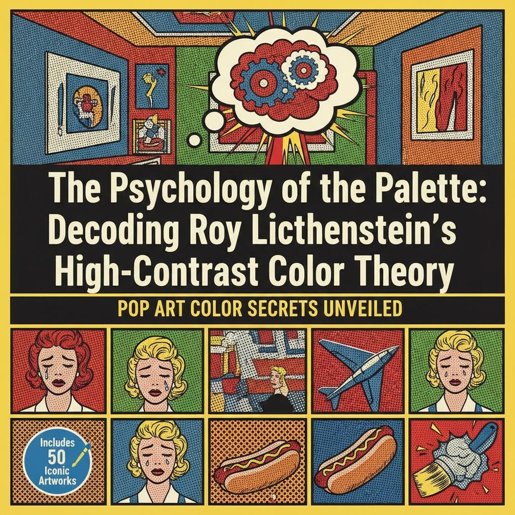
Lichtenstein’s palette was never merely decorative; it was a psychological instrument designed to evoke immediate, visceral responses. By stripping away the nuanced, muddy tones often found in traditional academic painting, he embraced a restricted spectrum of primary colors—red, yellow, and blue. This reductionism serves a higher purpose, tapping into the primal emotional registers that these hues command. A vibrant red does not simply denote color; it signals passion, danger, or the sudden burst of an Explosion I, demanding an instinctive reaction from the observer.
The psychological weight of these colors is balanced by the stark presence of white and black, creating a visual equilibrium that prevents the intensity from becoming overwhelming. In pieces like Apple and Grapefruit, the interplay of these primaries creates a sense of clarity and certainty. For the collector curating a sophisticated space, understanding this color theory is essential. These hues possess an architectural strength, capable of anchoring a room with their unapologetic boldness while simultaneously providing a window into the emotional landscape of the mid-20th century.
Graphic Narratives: Translating Comic Strip Drama into High Art
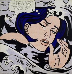
The genius of Lichtenstein lies in his ability to extract the cinematic drama of the comic strip and recontextualize it within the hallowed halls of fine art. He took the fleeting, ephemeral moments of pop culture—the heartbreak of a woman, the shock of a sudden impact—and froze them in time with a monumental permanence. This was not mere imitation; it was a sophisticated translation of narrative. By isolating specific frames, he transformed transient pop culture tropes into iconic symbols of human experience.
Consider the way Head blu shadow or his various portraits of women utilize the graphic language of melodrama. The heavy lines and simplified facial expressions strip away the clutter of realism, leaving only the essential emotional core. This distillation allows the viewer to connect with the subject on a symbolic level. The narrative becomes universal, transcoded from a specific comic panel into a timeless exploration of identity and emotion, making these works incredibly potent when placed within a contemporary collection.
The Tension of Contrast: Black Outlines and Visual Weight
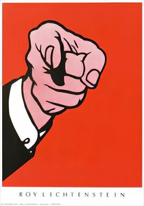
A defining characteristic of the Lichtenstein aesthetic is the use of heavy, black outlines to define form and boundary. This technique, borrowed from the graphic arts, provides a structural integrity that is both grounding and striking. These lines act as psychological barriers, separating the vibrant color fields and preventing the eye from wandering aimlessly across the composition. They provide a sense of visual weight, giving even the most abstract elements a tangible, sculptural presence on the canvas.
This high-contrast approach creates a rhythmic pulse within the artwork. The black outlines interact with the Ben-Day dots to create a sense of depth through contrast rather than traditional shading. It is a sophisticated play on perception where the "void" of the black line meets the "light" of the primary colors. For those looking to introduce a statement piece into an interior, this tension provides a dynamic energy that can transform a static wall into a focal point of intense visual interest.
Modernity in Monochrome: Exploring Texture and Pattern in Pop Art
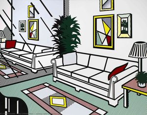
While Lichtenstein is celebrated for his color, his mastery over pattern and texture—often through the use of monochrome or limited palettes—is equally profound. In later works, such as Brushstroke with Still Life VI, we see an evolution toward a more abstract exploration of form. Here, the artist uses white polka dots and geometric shapes to investigate the concept of the "mark." The texture is not found in the thick impasto of a Van Gogh, but in the optical texture created by the repetition of pattern.
This exploration of pattern offers a sophisticated way to introduce movement into a space. The rhythmic repetition of dots and stripes creates an optical vibration that feels alive. It is a modern form of ornamentation that eschews the ornate for the essential. For the collector, these works offer a bridge between pure abstraction and representational art, providing a versatile aesthetic that complements both minimalist and maximalist design philosophies.
Curating the Bold: Integrating Lichtenstein’s Palette into Sophisticated Interiors
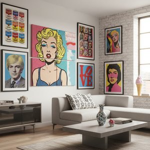
Integrating the bold, unapologetic energy of Pop Art into a high-end interior requires a discerning eye for balance. The goal is not to overwhelm the space with color, but to use it as a deliberate, curated accent. A large-scale reproduction of a Lichtenstein masterpiece can serve as the definitive anchor for a room, providing a sense of historical weight and cultural literacy. When paired with neutral, architectural elements—such as stone, wood, or matte finishes—the vibrancy of the artwork is heightened rather than diluted.
For professionals such as interior designers and hospitality buyers, the challenge lies in managing the visual dialogue between the art and the environment. Utilizing multi-panel layouts can break up the intensity of a single large image, allowing the color to flow across a wide wall in a way that feels integrated into the architecture. Whether through a meticulously hand-painted oil reproduction or a museum-quality print, bringing Lichtenstein into a collection is an act of celebrating the intersection of history, psychology, and modern luxury.
At ArtsDot.com, we specialize in preserving this legacy of human creativity. Our mission is to make the profound impact of masters like Roy Lichtenstein accessible to the global collector through exquisite, hand-painted oil reproductions on 100% cotton canvas. Every piece we create is a testament to academic excellence, executed by artists who understand the delicate balance of color and line. Whether you are seeking a bespoke commission that reimagines your own memories or a museum-grade reproduction to complete a professional design project, ArtsDot provides the craftsmanship, authenticity, and global service required for the most discerning tastes.