


The Science of Chromatic Equilibrium: Understanding Color Theory in High-End Interiors
 Chromatic Equilibrium: Leveraging Art as a Tool for Color Balance and Spatial Harmony in Interior Design
The Foundations of Chromatic Equilibrium: Understanding Color Theory & Psychology Harmonizing Spaces: A Guide to Utilizing Color Palettes in Interior Design Elevate your interior design projects with our expert guide to color palettes! Learn the psyc...
To step into a gallery is to enter a silent dialogue with the masters, where light and pigment perform a delicate dance across the canvas. For the discerning hotel designer, this dialogue extends far beyond the frame; it becomes the very foundation of spatial atmosphere. Achieving true chromatic equilibrium—that elusive state where hues coalesce into a harmonious resonance—demutually demands more than a mere aesthetic preference for pleasing shades. It requires an immersion in the historical and psychological weight of color theory. From Newton’s prism dissecting white light to Goethe's profound explorations of subjective experience, we understand that color is a potent force capable of reshaping the very perception of a room.
In the context of luxury hospitality, color serves as the breath of the interior. When we speak of balance, we are not discussing the neon overload of a modern fever dream, nor the somber, muted tones of a funeral shroud. Instead, we seek that high-impact sweet spot where saturated crimson meets a deep, midnight blue in perfect equilibrium. This is the art of the visual vibe check, where every pigment works in total synergy to create an atmosphere that feels both electric and effortless. By understanding the relationships between hues—whether through the dynamic tension of complementary pairs or the soothing continuity of analogous palettes—a designer can manipulate the emotional temperature of a lobby or suite with surgical precision.
Anchoring the Space: Using Masterpieces to Establish a Visual Focal Point
 Woman Holding a Balance
Johannes Vermeer’s Woman Holding a Balance: A Study in Quiet Contemplation Johannes Vermeer’s “Woman Holding a Balance,” completed around 1662–1663, stands as an emblem of the Dutch Golden Age—a period defined by artistic brilliance and profound psyc...
A well-designed space requires an anchor, a point of arrival for the eye that prevents the visual narrative from drifting into chaos. A balanced painting does not merely sit upon a wall; it commands the room, providing a focal point that invites long, contemplative gazative. When selecting a reproduction, one must look for works that possess an inherent stability. Consider the profound psychological observation found in Johannes Vermeer’s Woman Holding a Balance. The meticulous arrangement of light and shadow within this Dutch Golden Age masterpiece offers a sense of domestic tranquility and weight, making it an ideal anchor for a quiet lounge or a refined library setting.
These canonical works serve as the ultimate reference for how color, when mastered, can achieve timelessness. A painting that refuses to shout, opting instead for a perfect equilibrium of vibrant pigments and soft tones, allows the surrounding architecture to breathe while simultaneously providing a soul to the room. For the professional decorator, finding pieces that possess this inherent balance is the secret to creating a space that feels curated and soulful rather than cluttered. Whether it is a large-scale landscape or an intimate portrait, the right masterpiece acts as the gravitational center around which all other design elements—furniture, textiles, and lighting—revolve.
Strategic Contrast: Leveraging Complementary and Analogous Palettes from Art History
 Complementary colors
Complementary colors are pairs of colors which, when combined or mixed, cancel each other out (lose chroma) by producing a grayscale color like white or black. When two highly chromatic complementary colors are placed next to each other, they create ...
The mastery of contrast is perhaps the most sophisticated tool in a designer's repertoire. Throughout art history, the strategic use of saturation and value has allowed artists to create depth and drama without causing visual fatigue. In the realm of interior design, we can draw directly from the classical color wheel to inform our material selections. Complementary schemes—the striking opposition of red and green or blue and orange—offer a dynamic tension that is perfect for statement pieces in high-energy social spaces like bars or restaurants. These pairs create a strong, energetic contrast that captures attention immediately.
Conversely, for more serene environments such as spas or executive suites, the designer might look toward analogous palettes. By utilizing neighbors on the color wheel, such as azure and indigo, one creates a sense of rhythmic, visual pulse and continuity. This approach mirrors the luminous, light-drenched landscapes of the Impressionists, who sought to capture the fleeting warmth of a summer afternoon through subtle transitions of tone. By integrating these historical color relationships into modern upholstery and wall treatments, a designer can evoke deep emotional resonance, proving that stability in color is a timeless architectural achievement.
Atmospheric Nuance: Balancing Color Temperature and Value for Spatial Depth
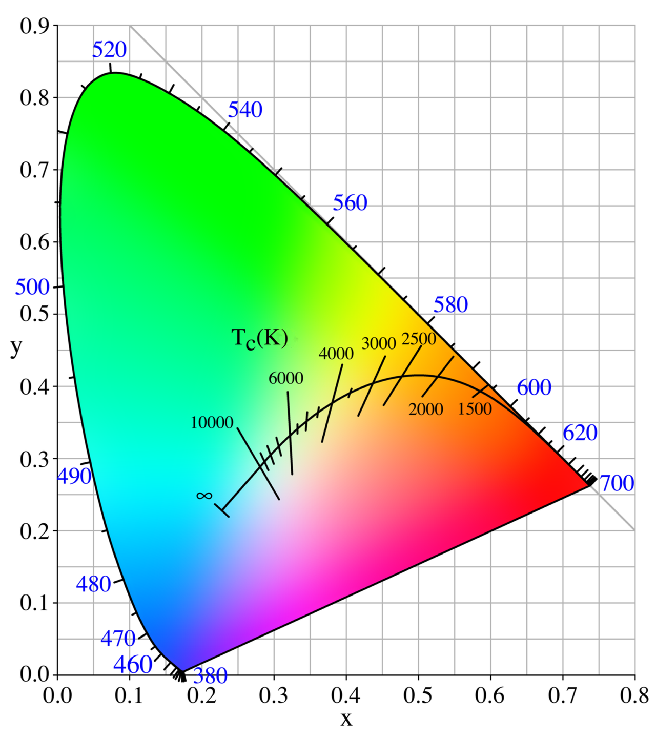 Color temperature
Color temperature is a parameter describing the color of a visible light source by comparing it to the color of light emitted by an idealized opaque, non-reflective body. The temperature of the ideal emitter that matches the color most closely is def...
Beyond the hue itself lies the critical dimension of value—the lightness or darkness of a color—and color temperature. A room dominated solely by saturated, high-value hues can feel overwhelming and claustrophobic; however, introducing varying values creates the necessary depth, shadow, and visual relief required for luxury. This is the principle of chiaroscuro, perfected during the Renaissance, where the dramatic interplay of light and dark was used to sculpt form and emotion. In a hotel setting, utilizing art with deep, shadowed landscapes can provide a sense of enclosure and intimacy, while lighter, more ethereal works can expand the perceived boundaries of a small room.
Furthermore, the designer must consider the psychological impact of color temperature. Warm light sources, typically in the 2700K to 3000K range, evoke comfort and hospitality, yet they must be balanced against the cool, bluish tones of modern architectural lighting to prevent a space from feeling visually stagnant. A masterpiece that features a soft rose breathing life into a deep, shadowed landscape can bridge these temperatures, acting as a chromatic mediator. This careful management of temperature and value ensures that the atmosphere remains sophisticated, preventing the "visual noise" that often plagues contemporary, poorly balanced interiors.
Curating the Collection: Selecting Reproductions that Harmonize with Architectural Finishes
 10 Masterpieces Defined by Perfect Color Balance
Introduction To step into a gallery is to enter a silent dialogue with the masters, where light and pigment perform a delicate dance across the canvas. While some works of art command attention through sheer, overwhelming vibrance, there exists a mor...
The final layer of sophistication in art integration is the seamless blending of the artwork with the physical finishes of the building. A hand-painted oil reproduction offers a tactile depth that no digital print can replicate; the visible brushstrokes and the rich, impasto textures of a 100% cotton canvas provide a sensory experience that complements high-end materials like marble, velvet, or polished wood. When selecting a piece, one must consider how the pigments will interact with the room's permanent palette. A muted ochre in a painting can anchor a brilliant ultramarine accent wall, creating a cohesive design language.
For those seeking to push the boundaries of traditional decor, we offer the ability to "remix" art history. Our professional artists can adapt historical styles to meet specific project requirements—for instance, requesting a contemporary photograph be rendered in the light-drenched style of Monet or the dramatic, textured impasto of Van Gogh. This level of customization ensures that the artwork is not merely an addition to the room, but an integral component of the architectural fabric. Whether through custom sizing or the use of our multi-panel layouts for wide staircases, the goal is a seamless transition between the art and the environment.
The Designer's Toolkit: Integrating Large-Format Murals and Multi-Panel Masterpieces
 Interior design
Interior design is the art and science of enhancing the interior of a building to achieve a healthier and more aesthetically pleasing environment for the people using the space. With a keen eye for detail and a creative flair, an interior designer is...
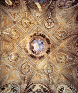
For large-scale hospitality projects, such as grand lobbies or expansive corridors, standard frame sizes often fall short of the architectural ambition. This is where the integration of large-format murals and ceiling frescoes becomes transformative. We specialize in creating massive canvas rolls that allow designers to recreate historical grandeur—such as the breathtaking ceilings of the Sistine Chapel—within a modern hotel context. These works are installed similarly to high-end wallpaper, providing a continuous, immersive experience that can redefine the scale of an entire floor.
Additionally, the contemporary trend toward "multi-panel" or group set paintings offers a modular solution for wide walls and complex geometries. By splitting a single iconic composition across three, four, or even five panels, a designer can create a rhythmic, modern architectural look that maintains the integrity of the original masterpiece while adapting to the physical constraints of the space. This approach allows for a sophisticated distribution of color and weight, ensuring that the art flows seamlessly across the architecture, much like the master painters of the past intended their works to inhabit the spaces they were created for.
For professional designers seeking bespoke solutions, volume discounts, or expert art consultations to digitally place masterpieces within your project renders, please visit ArtsDot.com.