 Preview
 Send
Send Share
Share
 Details

 Download
 Similars
 X-Ray
X-Ray Diaporama
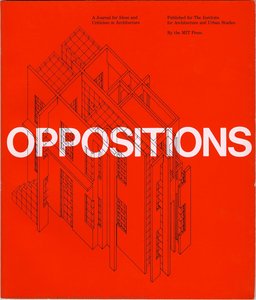
A+U (Architecure + Urbanism) no. 239
 Acrylic On Canvas
- WallArt
- Minimalist Graphic Design
 1990
1990 21.0 x 29.0 cm
 Vignelli Center for Design Studies
 Read More
Giclée / Art Print
Museum-quality giclée or canvas print with fast production and flexible finish options. ( Buy Hand Made Painting Buy Image)
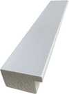
P118B $10
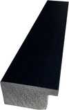
P118H $10
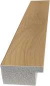
P118W $10
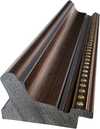
P438Z $10
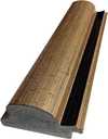
P508JH $12
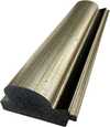
P508YH $12
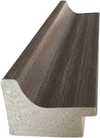
P805H $10
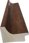
P805Z $10
P919BZ $10
P919G $10
P919XJ $10
P959ZH $10

P968JZ $12
W106C $8
W218G $10
W218JH $8
W218Y $10
W307PJ $10
W316G $10
W316PJ $8
W316Y $10
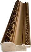
W398PJ $8
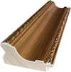
W4111J $10
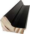
W500HY $15
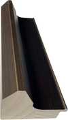
W500JH $15
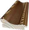
W692G $12
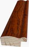
W849H $8
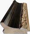
W940BG $15
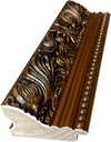
W953PJ $8

Pick from our preset sizes that match the artwork's original proportions.

You may enter your own dimensions to fit a specific frame or space. If your selected size does not match the original image's proportions, we will either crop the artwork or extend the image with a mirrored or solid-fill edge. A digital mockup will be sent for your approval before production begins.
Please note that the on-screen preview does not reflect the actual cropping or extension. Only the mockup will accurately show the final composition.
While custom sizes are available, we recommend selecting a dimension from the predefined list to preserve the original proportions.
Worldwide Delivery () in 2 weeks instead of standard 4/5 weeks. (17 August)

Free Worldwide Express Shipping

High-Quality Linen Canvas

Full Shipping Insurance

Customs Tax Refund Guarantee

True Color Matching Guarantee

60-Day Return Policy (Defects Only)

100% Money-Back Guarantee

Bulk Discount Offer
 Glass option is only available in size under 110 CM

A+U (Architecure + Urbanism) no. 239
Giclée / Art Print
Reproduction Size
-


Total Price
$ 63
Collectible Description
A Deep Dive Into Massimo Vignelli’s “A+U (Architecture + Urbanism) no. 239”
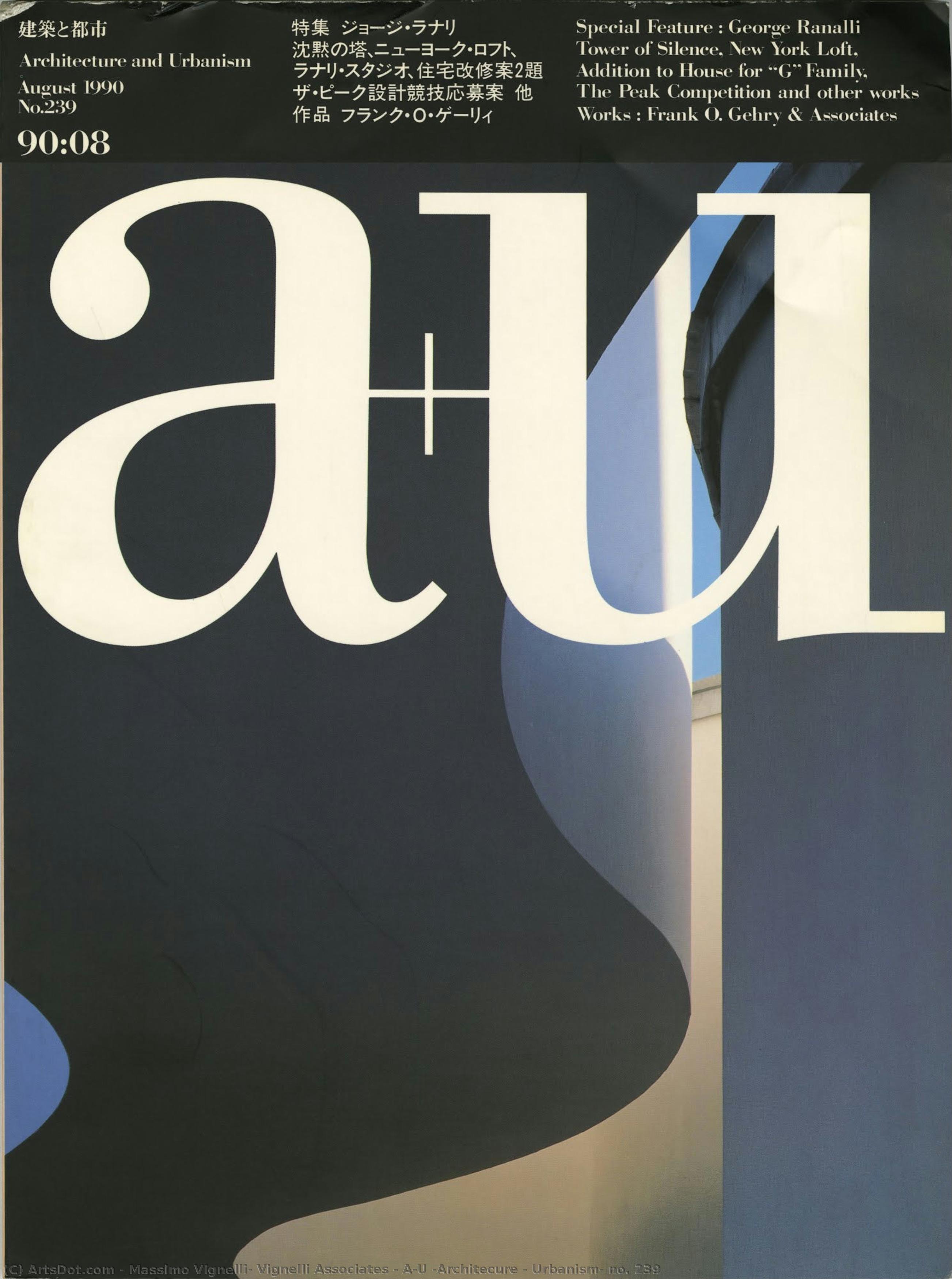
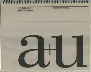
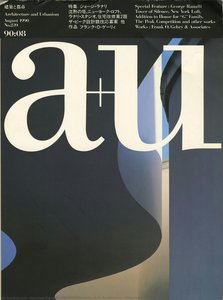
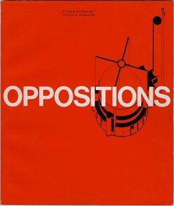
Massimo Vignelli's "A+U (Architecture + Urbanism) no. 239," published in 1990, transcends mere visual representation; it embodies the core tenets of Vignelli’s celebrated design philosophy—simplicity, functionality, and a profound respect for geometric precision. This magazine cover isn’t simply an advertisement for architectural publications; it's a meticulously crafted manifesto of modernist aesthetics that continues to resonate with designers and art enthusiasts today. The photograph itself captures a moment frozen in time, displayed thoughtfully on a wall within an urban space—likely a gallery or office – hinting at the intellectual engagement Vignelli sought to inspire.- Composition & Perspective: The image’s dominant vertical lines originate from the building glimpsed through the window behind the magazine cover, grounding the composition and establishing a sense of stability. Simultaneously, the horizontal edges of the wall contribute to depth perception, guiding the viewer's gaze across the frame. Vignelli skillfully employs this interplay of lines and planes to create an immersive experience that reflects the dynamism of urban environments.
- Typography & Logo Design: The striking white ‘a+u’ logo against a grey backdrop exemplifies Vignelli’s unwavering commitment to typographic clarity. Its rounded shapes offer a deliberate counterpoint to the straight vertical lines, symbolizing balance and harmony—principles central to his design approach. The bold typeface conveys confidence and authority, mirroring the magazine's mission to champion innovative architectural ideas.
- Color Palette & Lighting: Dominated by grayscale hues – shades of grey, white, and black – the cover’s palette underscores Vignelli’s minimalist aesthetic. Subtle blues and reds appear within the logo itself, muted yet purposeful, adding visual interest without disrupting the overall tonal unity. Natural light filtering through the window casts soft shadows on the wall, enhancing depth and creating an atmosphere conducive to contemplation.
- Historical Context: Published in the early 1990s, “A+U” reflects the broader cultural landscape of postmodern architecture—a reaction against excessive ornamentation and a renewed focus on rational design. Vignelli’s work aligns with this movement's ethos, advocating for elegant solutions that prioritize usability and visual impact. It stands as a testament to Vignelli’s enduring influence on graphic design and architectural communication.
- Symbolic Significance: The cover’s overall impression evokes a sense of orderliness and intellectual curiosity—qualities deeply ingrained in Vignelli's artistic vision. It speaks to the transformative potential of design, demonstrating how visual elements can shape perceptions and foster dialogue about urban spaces and architectural innovation. Ultimately, “A+U” no. 239 serves as an emblem of Vignelli’s unwavering belief in the power of simplicity to convey complex ideas effectively.
Related Artworks

![Milano\n\n[cover View, Folded] — Massimo Vignelli, Vignelli Associates, Contemporary Digital Art](/media/artworks/images/thumbnails/50/92/50929cf753214e7b83201f76b5596155.jpg)
![Fort Worth Art Museum The Italian Film: Neorealism And Beyond Poster And Event Calendar\n\n[front View] — Massimo Vignelli, Vignelli Associates, Contemporary Realism](/media/artworks/images/thumbnails/e9/9d/e99d0f51e4d4411c9237ff8af0cb0b6b.jpg)
Artist Biography
A Life Dedicated to Form: The World of Massimo Vignelli
Born in Milan, Italy, in 1931, Massimo Vignelli’s journey was one of unwavering dedication to the principles of modernist design. From a young age, he demonstrated an innate understanding of visual communication, beginning his formal training in architecture at the Politecnico di Milano and later continuing at the Università Iuav di Venezia. However, it was an apprenticeship with the esteemed Castiglioni brothers – pioneers in Italian industrial design – that truly ignited his passion for shaping the world through thoughtful creation. This early exposure instilled in him a belief in functionality, simplicity, and the power of elegant solutions to everyday problems. He wasn’t merely designing objects; he was crafting experiences, streamlining interactions, and elevating the mundane into the memorable. This formative period laid the groundwork for a career that would redefine visual culture across continents.From Italy to New York: A Transatlantic Vision
Vignelli's path led him to America in 1966, where he became instrumental in establishing the New York office of Unimark International. This marked a pivotal moment, not only for his career but also for the landscape of American design. Unimark quickly rose to prominence, and Vignelli’s contributions – most notably the enduring logo for American Airlines – solidified his reputation as a master of corporate identity. However, a growing divergence in creative philosophy prompted him to embark on an independent venture. In 1971, alongside his wife and lifelong collaborator, Lella Vignelli, he founded Vignelli Associates. This partnership proved extraordinarily fruitful, becoming synonymous with sophisticated design solutions that spanned graphic design, interior design, product design, and architecture. The firm’s ethos was rooted in a belief that good design should be accessible, timeless, and profoundly useful – principles they consistently championed throughout their careers.Iconic Creations: A Legacy of Clarity
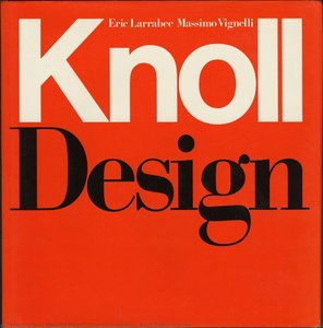
Massimo Vignelli's influence is woven into the fabric of modern life. Perhaps his most recognizable achievement is the redesign of the New York City Subway map in 1972. While initially controversial for its departure from strict geographical accuracy, it was a bold statement in clarity and usability. Vignelli prioritized legibility and intuitive navigation over literal representation, creating a diagrammatic map that continues to guide millions of commuters daily. This project exemplifies his core design philosophy: prioritizing communication above all else. Beyond the subway map, Vignelli Associates left an indelible mark on countless brands and institutions. Their work for Bloomingdale’s – including the iconic brown paper bag with its simple white logo – transformed a shopping experience into a statement of style. They designed furniture for Knoll, packaging for Heller, and corporate identities that became instantly recognizable symbols of quality and innovation. His *Heller Rainbow Dinnerware* stands as a testament to his minimalist aesthetic, showcasing vibrant color within clean geometric forms. The *Tredicesima Triennale di Milano* poster exemplifies his bold use of color and shape, while the *Knoll Design* cover demonstrates his ability to create striking visuals for renowned brands.A Lasting Impact: Beyond Aesthetics
Massimo Vignelli’s impact extends far beyond individual projects; he fundamentally reshaped how we perceive design itself. He was a staunch advocate for typographic discipline, famously advocating for a limited palette of typefaces – believing that true creativity lies not in endless options but in masterful execution with carefully chosen tools. His book, *The Vignelli Canon*, became a manifesto for designers, outlining his principles of clarity, simplicity, and enduring elegance. He wasn’t simply creating visually pleasing objects; he was striving to create order out of chaos, to communicate effectively, and to elevate the human experience through thoughtful design. His work continues to inspire generations of designers, reminding them that true innovation lies in stripping away the unnecessary and focusing on the essential. The Vignelli Center for Design Studies at the Rochester Institute of Technology serves as a lasting tribute to his legacy, preserving an extensive archive of his work and fostering continued exploration of his groundbreaking ideas. He passed away in 2014, but his designs remain powerfully present, shaping our world with their enduring elegance and unwavering commitment to clarity.
massimo vignelli, vignelli associates
1931 - 2014 , Italy
Quick Facts
- Artistic Movement Or Style: Modernism, Minimalism
- Date Of Birth: January 10, 1931
- Date Of Death: May 27, 2014
- Full Name: Massimo Vignelli
- Nationality: Italian
- Notable Artworks:
- Heller Rainbow Dinnerware
- Tredicesima Triennale di Milano
- Knoll Design (cover)
- Place Of Birth: Milan, Italy
Related Articles
Massimo Vignelli: A Legacy of Modernist Clarity in Graphic Design & Visual Communication
Explore the enduring impact of Massimo Vignelli's modernist design philosophy. Discover his iconic works, key principles, and lasting legacy in graphic design & corporate identity. Learn from a true master.
Concrete Narratives: Exploring Urban Life in Modern & Contemporary Art
Explore the evolution of cityscape painting with ArtsDot. Discover key artists from Realism to contemporary movements & invest in timeless urban visions. Expert guidance, museum-quality reproductions.
Minimalist Masterpieces: 10 Artworks for Serene Home Decor | ArtsDot
Find serenity with 10 minimalist masterpieces! Explore Agnes Martin, Rothko & more. Discover the stories behind iconic abstract art, neutral palettes & calming designs. Museum-quality reproductions at ArtsDot.com – elevate your home decor today!

Concrete Visions: Exploring Representations of Urban Life in Modern & Contemporary Art
Explore the evolution of cityscape painting from Realism to contemporary art. Discover key artists & invest in timeless urban visions with ArtsDot's expert guidance and museum-quality reproductions.
Concrete Visions: Exploring the Urban Landscape in Painting – From Realism to Contemporary Art
Explore the evolution of cityscape painting from Realism to contemporary art with ArtsDot. Discover key artists & invest in timeless urban visions. Expert guidance, museum-quality reproductions.
![Heller Rainbow Dinnerware\n\n[front view]](/media/artworks/images/thumbnails/ea/57/ea57127eead5435bb93c62bacfb5addc.jpg)
![Heller The Rainbow Group\n\n[front view]](/media/artworks/images/thumbnails/1a/ba/1aba337974cd4fb08cb72db590cd67c5.jpg)
![Knoll Au Louvre\n\n[front cover]](/media/artworks/images/thumbnails/3b/b3/3bb3519a623a474aaf75939753234c06.jpg)
![Knoll International\n\n[front view]](/media/artworks/images/thumbnails/ff/6e/ff6e2a61a8e94f928a5c761eb7095fb2.jpg)
![Tredicesima Triennale di Milano\n\n[red on pink]](/media/artworks/images/thumbnails/60/dd/60dd2cf08a074e6e9f2a2f3407137241.jpg)

![The White House\n\n[front view]](/media/artworks/images/thumbnails/ca/ab/caab2a5b79d94b53b3badc35ba072a72.jpg)