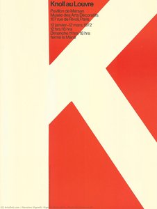
![Knoll Au Louvre\n\n[front Cover] — Massimo Vignelli, Vignelli Associates](/media/artworks/images/full/2c/43/2c431f9440c340d7b2bdabdde57f5b02.Jpg)
 Preview
 Send
Send Share
Share
 Details

 Download
 Similars
 X-Ray
X-Ray Diaporama
Knoll Au Louvre\n\n[front cover]


 Read More
Giclée / Art Print
Museum-quality giclée or canvas print with fast production and flexible finish options. ( Buy Hand Made Painting Buy Image)
P118B $10
P118H $10
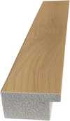
P118W $10
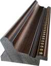
P438Z $10
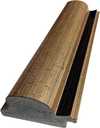
P508JH $12

P508YH $12
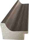
P805H $10
P805Z $10
P919BZ $10
P919G $10
P919XJ $10
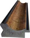
P959ZH $10

P968JZ $12
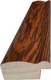
W106C $8
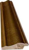
W218G $10
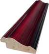
W218JH $8
W218Y $10
W307PJ $10
W316G $10
W316PJ $8
W316Y $10
W398PJ $8
W4111J $10
W500HY $15
W500JH $15
W692G $12
W849H $8
W940BG $15
W953PJ $8
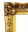
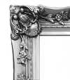
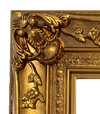
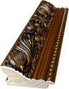
Pick from our preset sizes that match the artwork's original proportions.

You may enter your own dimensions to fit a specific frame or space. If your selected size does not match the original image's proportions, we will either crop the artwork or extend the image with a mirrored or solid-fill edge. A digital mockup will be sent for your approval before production begins.
Please note that the on-screen preview does not reflect the actual cropping or extension. Only the mockup will accurately show the final composition.
While custom sizes are available, we recommend selecting a dimension from the predefined list to preserve the original proportions.
Worldwide Delivery () in 2 weeks instead of standard 4/5 weeks. (17 August)

Free Worldwide Express Shipping

High-Quality Linen Canvas

Full Shipping Insurance

Customs Tax Refund Guarantee

True Color Matching Guarantee

60-Day Return Policy (Defects Only)

100% Money-Back Guarantee

Bulk Discount Offer
 Glass option is only available in size under 110 CM

Knoll Au Louvre\n\n[front cover]
Giclée / Art Print
Reproduction Size
-


Total Price
$ 63
Collectible Description
The Genesis of a Vision
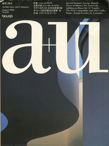
Massimo Vignelli’s “Knoll au Louvre,” created in 1971 for Knoll International, isn't merely a catalog cover; it’s a distilled essence of modernist design philosophy. Born from the collaborative vision of Massimo and Lella Vignelli, this striking image transcends its functional purpose as promotional material, becoming an enduring symbol of clarity, precision, and the elegant power of geometric abstraction. The project arose from Knoll’s desire to showcase their furniture collection within the context of a sophisticated exhibition at Pavillon de Marsan in Paris – a space already renowned for its commitment to artistic innovation. Vignelli's brief was simple: create an image that would immediately communicate Knoll’s brand identity and the beauty of their products, yet also capture the spirit of the Parisian art world.
The design itself is deceptively straightforward. A bold, crimson “K” dominates the composition, its sharp angles echoing the clean lines of Knoll's furniture. Two smaller, equally assertive "L’s" flank it, creating a dynamic and balanced visual rhythm. This foundational element isn’t merely decorative; it’s a deliberate assertion of Knoll’s presence – a confident statement in a landscape of established luxury brands. The background is a stark white, providing an almost brutal contrast to the vibrant red, further emphasizing the logo's impact and drawing the eye directly to its core.
A Swiss Style Masterpiece
“Knoll au Louvre” exemplifies the principles of Swiss style design – also known as International Typographic Collage. Developed in the 1950s, this approach prioritizes clarity, legibility, and a restrained use of color. Vignelli’s mastery lies in his ability to distill complex ideas into their most essential components. The typography itself is meticulously chosen: Akzidenz-Grotesk, a typeface renowned for its neutrality and readability, forms the backbone of the design. Its sans-serif nature perfectly complements the geometric shapes, creating a harmonious and uncluttered visual experience.
The use of white space is equally crucial. It’s not simply an absence of color; it's a deliberate element that allows each shape to breathe and contributes significantly to the overall sense of balance and sophistication. This minimalist approach was revolutionary at the time, challenging the prevailing trends of ornate decoration and flamboyant typography. The design’s success can be attributed in part to its ability to communicate instantly – viewers immediately recognize Knoll’s brand without needing any explanation.
Contextualizing a Moment in Design History
The creation of “Knoll au Louvre” coincided with a period of profound change in the world of graphic design. The rise of corporate identity systems, fueled by the burgeoning advertising industry and the increasing influence of television, demanded a new approach to visual communication. Vignelli’s work stood at the forefront of this movement, advocating for a rational and systematic approach to design that prioritized functionality and clarity over ornamentation. His designs weren't just aesthetically pleasing; they were strategically effective – designed to communicate brand values and achieve specific business objectives.
The exhibition itself, held at Pavillon de Marsan in Paris, was a significant event within the art world. The pavilion, a historic landmark known for its innovative architectural design, provided an ideal setting for showcasing Knoll’s furniture alongside works by leading contemporary artists. “Knoll au Louvre” perfectly captured the spirit of this exhibition – a celebration of modernism, elegance, and the power of visual communication.
Symbolic Resonance and Enduring Appeal
Beyond its technical brilliance, “Knoll au Louvre” possesses a subtle yet powerful symbolic resonance. The geometric shapes evoke a sense of order, stability, and precision – qualities that are intrinsically linked to Knoll’s brand identity. The bold red color represents energy, passion, and confidence, while the white background symbolizes purity and simplicity. Together, these elements create an image that is both visually striking and conceptually rich.
Even today, decades after its creation, “Knoll au Louvre” remains a timeless masterpiece of graphic design. Its clean lines, bold colors, and masterful use of typography continue to inspire designers around the world. It’s a testament to Vignelli's enduring legacy – a reminder that great design is not just about aesthetics; it’s about communicating ideas with clarity, precision, and elegance.
Related Artworks
![Knoll International\n\n[front View] — Massimo Vignelli, Vignelli Associates, Modernism](/media/artworks/images/thumbnails/ff/6e/ff6e2a61a8e94f928a5c761eb7095fb2.jpg)
![Fort Worth Art Museum The Italian Film: Neorealism And Beyond Poster And Event Calendar\n\n[front View] — Massimo Vignelli, Vignelli Associates, Contemporary Realism](/media/artworks/images/thumbnails/e9/9d/e99d0f51e4d4411c9237ff8af0cb0b6b.jpg)
![The White House\n\n[front View] — Massimo Vignelli, Vignelli Associates, Modernist Design](/media/artworks/images/thumbnails/ca/ab/caab2a5b79d94b53b3badc35ba072a72.jpg)
Artist Biography
A Life Dedicated to Form: The World of Massimo Vignelli
Born in Milan, Italy, in 1931, Massimo Vignelli’s journey was one of unwavering dedication to the principles of modernist design. From a young age, he demonstrated an innate understanding of visual communication, beginning his formal training in architecture at the Politecnico di Milano and later continuing at the Università Iuav di Venezia. However, it was an apprenticeship with the esteemed Castiglioni brothers – pioneers in Italian industrial design – that truly ignited his passion for shaping the world through thoughtful creation. This early exposure instilled in him a belief in functionality, simplicity, and the power of elegant solutions to everyday problems. He wasn’t merely designing objects; he was crafting experiences, streamlining interactions, and elevating the mundane into the memorable. This formative period laid the groundwork for a career that would redefine visual culture across continents.From Italy to New York: A Transatlantic Vision
Vignelli's path led him to America in 1966, where he became instrumental in establishing the New York office of Unimark International. This marked a pivotal moment, not only for his career but also for the landscape of American design. Unimark quickly rose to prominence, and Vignelli’s contributions – most notably the enduring logo for American Airlines – solidified his reputation as a master of corporate identity. However, a growing divergence in creative philosophy prompted him to embark on an independent venture. In 1971, alongside his wife and lifelong collaborator, Lella Vignelli, he founded Vignelli Associates. This partnership proved extraordinarily fruitful, becoming synonymous with sophisticated design solutions that spanned graphic design, interior design, product design, and architecture. The firm’s ethos was rooted in a belief that good design should be accessible, timeless, and profoundly useful – principles they consistently championed throughout their careers.Iconic Creations: A Legacy of Clarity
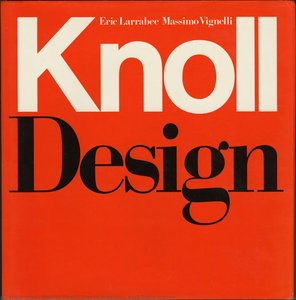
Massimo Vignelli's influence is woven into the fabric of modern life. Perhaps his most recognizable achievement is the redesign of the New York City Subway map in 1972. While initially controversial for its departure from strict geographical accuracy, it was a bold statement in clarity and usability. Vignelli prioritized legibility and intuitive navigation over literal representation, creating a diagrammatic map that continues to guide millions of commuters daily. This project exemplifies his core design philosophy: prioritizing communication above all else. Beyond the subway map, Vignelli Associates left an indelible mark on countless brands and institutions. Their work for Bloomingdale’s – including the iconic brown paper bag with its simple white logo – transformed a shopping experience into a statement of style. They designed furniture for Knoll, packaging for Heller, and corporate identities that became instantly recognizable symbols of quality and innovation. His *Heller Rainbow Dinnerware* stands as a testament to his minimalist aesthetic, showcasing vibrant color within clean geometric forms. The *Tredicesima Triennale di Milano* poster exemplifies his bold use of color and shape, while the *Knoll Design* cover demonstrates his ability to create striking visuals for renowned brands.A Lasting Impact: Beyond Aesthetics
Massimo Vignelli’s impact extends far beyond individual projects; he fundamentally reshaped how we perceive design itself. He was a staunch advocate for typographic discipline, famously advocating for a limited palette of typefaces – believing that true creativity lies not in endless options but in masterful execution with carefully chosen tools. His book, *The Vignelli Canon*, became a manifesto for designers, outlining his principles of clarity, simplicity, and enduring elegance. He wasn’t simply creating visually pleasing objects; he was striving to create order out of chaos, to communicate effectively, and to elevate the human experience through thoughtful design. His work continues to inspire generations of designers, reminding them that true innovation lies in stripping away the unnecessary and focusing on the essential. The Vignelli Center for Design Studies at the Rochester Institute of Technology serves as a lasting tribute to his legacy, preserving an extensive archive of his work and fostering continued exploration of his groundbreaking ideas. He passed away in 2014, but his designs remain powerfully present, shaping our world with their enduring elegance and unwavering commitment to clarity.
massimo vignelli, vignelli associates
1931 - 2014 , Italy
Quick Facts
- Artistic Movement Or Style: Modernism, Minimalism
- Date Of Birth: January 10, 1931
- Date Of Death: May 27, 2014
- Full Name: Massimo Vignelli
- Nationality: Italian
- Notable Artworks:
- Heller Rainbow Dinnerware
- Tredicesima Triennale di Milano
- Knoll Design (cover)
- Place Of Birth: Milan, Italy
Related Articles
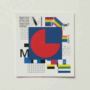
Massimo Vignelli: A Legacy of Modernist Clarity in Graphic Design & Visual Communication
Explore the enduring impact of Massimo Vignelli's modernist design philosophy. Discover his iconic works, key principles, and lasting legacy in graphic design & corporate identity. Learn from a true master.
Louvre Masterpieces: Explore the Top 25 Artworks for Your Home | ArtsDot
Journey through the Louvre's 25 most iconic artworks! Explore masterpieces by Leonardo da Vinci, Michelangelo & Delacroix. Discover art history, techniques & find museum-quality reproductions for your home at ArtsDot.com.
F.A.Q.: Poster Prints – Durability, Comparison to Canvas, & Sizes for Elite Collectors
provides elite collectors with detailed insights into our poster print quality, comparing durability & materials to canvas. Explore sizing options and discover museum-quality art reproductions for lasting investment value.
Alphonse Mucha: A Comprehensive Exploration of Art Nouveau's Master of Decorative Symbolism
Explore the life & art of Alphonse Mucha, master of Art Nouveau! Discover his iconic posters, stunning illustrations, and the monumental Slav Epic. A comprehensive guide for collectors & enthusiasts.

Sergey Vinogradov: Capturing the Lyricism of Everyday Russian Life
Explore the captivating world of Sergey Vinogradov (1869-1938), a leading Russian Impressionist painter. Discover his lyrical genre scenes, landscapes & wartime art – a testament to everyday life and artistic mastery.
![Heller Rainbow Dinnerware\n\n[front view]](/media/artworks/images/thumbnails/ea/57/ea57127eead5435bb93c62bacfb5addc.jpg)
![Heller The Rainbow Group\n\n[front view]](/media/artworks/images/thumbnails/1a/ba/1aba337974cd4fb08cb72db590cd67c5.jpg)
![Milano\n\n[cover view, folded]](/media/artworks/images/thumbnails/50/92/50929cf753214e7b83201f76b5596155.jpg)
![Knoll Au Louvre\n\n[front cover]](/media/artworks/images/thumbnails/3b/b3/3bb3519a623a474aaf75939753234c06.jpg)
![Tredicesima Triennale di Milano\n\n[red on pink]](/media/artworks/images/thumbnails/60/dd/60dd2cf08a074e6e9f2a2f3407137241.jpg)