The Primary Palette: Analyzing Bold Color Choices for High-Impact Environments
In the high-stakes world of hospitality design, where the first impression of a lobby can define a brand's entire identity, the strategic use of color is not merely an aesthetic choice but a psychological tool. Roy Lichtenstein, a titan of the Pop Art movement, mastered this manipulation through a restricted yet piercing palette of primary colors. By stripping away the nuanced gradients of traditional fine art and embracing the unapologetic clarity of red, yellow, and blue, Lichtenstein created works that demand immediate ocular attention. For the hotel designer, these pigments offer a blueprint for creating focal points within expansive architectural volumes. When we examine pieces like Explosion I, we see how a sudden burst of primary yellow against stark black outlines can energize a sterile corridor or a waiting area, injecting a sense of kinetic energy that prevents a space from feeling stagnant. This use of high-saturation color serves to anchor the eye, providing a visual heartbeat to even the most minimalist contemporary interiors.
Ben-Day Dots and Visual Texture: Creating Depth in Flat Compositions
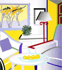
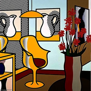
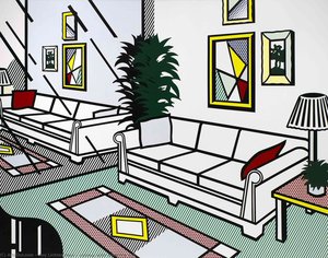
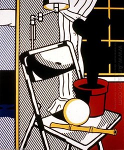
While at first glance Lichtenstein’s work appears deceptively flat, much like the mass-produced comic strips that inspired him, there is a sophisticated layer of optical complexity found in his signature Ben-Day dots. This technique, which mimics the mechanical printing process of mid-century periodicals, introduces a rhythmic texture that functions as a bridge between graphic design and fine art. For professionals managing large-scale procurement for corporate or hospitality spaces, understanding this texture is vital. These dots create a secondary layer of "visual noise" that can soften the impact of bold colors, preventing them from becoming overwhelming in large-format installations. In works such as Brushstroke with Still Life VI, the interplay of white polka dots and solid color blocks creates a structural depth that mimics architectural patterns. This allows a designer to introduce pattern-heavy elements into a room without sacrificing the clean lines required by modern luxury standards, effectively using dot-based textures to add a sense of tactile richness to smooth surfaces like marble or polished concrete.
Emotional Resonance: Using Pop Art Colors to Define Hospitality Moods
Color psychology is the silent language of interior design, and Lichtenstein’s oeuvre provides an extraordinary vocabulary for modulating mood. The artist’s ability to isolate emotion within bold color fields allows designers to curate specific atmospheres across different zones of a hotel property. A lounge area might benefit from the more contemplative, cooler tones found in Head blu shadow, where deep blues and stark shadows evoke a sense of sophisticated calm and nocturnal elegance. Conversely, dining spaces or breakfast atriums can draw inspiration from the high-energy, sun-drenched palettes seen in Goldfish Bowl II, where vibrant, warm hues stimulate appetite and social interaction. By selecting reproductions that utilize these specific chromatic triggers, a designer can ensure that the emotional temperature of each room is perfectly aligned with its intended function, guiding guests through a seamless transition from high-energy social hubs to serene, private retreats.
Strategic Implementation: Scaling Lichtenstein’s Aesthetics for Large-Scale Hotel Interiors
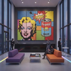
The challenge of decorating vast architectural expanses—such as grand staircases, long galleries, or expansive ballrooms—lies in the scale of the art. A small, delicate painting often disappears within a monumental space, losing its communicative power. Lichtenstein’s aesthetic, however, is inherently scalable. His reliance on thick, definitive outlines and simplified shapes ensures that his compositions retain their legibility even when translated into massive, multi-panel installations or large-format murals. For the procurement manager, this scalability offers a unique opportunity to utilize "Multi-Panel" layouts, where a single iconic image is split across three, four, or five canvases. This technique allows for a cohesive, modern architectural look that wraps around corners or spans wide walls, turning a structural necessity into a curated gallery experience. The bold geometry of his work acts as a graphic anchor, providing the necessary visual weight to balance heavy architectural elements like steel beams or large glass facades.
From Canvas to Corridor: Integrating Masterpiece Reproductions into Modern Architectural Design
Integrating high-quality art reproductions into a professional design scheme requires a balance between artistic prestige and operational reality. The transition from viewing an artwork as a mere decoration to treating it as an architectural component is where true luxury design resides. When sourcing for large-scale projects, the focus must remain on the quality of the medium; the visible brushstrokes of a hand-painted oil reproduction offer a depth and tonal range that digital prints simply cannot replicate. This tactile quality is essential when the art must compete with high-end finishes like velvet upholstery or textured wallpapers. Whether it is through custom-sized canvases that match specific wall dimensions or the use of "Period Shifts" to adapt classic styles to modern settings, the goal is a seamless integration. By treating Lichtenstein’s bold, graphic language as a foundational element of the interior's DNA, designers can create environments that are not only visually striking but also deeply memorable, leaving a lasting imprint on every guest who walks through the doors.