The Principles of High Renaissance Composition: Achieving Visual Equilibrium in Large-Scale Spaces
In the realm of luxury hospitality design, the concept of atmosphere is often dictated by the silent language of composition. The High Renaissance, a brief but explosive period spanning roughly 1490 to 1520, provides the ultimate blueprint for this architectural dialogue. Unlike the more experimental or fragmented styles that followed, the works of masters like Leonardo da Vinci and Raphael were built upon a foundation of mathematical order and profound stability. For the designer tasked with furnishing a grand lobby or a high-ceilinged dining hall, understanding these principles is not merely an academic exercise but a functional tool for establishing prestige.
At the heart of this era lies the pursuit of visual equilibrium. This was achieved through the deliberate use of geometric structures, most notably the pyramidal composition. When viewing Leonardo’s Virgin of the.Rocks, one observes how figures are arranged in a stable, triangular formation that directs the eye upward toward a central apex. In a large-scale interior, implementing such structured arrangements allows an artwork to anchor a room rather than clutter it. By utilizing compositions that possess an inherent sense of gravity and centeredness, designers can create focal points that command attention without disrupting the flow of movement within a professional or commercial space.
This era moved away from the flat, symbolic representations of the Medieval period toward a more sophisticated humanist approach, where every element—from the placement of an angel to the depth of a shadow—served a larger narrative of harmony. For procurement managers and decorators, selecting works that embody this ordered rationality ensures that even the most ambitious installations feel intentional and complete.
Mastering Scale and Proportion: Integrating Classical Geometry into Modern Hotel Architecture
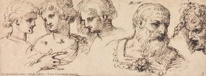 Five Classical Heads
Discover Inigo Jones’ ‘Five Classical Heads,’ a striking 1639 pen & ink drawing showcasing Mannerist portraits of male heads. A study in form, detail, and classical beauty.
The challenge of modern hotel architecture often lies in managing vast, sometimes intimidating, volumes of space. The High Renaissance masters solved this through a rigorous application of proportion and the Golden Ratio. They understood that beauty resides in quantifiable relationships between parts and the whole. When integrating art into contemporary structures, such as glass-walled atriums or expansive corridors, the use of classical proportions allows for a seamless transition between the built environment and the decorative elements.
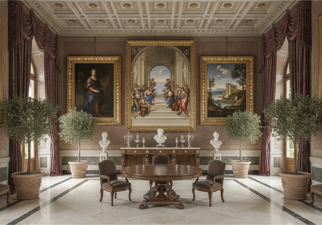
The masters did not merely paint figures; they engineered space. Through the development of advanced linear perspective, artists like Raphael created illusions of depth that could expand the perceived boundaries of a room. For a designer, this means that a well-chosen Renaissance reproduction can act as a "window," providing a sense of infinite recession in a confined lounge or adding much-needed architectural weight to a minimalist suite. The use of mathematical proportion ensures that even when an artwork is scaled up for a massive feature wall, it retains its structural integrity and does not appear disproportionate to the surrounding furniture or moldings.
Furthermore, the integration of these classical ideals allows for a sophisticated layering of textures and forms. By respecting the scale of the original masters, designers can utilize multi-panel layouts—splitting a single masterpiece across three, four, or five canvases—to wrap around corners or span wide staircases. This technique maintains the geometric logic of the Renaissance while adapting it to the unique demands of modern, large-format architectural installations.
Color Theory and Sfumato: Utilizing Soft Gradations and Tonal Depth for Atmospheric Interiors
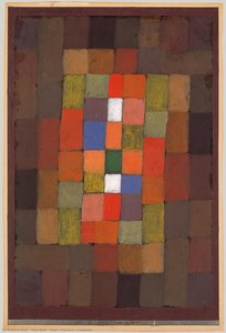 Static-Dynamic Gradation
Paul Klee’s Static-Dynamic Gradation (1923) exemplifies Expressionism with a grid of rectangles exploring form, movement, and color theory. Employing hues like red and orange alongside blues and greens, it symbolizes stability and change through geom
Color is the most immediate emotional language available to an interior designer. In the High Renaissance, color was never used in isolation; it was part of a carefully balanced symphony designed to evoke mood and depth. One of the most revolutionary techniques of this period was sfumato, perfected by Leonardo da Vinci. This method involves the subtle, smoky blending of tones, eliminating harsh outlines to create an ethereal, atmospheric quality. In a luxury hotel setting, where lighting can vary from bright midday sun to dim, amber-hued evenings, works featuring sfumato provide a consistent sense of softness and elegance.
This technique relies on chiaroscuro—the dramatic manipulation of light and shadow—to sculpt form. By utilizing paintings that feature deep tonal ranges, designers can introduce "visual weight" to a room. A painting with rich, dark shadows and luminous highlights can ground a brightly lit breakfast area or add a layer of mystery to a private executive lounge. The goal is to achieve harmonious hues, where no single shade dominates, but rather each tone complements its neighbor to create a visual experience that feels both complete and endlessly inviting.
Beyond the technical brilliance, the color palettes of the High Renaissance—often featuring deep ultramarines, rich ochres, and soft flesh tones—offer a timelessness that transcends seasonal trends. For the hospitality professional, these colors provide a reliable foundation for color matching with upholstery, drapery, and stone finishes, ensuring a cohesive brand identity across an entire property.
Strategic Art Placement: Using Multi-Panel Renaissance Masterpieces for Feature Walls and Grand Staircases
The placement of art within a commercial space requires a strategic understanding of the viewer's journey. The High Renaissance emphasis on compositional strategies offers unique opportunities for directing traffic and focus. In grand architectural features like staircases or long corridors, the use of multi-panel paintings can transform a transitional space into a destination. By breaking a classical composition across multiple canvases, the designer creates a rhythmic progression that guides the eye along the architectural line.
This "fragmented" approach to a unified whole is particularly effective for wide walls that might otherwise feel empty or unanchored. A single, massive canvas can sometimes overwhelm a space, but a series of coordinated panels allows for a more nuanced integration with the surrounding decor. This method also facilitates the customization required in high-end projects, allowing art to be tailored to specific wall dimensions without losing the essence of the original masterpiece.
Moreover, strategic placement can utilize the pyramidal structure of Renaissance works to create "anchors" at the end of long vistas. Placing a significant, centered work at the terminus of a hallway or above a reception desk provides a sense of arrival and stability. It reinforces the idea that the space is curated with intention, reflecting the prestige and meticulous attention to detail expected by high-end clientele.
Curating Timelessness: Selecting High Renaissance Reproductions for Luxury Hospitality Branding
For the procurement manager or hotel designer, the ultimate goal is the creation of a lasting legacy. The High Renaissance represents the pinnacle of artistic production, offering a repertoire of works that signify culture, intellect, and permanence. Selecting high-quality, hand-painted reproductions allows for the implementation of this grandeur without the logistical complexities of acquiring original museum pieces. At ArtsDot.com, we specialize in providing these essential tools for the hospitality industry.
Our service is built for the professional needs of large-scale projects, offering everything from custom sizing to bespoke multi-panel layouts that fit your specific architectural requirements. We understand that reliability and efficiency are paramount; therefore, our process is designed for transparency, providing digital mockups for approval, pre-shipment photos, and rigorous quality control. Whether you require a single statement piece or a bulk order of coordinated works for an entire hotel chain, we provide the operational reliability required to meet tight deadlines.
By choosing hand-painted oil reproductions on 100% cotton canvas, you bring the tactile depth of visible brushstrokes and rich textures into your space—qualities that digital prints simply cannot replicate. From our specialized architectural murals to our ability to "remix" history through custom color matching, we empower designers to curate environments that are not only beautiful but profoundly enduring. For professional inquiries, volume discounts, or custom project coordination, please contact us directly at ArtsDot.com.