The Foundations of Color Theory: From Goethe to the Impressionists
 Chromatic Harmonies & Discord: A History of Color Theory in Art
Explore the fascinating evolution of color theory in art history! Discover Impressionism, Neo-Impressionism & beyond with expert insights for collectors and enthusiasts. Learn about Seurat's techniques & the psychology of color.
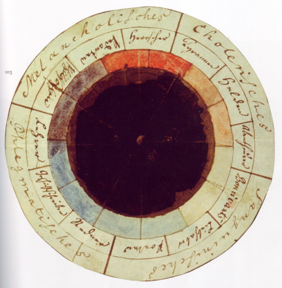
For centuries, artists intuitively understood color’s power—its ability to capture light, evoke emotion, and define form. Yet, it wasn't until the 18th and 19th centuries that a systematic exploration of color began to emerge, moving beyond practical application into the realm of scientific inquiry and philosophical debate. Johann Wolfgang von Goethe’s Theory of Colours (1810) marked a pivotal moment, challenging Newtonian physics by emphasizing the *subjective* experience of color. Goethe posited that color wasn't merely a property of light but arose from the interplay between light and darkness, intimately connected to human perception and feeling. This idea resonated deeply with artists seeking to express more than just visual accuracy; they wanted to convey inner states and emotional truths. While Newton dissected light *into* its components, Goethe explored how those components were *felt*. This shift in perspective laid the groundwork for the revolutionary approaches that would define Impressionism.
Prior to this burgeoning understanding, color was often dictated by tradition and symbolism—blues representing piety, reds signifying passion or power. But as artists began to study light directly, observing its effects on landscapes and objects, a new emphasis arose: capturing the ephemeral qualities of *fleeting* moments. This pursuit demanded a more nuanced approach to color mixing and application, moving away from pre-defined palettes towards a greater sensitivity to observed hues.
Impressionism's Revolution: Capturing Fleeting Light and Chromatic Vibrancy
Impressionism was a 19th-century art movement characterized by visible brush strokes, open composition, emphasis on accurate depiction of light in its changing qualities (often accentuating the effects of the passage of time), ordinary subject matter...
The Impressionists didn’t simply paint *with* color; they painted *light itself*. Claude Monet, Camille Pissarro, Pierre-Auguste Renoir—these artists abandoned the academic studio for the open air, attempting to record the immediate sensations of sunlight on water, fields, and cityscapes. Their canvases exploded with vibrant hues, often applied in broken brushstrokes – a technique designed not to blend colors on the palette but to allow the viewer’s eye to optically mix them. This was rooted in contemporary scientific understanding of how the human retina perceives color, recognizing that our eyes don't passively receive light but actively interpret it.
Consider Monet’s series paintings—the Water Lilies, the Rouen Cathedral—each a meticulous study of how light transforms a single subject across different times of day and atmospheric conditions. The emphasis wasn’t on recreating a precise likeness but on capturing the *impression* of light and color at a specific moment. This pursuit led to a rejection of traditional chiaroscuro, replacing it with a focus on complementary colors and subtle tonal variations. The goal was not to depict objects as they “truly” were, but as they appeared under varying conditions of illumination.
Post-Impressionist Explorations: Emotion, Structure, and Subjective Color
 Chromatic Resonance: Exploring the Psychological & Aesthetic Impact of Vibrant Colors in Art History
Explore the fascinating relationship between color & emotion in art history. Discover how master artists used vibrant hues to evoke feelings, cultural meanings, and psychological responses. A deep dive for classic art enthusiasts.
While Impressionism sought to capture the objective experience of light, Post-Impressionism delved into the *subjective* realm of emotion and structure. Paul Cézanne approached color with an almost architectural precision, using chromatic relationships to construct form and space. His famous dictum – “modulate” rather than “model”—reflected his understanding that color temperature and intensity could create three-dimensional form more effectively than traditional light-and-shadow techniques. He believed color wasn’t merely a decorative element but the very foundation of pictorial structure.
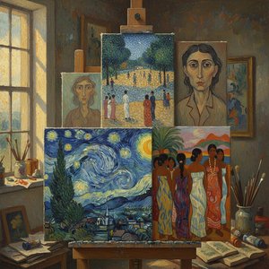
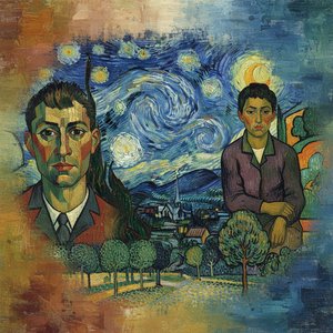
Vincent van Gogh, on the other hand, transformed color into pure emotional expression. His bold use of complementary colors—blues and oranges, yellows and violets—created vibrations and tensions that mirrored his internal landscape. Works like The Starry Night aren’t representations of reality but visceral expressions of feeling. Paul Gauguin similarly embraced arbitrary color choices, believing they could enhance artistic truth rather than diminish it. These artists moved beyond simply recording light; they used color to convey psychological states and symbolic meanings.
The Psychology of Hue: How Colors Influence Perception and Mood
 Wikipedia: Color psychology
Color psychology is the study of colors and hues as a determinant of human behavior. Color influences perceptions that are not obvious, such as the taste of food. Colors have qualities that may cause certain emotions in people. How color influences i...
The power of color extends far beyond the aesthetic realm, deeply influencing our perceptions and emotions. Color psychology—the study of how colors affect human behavior—reveals that certain hues can evoke specific responses. Reds are often associated with energy, passion, and excitement, while blues tend to be calming and serene. However, these associations aren’t universal; they vary depending on cultural context, personal experience, and even age and gender.
Carl Jung explored the archetypal meanings of color, linking them to subconscious processes and collective symbolism. He believed colors possessed inherent qualities that resonated with deep-seated human emotions. Marketers have long understood this power, strategically employing color in branding and advertising to influence consumer behavior. Logos are carefully chosen for their psychological impact, aiming to attract customers and evoke specific feelings about a product or service. Beyond marketing, color psychology finds applications in medical therapy, sports performance, and even interior design—all seeking to harness the emotive potential of hue.
Seurat’s Pointillism: A Scientific Approach to Chromatic Harmony
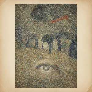
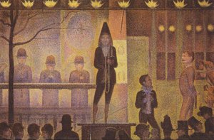
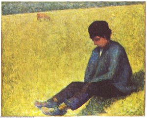
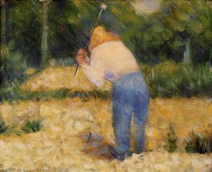
Georges Seurat took the Impressionist exploration of light and color to a new level with his revolutionary technique of Pointillism. Rejecting the spontaneous brushstrokes of Monet and Renoir, Seurat meticulously applied tiny dots of pure color to the canvas, relying on optical mixing to create form and luminosity. This wasn’t simply an aesthetic choice; it was a deliberate attempt to apply scientific principles to painting.
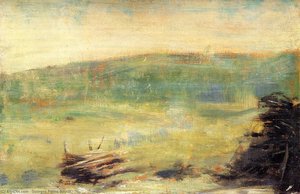
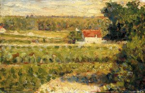
Seurat studied color theory extensively, drawing inspiration from both Goethe and contemporary scientists. His masterpiece, A Sunday Afternoon on the Island of La Grande Jatte, exemplifies his approach—a carefully constructed composition built entirely from dots of contrasting hues. Works like House with Red Roof demonstrate Seurat’s ability to capture Parisian light and atmosphere through this meticulous technique. He believed that by separating colors into their constituent components, he could create a more vibrant and harmonious image. His paintings are not merely visually striking; they represent a fascinating intersection of art and science.
Cultivating a Rich Palette: Selecting Colors for Your Home Collection
Bringing the principles of chromatic abundance into your home involves understanding how colors interact and evoke specific moods. Consider the emotional impact you wish to create—a calming bedroom might benefit from blues and greens, while a lively living room could embrace warmer tones like reds and oranges. Don’t be afraid to experiment with complementary color schemes, creating visual interest through contrast.
Selecting artwork that resonates with your personal aesthetic is paramount. Whether you prefer the vibrant landscapes of Monet or the emotional intensity of Van Gogh, choose pieces that speak to you on a deeper level. At ArtsDot.com, we offer handmade oil paintings and museum-quality reproductions of masterpieces from across art history, allowing you to cultivate a collection that reflects your unique taste and style. Our expert consultants can provide personalized guidance, helping you select the perfect colors and compositions for your home. From custom reproductions based on your favorite works to photo-to-painting services, we are dedicated to making the world of art accessible to everyone.