The Language of Hue: Color's Historical Significance
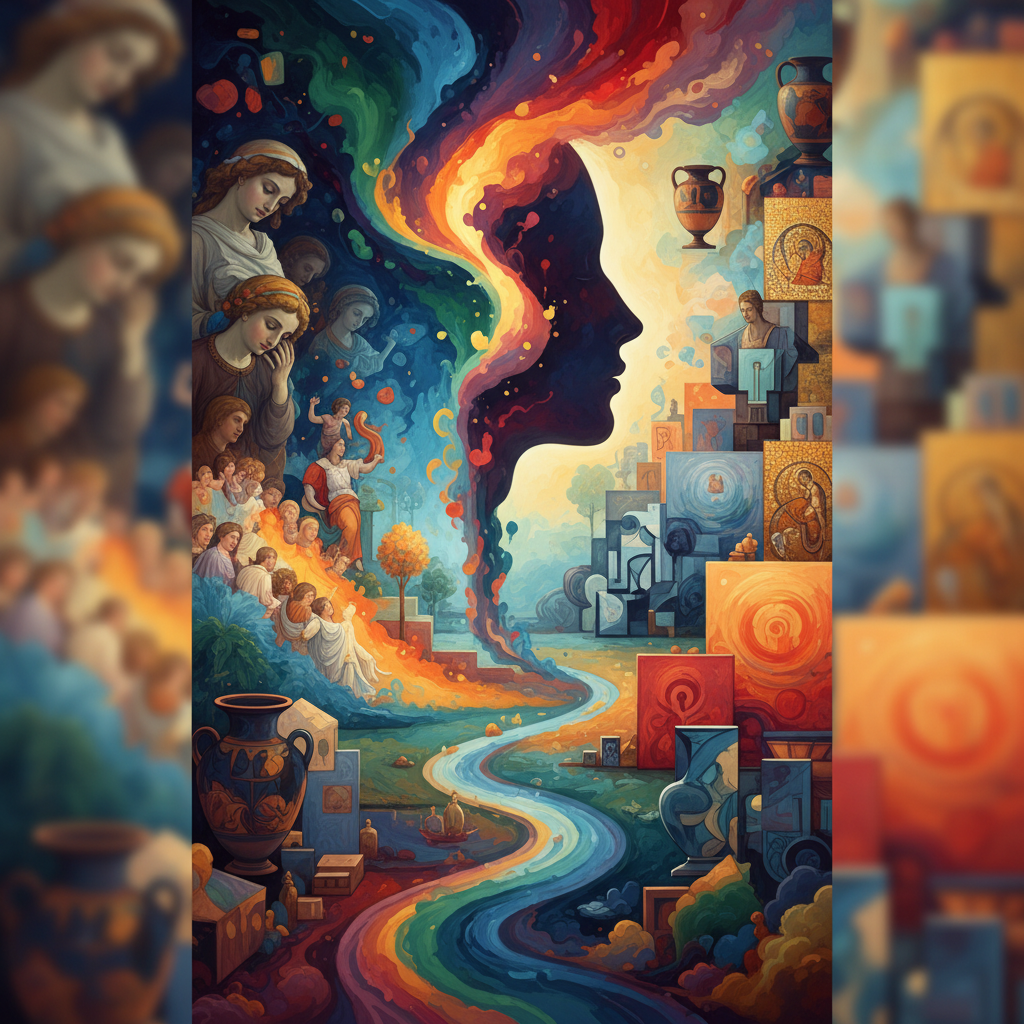
From the ochre pigments ground from earth in prehistoric cave paintings to the vibrant synthetics that defined Impressionism, color has always been more than mere decoration; it’s a fundamental language of human expression. Long before articulated theories of psychology, our ancestors intuitively understood color’s power to communicate – danger signaled by crimson clays, spiritual reverence embodied in lapis lazuli blues. Ancient civilizations like Egypt and China didn't simply *use* color, they codified its meaning within their religious practices and social hierarchies. Consider the elaborate symbolism woven into Egyptian tomb paintings, where each hue held specific connotations relating to life, death, and rebirth. The very act of creating pigment was often a ritualistic process, imbuing the colors themselves with sacred significance. This early understanding wasn’t about aesthetic preference; it was about harnessing forces believed to reside within the spectrum itself.
As art evolved through the Renaissance, color began to be understood not just symbolically but also scientifically. Artists like Leonardo da Vinci meticulously studied light and shadow – chiaroscuro – recognizing how manipulating tonal values could create depth and realism. However, even with this burgeoning scientific approach, emotional resonance remained paramount. The rich reds and golds of religious iconography weren’t merely representations of wealth or status; they were intended to inspire awe and devotion. It wasn't until the 18th and 19th centuries that a more systematic exploration of color psychology began to emerge, laying the groundwork for understanding how hues directly impact our perceptions and feelings.
Psychological Palettes: How Colors Evoke Emotion
The study of color psychology reveals a fascinating interplay between biological predisposition and cultural conditioning. While some responses to color appear universal – red often associated with energy or danger, blue with calmness – the nuances are deeply influenced by individual experience and societal norms. As Verywell Mind points out, colors can even influence physiological reactions, from increased blood pressure to eyestrain. This isn’t simply a matter of subjective preference; it's rooted in how our brains process visual information.
Consider the impact of warm versus cool tones. Warm colors – reds, oranges, and yellows – tend to be stimulating, evoking feelings of excitement, passion, or even aggression. They draw attention and can create a sense of urgency. Conversely, cool colors – blues, greens, and purples – are generally associated with tranquility, peace, and serenity. They often promote relaxation and introspection. However, these associations aren’t absolute. A muted olive green might evoke feelings of nostalgia or melancholy, while a vibrant turquoise could feel invigorating and optimistic. The context in which a color is used—its saturation, value, and surrounding hues—plays a crucial role in shaping its emotional impact.
Masterstrokes in Mood: Artists & Their Use of Color
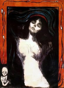
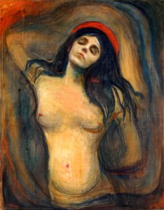
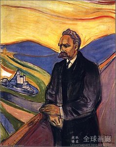
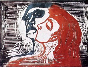
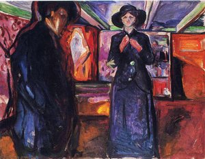
Few artists demonstrate the power of color to convey emotion as profoundly as Edvard Munch. His works, such as “Farm and Red Fir” and “Young Man and Prostitute,” are not simply depictions of scenes; they are visceral expressions of inner turmoil. Munch deliberately employed jarring color combinations and distorted forms to evoke feelings of anxiety, alienation, and despair. The fiery reds in “Farm and Red Fir”, for example, aren’t naturalistic representations of a sunset; they symbolize the emotional intensity of the scene, hinting at underlying psychological distress.
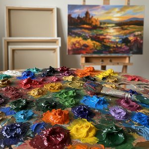
“Untitled (5816)”, another striking piece by Munch, showcases his masterful use of impasto – thick layers of paint applied with visible brushstrokes. This technique not only adds texture and depth but also amplifies the emotional impact of the colors themselves. The swirling blues and greens create a sense of unease and vulnerability, drawing the viewer into the artist’s troubled psyche. Similarly, artists like Van Gogh utilized color expressively, employing bold, contrasting hues to convey his subjective experience of the world. His iconic “Starry Night” isn't a literal depiction of a night sky; it’s a powerful expression of wonder, awe, and perhaps even spiritual longing.
Cultural Chromatics: Variations in Color Symbolism
While certain emotional associations with color may be widespread, cultural interpretations can vary dramatically. As highlighted by HowStuffWorks, white symbolizes purity and innocence in Western cultures, it’s traditionally associated with mourning and death in many Eastern societies. This difference underscores the importance of considering cultural context when interpreting art or designing for a global audience.
Red, often linked to passion and energy in the West, holds different significance elsewhere. In China, red is considered a lucky color, symbolizing prosperity and happiness, frequently used during celebrations like weddings. These variations aren’t arbitrary; they are rooted in historical traditions, religious beliefs, and societal values. Understanding these nuances allows us to appreciate the richness and complexity of cultural expression through color.
Beyond the Canvas: The Enduring Impact of Color Psychology
The principles of color psychology extend far beyond the realm of art. Marketers leverage its power to influence consumer behavior, carefully selecting colors for logos, packaging, and advertising campaigns. Hospitals utilize calming blues and greens in patient rooms to promote relaxation and reduce anxiety. Interior designers employ color strategically to create specific moods and atmospheres within spaces. The impact is pervasive, shaping our perceptions and influencing our choices in countless ways.
Ultimately, the enduring fascination with color lies in its ability to tap into something deeply primal within us. It’s a language that transcends words, speaking directly to our emotions and subconscious minds. By understanding the historical, psychological, and cultural dimensions of color, we can not only appreciate art more fully but also gain a deeper insight into ourselves and the world around us.