
The Industrial Foundation: Silk Screening and Mass Production Aesthetics
To understand the visual revolution of the 1960s, one must look beyond the canvas and toward the factory floor. The Pop Art movement did not emerge from a vacuum of classical inspiration; rather, it was born from the hum of the printing press and the efficiency of industrial manufacturing. For the modern designer tasked with creating high-impact environments, recognizing this connection is vital. The movement sought to collapse the distance between "high art" and "low culture" by adopting the very tools used to produce advertisements, comic books, and consumer packaging. This was not merely a stylistic choice but a profound philosophical shift that embraced the repetitive, the mechanical, and the accessible.
At the heart of this transformation lay silk screening, a technique traditionally reserved for commercial labeling and textile printing. By utilizing stencils to transfer ink through a fine mesh, artists could achieve flat, saturated planes of color and sharp, decisive edges that mimicked the look of mass-produced goods. This method allowed for a certain level of detachment from the artist's hand, moving away from the emotional, textured brushwork of Abstract Expressionism toward a more calculated, impersonal aesthetic. For hospitality professionals looking to curate spaces with a sense of modern energy, this industrial lineage provides a foundation of boldness and clarity that remains unmatched in contemporary decor.
Decoding the Ben-Day Dot: From Printing Press to High Art
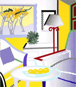
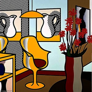
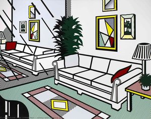
If silk screening provided the framework for Pop Art, then the Ben-Day dot provided its heartbeat. Originally developed as a cost-effective method in newspaper and comic book printing, Ben-Day dots were designed to create secondary colors and shading through the optical illusion of overlapping small circles of primary ink. In the hands of masters like Roy Lichtenstein, this utilitarian printing trick was elevated to a sophisticated artistic language. What was once a hidden element of low-cost media became a focal point of intense scrutiny, transforming a mechanical necessity into a powerful symbol of modern life.
When we observe these dots closely, we see more than just pattern; we witness the intersection of technology and perception. The way these tiny points of color coalesce to form skin tones or sky blues creates a unique visual vibration that is both nostalgic and avant-garde. In large-scale installations or hotel lobbies, the use of Ben-Day dot motifs can introduce a rhythmic texture that guides the eye across a surface without overwhelming the architectural composition. It is a technique that celebrates the beauty of the pixel before the digital age, offering a tactile, retro-futuristic quality that resonates deeply with contemporary luxury aesthetics.
Roy Lichtenstein and the Mechanical Aesthetic: A Case Study in Texture
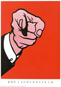
No exploration of this era is complete without analyzing the work of Roy Lichtenstein, whose oeuvre serves as the definitive blueprint for the mechanical aesthetic. In masterpieces such as Thinking of Him or Woman in a Bath, Lichtenstein did not simply copy comic strips; he re-engineered them. He meticulously recreated the appearance of cheap, mass-produced printing on much larger, more permanent scales. His work often features heavy black outlines and a restricted palette, creating a graphic intensity that demands attention within any interior setting.
The brilliance of Lichtenstein’s approach lies in his ability to infuse profound emotional depth into seemingly shallow subject matter. Through the use of Ben-Day dots and bold, flat colors, he could depict themes of isolation, romance, and drama with a clinical, detached precision. For a designer, studying his compositions offers invaluable lessons in balance and impact. His ability to utilize "empty" space and stark contrasts provides a template for creating focal points in expansive corporate or hospitality environments, where the art must compete with—and ultimately complement—complex architectural elements.
Visual Impact for Modern Interiors: Integrating Pop Art Textures into Hospitality Design
For the procurement manager or hotel designer, integrating Pop Art elements requires a strategic approach to texture and scale. The movement’s reliance on bold outlines and saturated hues makes it an ideal candidate for creating "statement walls" or defining specific zones within a larger floor plan. Because the aesthetic is rooted in graphic clarity, these pieces function exceptionally well in high-traffic areas like lounges, corridors, or dining rooms where visual legibility is paramount. The goal is to leverage the movement's inherent energy to stimulate the guest experience without disrupting the overall design narrative.
Modern hospitality design often leans toward a sophisticated minimalism, which provides the perfect neutral backdrop for the vibrant textures of Pop Art. One might consider using multi-panel, large-format reproductions to wrap around a staircase or a wide feature wall, creating a sense of continuity and movement. By selecting pieces that emphasize the rhythmic patterns of dots or the clean lines of silk-screened motifs, designers can introduce a layer of historical depth and cultural relevance that elevates a standard room into a curated experience. The key is to treat these bold textures as architectural components rather than mere afterthoughts.
Materiality and Longevity: Preserving the Bold Colors of the Pop Movement
The enduring appeal of Pop Art lies in its vibrant, unapologetic color palette. However, for long-term installations in commercial spaces, the preservation of these pigments is a critical consideration. The intense yellows, deep reds, and stark blacks that define the movement are susceptible to environmental factors such as UV exposure and atmospheric pollutants. To ensure that an investment in high-quality reproductions remains as striking in ten years as it is on day one, professional-grade materials are essential.
When sourcing art for large-scale projects, it is vital to prioritize works finished with protective layers, such as Damar varnish, which shields the surface from dust and moisture. Furthermore, understanding the difference between a flat print and a hand-painted oil reproduction can significantly impact the longevity and tactile quality of the space. A hand-painted piece offers a deeper tonal range and physical texture—visible brushstrokes that mimic the original's energy—whereas high-quality Giclée prints offer archival stability with 12-color inks. For the discerning professional, selecting the right medium is not just about aesthetics; it is about ensuring the permanence of the brand’s visual identity.