Introduction: The Allure of Warm Color Palettes
From the flickering candlelight illuminating Renaissance masterpieces to the fiery passion captured on Baroque canvases, warm color palettes have consistently held a unique power over artists and viewers alike. There’s an inherent magnetism in hues of red, orange, and yellow – a primal connection that speaks to our deepest emotions and experiences. These aren't merely aesthetic choices; they are deliberate invocations of feeling, capable of transforming a simple depiction into a profoundly moving statement. This exploration delves into the fascinating world of warm colors, tracing their historical significance, psychological impact, and enduring appeal in art, offering insights for both seasoned collectors and those beginning to cultivate an appreciation for the emotive potential of painting.
The Psychology of Warm Colors: Evoking Emotion and Atmosphere
 The Chromatic Spectrum of Feeling: Exploring Color & Emotion in Art History
Explore the fascinating relationship between color and emotion in art history. Discover how master artists used color to evoke feelings & cultural meanings, plus the psychology behind it all.
The human response to color is deeply ingrained, stemming from our biological and cultural associations. Warm colors—reds, oranges, and yellows—are inherently stimulating. Red, often linked to energy, passion, and even danger, commands attention and evokes a sense of excitement. Orange, a blend of red’s intensity and yellow’s cheerfulness, radiates warmth and optimism, fostering feelings of creativity and enthusiasm. Yellow, the brightest hue in the spectrum, embodies joy, intellect, and vitality, though its overuse can sometimes be perceived as overwhelming or even anxious. These colors aren't isolated sensations; they interact with each other and our individual experiences to create complex emotional responses.
Consider how a predominantly red painting might evoke feelings of urgency or love, while an orange-toned landscape could inspire a sense of adventure and freedom. The skillful artist understands these nuances, employing color not just to represent reality but to actively shape the viewer’s perception and emotional state. The interplay of light and shadow further amplifies this effect; a warm hue bathed in dramatic illumination can create a powerful focal point, drawing the eye and intensifying the overall impact.
Historical Masters of Warmth: From Renaissance Glow to Baroque Drama
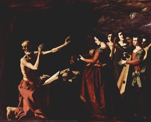
 Martirio de Santiago
Explore Zurbarán’s dramatic *Martirio de Santiago*, a Baroque masterpiece of faith & sacrifice. Intense emotion, masterful tenebrism, and historical depth.
Throughout art history, masters have harnessed the power of warm colors to achieve specific artistic goals. In the Renaissance, artists like Titian employed rich reds and golds to convey wealth, status, and spiritual significance in portraits and religious scenes. The warmth emanating from these paintings wasn’t simply a reflection of opulent materials; it symbolized divine grace and earthly power. As we move into the Baroque period, the use of warm colors takes on a more dramatic intensity.
Francisco de Zurbarán, for example, in his *Martirio de Santiago*, utilizes deep reds and browns alongside masterful tenebrism to create a scene of profound faith and sacrifice. The stark contrast between light and shadow intensifies the emotional weight of the subject matter, drawing viewers into the heart of the narrative. The warmth isn’t comforting here; it's a visceral representation of suffering and devotion. This deliberate use of color and light elevates the painting beyond mere depiction, transforming it into a powerful spiritual experience.
Tenebrism & Chiaroscuro: Harnessing Light and Shadow for Emotional Impact
Tenebrism, from Italian tenebroso ('dark, gloomy, mysterious'), also occasionally called dramatic illumination, is a style of painting using especially pronounced chiaroscuro, where there are violent contrasts of light and dark, and where darkness be...
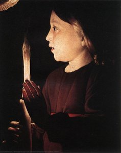
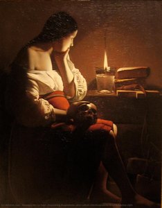
Central to understanding the impact of warm colors in Baroque art is the technique of tenebrism – an extreme form of chiaroscuro. While chiaroscuro broadly refers to the use of light and shadow to create depth and volume, tenebrism specifically emphasizes violent contrasts, where darkness dominates the composition. This spotlight effect, pioneered by artists like Caravaggio, wasn’t merely a stylistic choice; it was a deliberate strategy for adding drama and emotional intensity.
By plunging much of the scene into shadow, artists could draw attention to key figures or elements, amplifying their significance. Warm colors, when illuminated in this manner, become beacons of hope, passion, or suffering, depending on the context. The technique relies heavily on the psychological impact of color; a single flame illuminating a face can convey vulnerability, determination, or despair with remarkable power. The interplay between light and shadow isn’t simply about visual representation; it's about manipulating perception and evoking a specific emotional response.
Warm Tones in Interior Design: Creating Inviting Spaces with Art
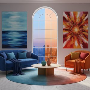 The Emotional Palette: Choosing Art by Color & Its Impact on Interior Spaces
Discover how color psychology impacts interior spaces. Expert advice on selecting art to evoke specific moods & enhance your designs. offers custom reproductions & professional consultation.
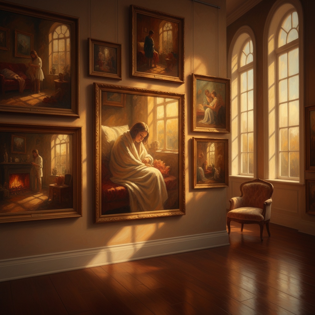
The principles that guided the Old Masters remain remarkably relevant today, particularly when considering how art impacts our living spaces. Warm color palettes are inherently inviting, creating a sense of comfort, intimacy, and energy. A room dominated by cool tones can feel sterile or impersonal; introducing artwork featuring reds, oranges, and yellows can instantly inject warmth and personality.
Consider the placement of an orange-toned landscape in a living room – it can create a focal point that draws the eye and fosters conversation. Or imagine a red-hued portrait above a fireplace, radiating passion and energy. The key is to consider the overall aesthetic and desired mood; a carefully chosen artwork can transform a space from functional to emotionally resonant. ArtsDot offers custom reproductions allowing you to select pieces perfectly tailored to your interior design vision.
Selecting Your Own Warm Palette: A Guide to Harmonious Composition
Choosing artwork featuring warm colors doesn’t have to be daunting. Begin by considering the existing color scheme of your space and identifying complementary hues. A predominantly blue room, for example, might benefit from accents of orange or yellow to create a dynamic contrast. Experiment with different shades and intensities; a muted terracotta can evoke a sense of rustic charm, while a vibrant crimson commands attention.
Don’t be afraid to explore the works of artists who masterfully employ warm color palettes – Alec Monopoly's bold and energetic compositions or Yoel Benharrouche’s tranquil gradients can provide inspiration. Ultimately, the most important factor is selecting pieces that resonate with you personally and evoke a desired emotional response. At ArtsDot, we offer an extensive collection of handmade oil paintings and museum-quality prints, allowing you to bring the power of warm colors into your own home.