
Introduction: The Allure of Softness – A Historical Perspective
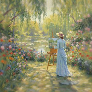
From the delicate blush of a Renaissance portrait to the hazy lavender fields captured by Impressionist masters, pastel hues have long held a unique position in the world of art. More than simply a stylistic choice, the embrace of softness represents a deliberate turn towards intimacy, emotion, and a nuanced understanding of light and atmosphere. Before the advent of readily available synthetic pigments, achieving these subtle tones required considerable skill – often involving meticulous layering of glazes or the use of naturally occurring earth pigments. This inherent difficulty contributed to their association with refinement and artistic mastery. The early appeal wasn’t merely aesthetic; it was a testament to the artist's control and sensitivity. Consider the portraits of Madame X by John Singer Sargent, where pastel allows for an almost ethereal quality, capturing not just likeness but also a sense of inner life. This tradition continued into the 19th century, blossoming with movements that prioritized subjective experience over strict realism.
The Psychology of Pastel Hues: Evoking Emotion and Mood
 Wikipedia: Color psychology
Color psychology is the study of colors and hues as a determinant of human behavior. Color influences perceptions that are not obvious, such as the taste of food. Colors have qualities that may cause certain emotions in people. How color influences i...
The power of pastel colors extends far beyond their visual appeal; they tap directly into our subconscious, influencing mood and perception in profound ways. Color psychology reveals that softer shades—baby blues, blush pinks, gentle lavenders, and creamy yellows—are inherently calming, often associated with feelings of tranquility, nostalgia, and tenderness. This isn’t accidental. The desaturation inherent in pastel tones reduces visual “noise,” allowing the eye to rest and the mind to relax. Studies have shown that exposure to these hues can even lower heart rates and reduce stress levels, explaining their frequent use in healthcare settings and spaces designed for contemplation. But the emotional impact is far more complex than simple relaxation. Pink, for example, while often associated with sweetness and femininity, can also evoke feelings of compassion and empathy. Blues suggest serenity and trust, while yellows offer a sense of optimism and warmth. Artists intuitively understood these connections long before the advent of modern psychological research, employing pastel palettes to subtly guide the viewer’s emotional response.
Impressionism’s Embrace of Light & Color: Laying the Foundation for Pastel Palettes
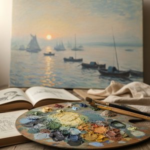 Impressionism: A Revolution of Light & Color That Changed Art History
Explore the revolutionary world of Impressionism! Discover its history, key artists like Monet & Renoir, defining techniques, and lasting impact on modern art. A comprehensive guide for art lovers.
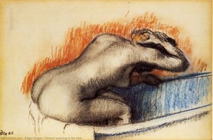
The Impressionist revolution fundamentally altered how artists approached color. Rejecting the academic tradition of precise representation, painters like Monet, Renoir, and Degas sought to capture the fleeting effects of light and atmosphere. This pursuit naturally led them to explore a wider range of hues, including softer, more delicate tones. Edgar Degas’s depictions of dancers are particularly compelling in this regard. He wasn't simply interested in portraying their physical form; he aimed to capture the ephemeral quality of movement and light within the studio. Pastel allowed him to achieve a remarkable sense of immediacy, with visible brushstrokes conveying energy and spontaneity. The broken color technique – applying small strokes of pure color side-by-side – created a shimmering effect that mimicked the way light interacts with surfaces. This emphasis on capturing *impression* rather than precise detail paved the way for a greater acceptance of softer palettes and more subjective interpretations of reality. The focus shifted from recreating what was seen to conveying how it felt.
Post-Impressionism and Beyond: Gauguin, Manet, and the Symbolic Use of Pastels
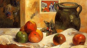
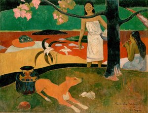 Pastorales Tahitiennes
Paul Gauguin's 'Pastorales Tahitiennes,' created in 1892, embodies Post-Impressionism with vibrant colors and symbolic imagery capturing Tahiti’s idyllic beauty.
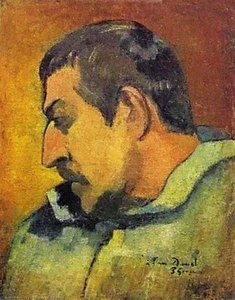
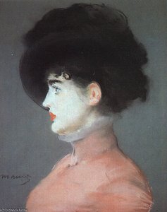
Édouard Manet’s ‘Portrait of Irma Brunner,’ painted in 1880, exemplifies this innovative approach. While rooted in Realism, Manet's use of pastel showcases a meticulous detail and captures not just the beauty of Irma Brunner’s attire and gaze but also a sense of contemporary life. The subtle gradations of color and delicate textures create an intimacy rarely seen in earlier portraiture. Paul Gauguin, however, took the exploration of pastels in a different direction. His ‘Pastorales Tahitiennes,’ created in 1892, embodies Post-Impressionism with vibrant colors and symbolic imagery capturing Tahiti’s idyllic beauty. Gauguin wasn't interested in simply replicating what he saw; he sought to convey the spiritual essence of the island and its people. He used pastel not just for its aesthetic qualities but also as a means of expressing his own subjective emotions and beliefs. The bold, often non-naturalistic colors and simplified forms create a dreamlike quality that transcends mere representation. This move towards symbolism and emotional expression further solidified the power of pastels as a tool for conveying inner states.
Beyond Aesthetics: The Nuances of Pastel in Composition and Subject Matter
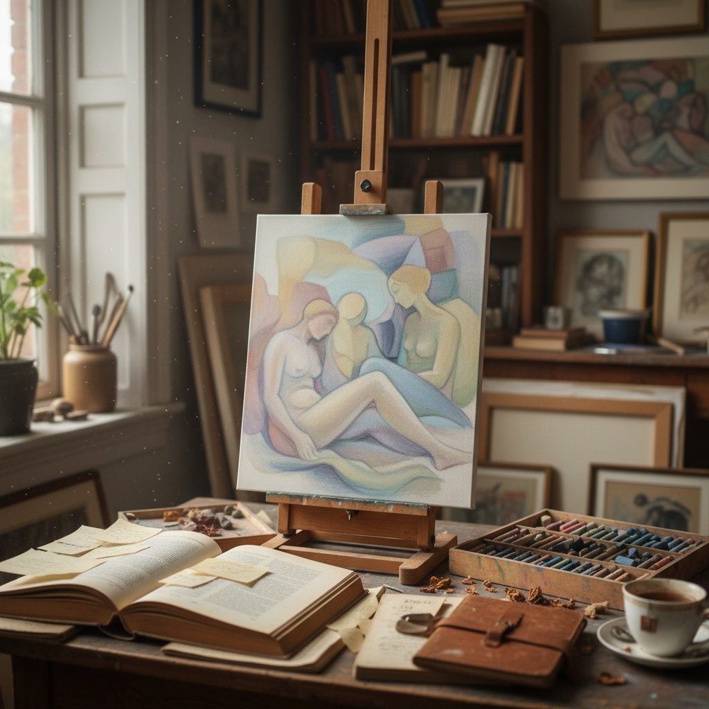
The choice of pastel isn’t simply about color; it's also about how that color interacts with composition and subject matter. Softer palettes often lend themselves to scenes of intimacy, tranquility, or nostalgia – think of domestic interiors bathed in warm light, portraits capturing a fleeting moment of connection, or landscapes evoking a sense of peaceful solitude. However, pastels can also be surprisingly effective when juxtaposed with bolder elements, creating a dynamic tension that draws the eye and adds depth to the artwork. The skillful use of negative space is crucial; allowing areas of lightness to balance the softer tones prevents the composition from feeling overly saccharine or cloying. Furthermore, artists often employ pastel to create a sense of atmosphere – blurring edges, softening forms, and suggesting distance or haze. This technique can be particularly effective in landscapes, where it evokes a sense of mystery and wonder.
Cultivating Calm: Integrating Pastel Tones into Your Collection
Whether you’re drawn to the delicate beauty of Impressionist landscapes or the symbolic power of Post-Impressionist portraits, integrating pastel tones into your art collection can bring a sense of serenity and emotional resonance to your living space. Consider how the colors will interact with your existing décor – softer palettes often complement neutral backgrounds, allowing the artwork to take center stage. At ArtsDot, we offer a wide selection of museum-quality reproductions, meticulously crafted by skilled artists using traditional techniques. From oil paintings on canvas to giclée prints and custom framing options, we can help you find the perfect piece to enhance your home or office. Explore our collection today and discover the timeless allure of pastel hues – a testament to the enduring power of art to evoke emotion, inspire contemplation, and transform your surroundings.